Every presentation tells a story, but not everyone experiences that story in the same way. Usually, someone viewing your slides may immediately understand a chart, diagram, or infographic. However, a person using a screen reader depends entirely on how well the presentation has been structured. A screen reader PowerPoint audit is an essential step before sharing presentations with clients, students, employees, or the general public when accessibility is a major consideration. Microsoft PowerPoint includes an Accessibility Checker that helps identify many common issues. However, Microsoft also acknowledges that automated tools cannot detect every accessibility problem.
This guide explains what a comprehensive PowerPoint accessibility audit involves, how screen readers interpret PowerPoint slides, and what Microsoft’s Accessibility Checker can detect or what it might miss. We will also explain how to manually verify whether your presentation is suitable for users of screen readers, such as Narrator on Windows and VoiceOver on Mac.
Why Screen Reader Accessibility Matters
Accessibility is no longer simply a best practice; it increasingly forms part of organizational compliance and inclusive design standards. A study by the UK Government Digital Service (GDS) found that the best automated accessibility testing tools detected only 30-40% of known accessibility issues, underscoring the importance of manual testing alongside automated checks.
Screen readers convert digital content into synthesized speech or refreshable Braille. Instead of “seeing” a slide, users navigate its content sequentially. For PowerPoint, this means the software exposes information through the document’s accessibility structure rather than its visual appearance.
A professionally designed slide can become confusing if objects are announced in the wrong order, images have missing or meaningless alternative text, hyperlinks are read as raw URLs, slide titles are duplicated or absent, and decorative graphics are announced unnecessarily. These issues may go unnoticed by someone viewing the presentation visually, yet they can significantly reduce usability for screen reader users.
Understanding How Screen Readers Read PowerPoint Slides
One of the biggest misconceptions about PowerPoint accessibility is that screen readers interpret slides exactly as they appear visually. In reality, they rely on PowerPoint’s accessibility tree, which defines how slide elements are exposed to assistive technologies.
Understanding Screen Reader Accessibility Tree
Typically, a screen reader encounters elements in this order: slide title, placeholder content, text boxes, images, charts, tables, and other objects. The actual sequence depends on each object’s reading order within the slide.
Why Screen Readers May Read Content Out of Sequence
While the chart may appear first in the slide, if the reading order places the annotation before the chart, a screen reader user hears the explanation before knowing what it refers to. This illustrates why visual design alone is not sufficient for accessibility.
What is a PowerPoint Accessibility Audit
A PowerPoint accessibility audit evaluates whether a presentation can be effectively understood by users with assistive technology. While Microsoft PowerPoint includes built-in accessibility checks, a complete audit combines automated analysis with manual review.
Professional accessibility audits generally examine alternative text, reading order, slide titles, color contrast, table structure, hyperlink wording, keyboard navigation, slide layouts, and manual screen reader testing. The objective is to ensure that someone using a screen reader can independently understand the presentation.
How to Perform a PowerPoint Accessibility Audit
For a PowerPoint accessibility check, you should start with the built-in Accessibility Checker and look for errors, warnings, tips, and quick fixes. This should be followed by a manual review.
Step 1: Use the PowerPoint’s Accessibility Checker
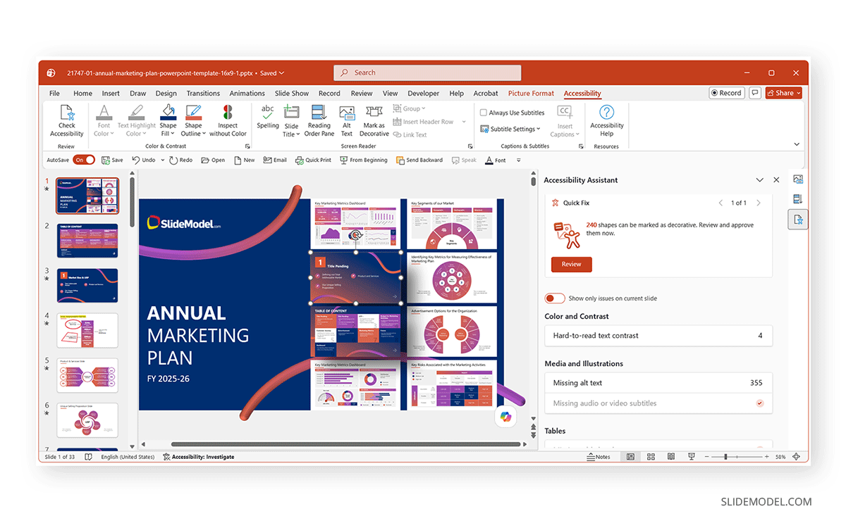
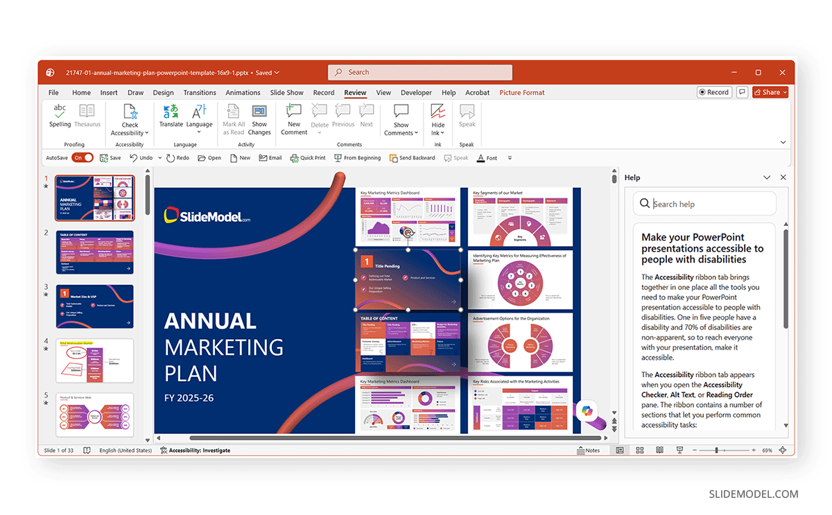
Microsoft recommends beginning with the built-in Accessibility Checker. In current versions of PowerPoint, Review > Check Accessibility. From the dropdown menu, you can check for accessibility suggestions, Alt Text, reading order for objects, and PowerPoint accessibility settings.
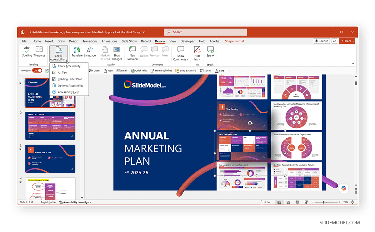
Check Accessibility: This option scans for accessibility issues and provides fixes by opening a pane of suggestions.
The Accessibility pane appears on the right side of the screen and categorizes findings into several groups. Tips suggest improvements that enhance usability but may not be strict accessibility requirements. Each issue includes Microsoft’s explanation, making the checker useful even for people new to accessible presentation design. You can make the necessary changes based on PowerPoint’s suggestions by applying quick fixes to content that might be hard to read from an accessibility standpoint.
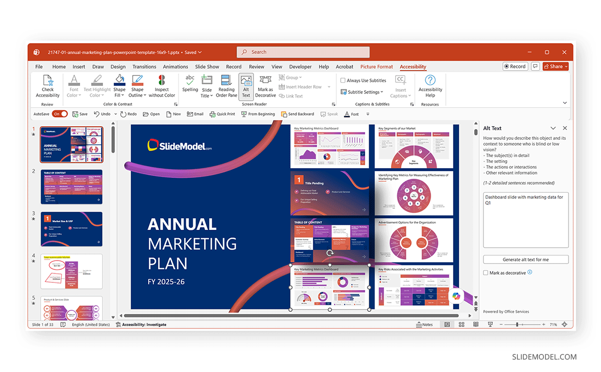
Alt Text: The Alt Text pane allows you to review existing descriptions, edit them, or use Microsoft’s AI-generated suggestions as a starting point. Automatically generated descriptions should always be reviewed for accuracy before publishing.
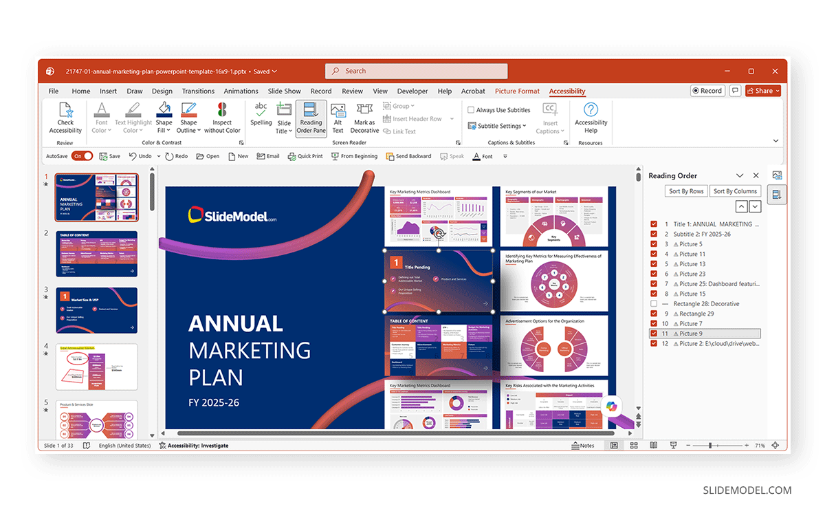
Reading Order Pane: Shows the reading order of slides so you can review the order in which your slide objects will be read out.
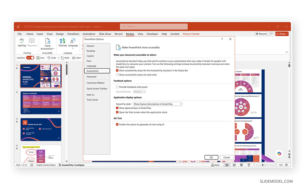
Options Accessibility: This opens the PowerPoint Options, where you can check current accessibility settings and enable Alt text generation for slides.
Accessibility Help: Opens the Help menu with details about accessibility features in PowerPoint.
Step 2: Perform a Manual Review After an Automated Check
Accessibility checkers are excellent for identifying structural problems, but they cannot evaluate meaning. For example, PowerPoint can verify whether an image has alternative text. It cannot determine whether the alt text is useful. Likewise, automated tools cannot judge whether decorative images should be ignored, if the reading order is logical, or whether slide content makes sense when spoken aloud. Similarly, you might need to look into charts, tables, SmartArt, and abbreviations during manual review.
Technical Checklist: What Every Accessibility Audit for a Presentation Should Review
Below is a technical accessibility audit checklist suitable for reviewing assistive technology. You can also use this checklist to create an accessibility audit presentation, an accessible presentation checklist, or to review screen reader-friendly slides and WCAG PowerPoint requirements.
Alternative Text for Images and Graphics
Alternative text is one of the first items auditors review. Informative visuals should explain their purpose. Not merely describe their appearance.
Reading Order Determination
Reading order determines the sequence in which assistive technologies announce slide elements. PowerPoint’s Reading Order Pane allows reviewers to inspect and rearrange objects. A proper reading order follows the natural flow of information rather than the visual layering of objects. Slides built from numerous overlapping text boxes often produce confusing reading sequences.
Use of Unique Slide Titles
Every slide should contain a meaningful title. Titles help screen reader users navigate presentations efficiently. Avoid repeating titles such as overview, summary, results, etc. If a visual design requires hiding the title, PowerPoint allows it to remain accessible without being displayed on the slide.
Color Contrast Management
Text must remain readable for users with low vision. Under Web Content Accessibility Guidelines (WCAG) 2.1 Level AA, normal text requires a minimum contrast ratio of 4.5:1, while large text (18 pt regular or 14 pt bold and larger) requires 3:1.
PowerPoint flags some contrast issues, but complex gradients, transparent overlays, background images, and custom graphics often require manual verification using dedicated contrast analysis tools.
Table Structure Design
Tables should represent actual tabular information. Instead of visually arranging content using empty cells or merged rows, define proper header rows. Screen readers announce headers as users navigate cells, helping preserve context. Complex comparison tables often benefit from being simplified into multiple smaller tables.
Hyperlink Text
Screen readers frequently allow users to browse links independently of surrounding text. Links such as “Click here” or “Read more”. Instead, descriptive links work far better: “Download the Annual Report” or “View Accessibility Guidelines”.
Reviewing Built-in Slide Layouts vs. Freeform Text Boxes
One of the most overlooked accessibility issues involves manually positioned text boxes. Slides created entirely from freeform text boxes often lose this structure, making navigation inconsistent for screen readers. Whenever possible, begin with Microsoft’s built-in layouts and modify them rather than creating slides from scratch.
Manual Screen Reader Testing
No accessibility audit is complete without testing the presentation with an actual screen reader. Automated tools can identify many structural issues, but they cannot determine whether a presentation is easy to understand when read aloud. Testing with a screen reader helps verify that slide content is announced in a logical order and provides a better indication of the user experience. Below are two commonly used screen readers for manual testing.
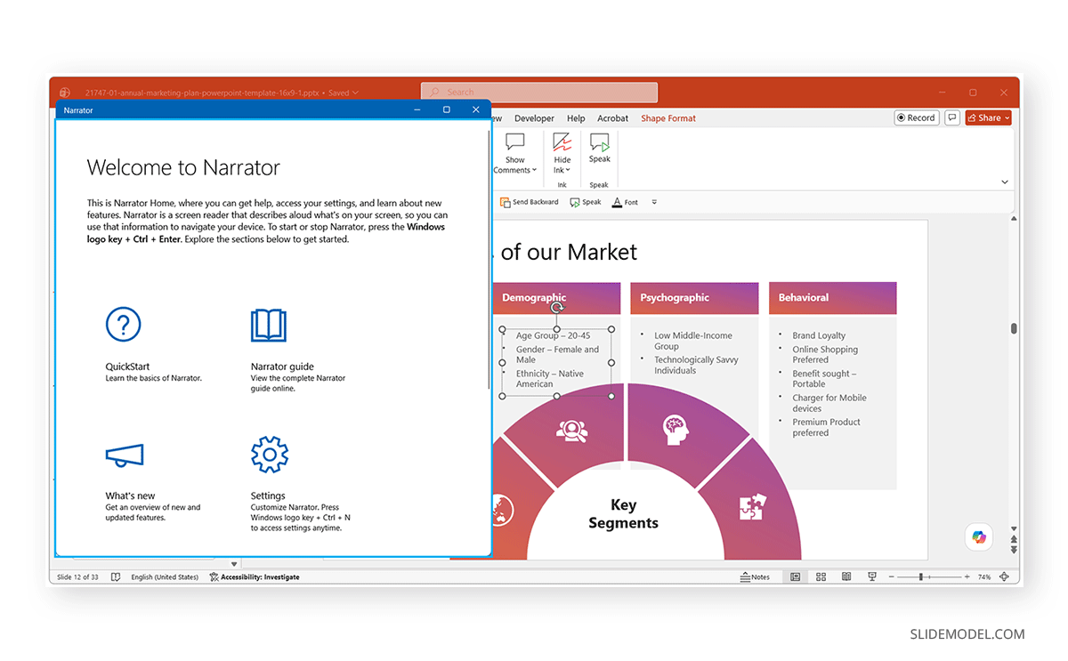
Narrator (Windows)
Narrator is an accessibility tool built into Windows that provides a convenient way to test PowerPoint presentations without installing additional software. As you navigate through the presentation, pay attention to whether:
- Slide titles are announced first.
- The reading order follows the intended sequence.
- Images are described with meaningful alternative text.
- Decorative objects are skipped.
- Hyperlinks clearly communicate their destination.
Whenever possible, navigate using only the keyboard rather than the mouse. This more closely reflects how many screen reader users interact with presentations.
VoiceOver (Mac)
VoiceOver is Apple’s built-in screen reader for macOS and can also be used to evaluate PowerPoint presentations. Although the PowerPoint interface differs slightly from the Windows version, the same accessibility principles apply. During testing, verify that:
- Navigation between slide objects is logical.
- Slide titles are announced correctly.
- The reading order matches the intended flow of information.
- Alternative text accurately describes images and graphics.
- Tables are announced with their headers and can be navigated correctly.
As with Narrator, perform the test using keyboard navigation whenever possible to better evaluate how the presentation may work with assistive technology.
Common Accessibility Mistakes
Even experienced presentation designers can unintentionally introduce accessibility barriers. Many issues arise not from complex technical problems but from everyday design habits that make slides more difficult to navigate with screen readers or other assistive technologies.
Text Embedded Inside Images
One of the most common mistakes is placing important information inside images. Screen readers cannot interpret text that has been flattened into a picture unless meaningful alternative text is provided. Even then, users cannot interact with or navigate the content as they would with regular text. Whenever possible, keep titles, labels, and body content as editable PowerPoint text rather than incorporating them into graphics.
Using Screenshots Instead of Native Content
Presenters often capture screenshots of websites, spreadsheets, dashboards, or documents rather than recreating the information with PowerPoint elements. While screenshots may preserve visual formatting, they hide the underlying content from assistive technologies. If a screenshot must be included for demonstration purposes, explain its purpose in the surrounding text or provide concise alternative text describing the key information shown.
Charts Without Context
Charts and graphs communicate patterns visually, but they rarely explain those patterns on their own. Screen reader users may know that a chart exists without understanding its message. Include a brief explanation highlighting the main takeaway, such as trends, comparisons, or significant changes.
Depending Only on Color
Using color alone to distinguish categories, priorities, or status creates barriers for people with color vision deficiencies and users of monochrome displays or screen readers. Instead of relying solely on red and green, combine color with text labels, icons, patterns, or data labels to keep the context clear, regardless of how the presentation is viewed.
Repeating Slide Titles
Duplicating slide titles may seem harmless, especially in long presentations, but it creates confusion for users navigating with screen readers or reviewing slide outlines. When multiple slides share identical titles, locating specific content becomes much more difficult. Each slide should have a unique, descriptive title that accurately reflects its primary topic.
Leaving Placeholder Content Behind
Default placeholders, such as “Click to add title” or unused content boxes, sometimes remain hidden within presentations after editing. Although these objects are invisible during a slideshow, screen readers may still encounter them, creating unnecessary noise and confusion. Therefore, you should always review the Selection Pane before finalizing a presentation and remove unused placeholders or decorative objects.
Excessive Floating Text Boxes
Building slides from dozens of independently positioned text boxes may provide design flexibility, but it often results in an illogical reading sequence. Whenever practical, use PowerPoint layouts, placeholders, tables, and grouped objects instead of numerous disconnected text boxes.
Poor Alternative Text
Alternative text should describe information that is not already conveyed elsewhere on the slide. A common mistake is simply repeating the visible heading or writing generic descriptions such as “Image” or “Chart”. If the surrounding text already fully explains the graphic, the image may instead be marked as decorative to prevent unnecessary repetition.
Overuse of Animations and Transitions
Some assistive technologies may not announce animated content consistently, while excessive motion can distract or overwhelm certain users. Use animations sparingly, ensure they support rather than replace the presentation’s message, and verify that all essential information remains available even if animations are disabled.
Inconsistent Fonts and Contrast
Decorative fonts, small text, and low-contrast color combinations reduce readability for many users, including those with low vision or cognitive disabilities. Slides that appear attractive on a projector may become difficult to read on laptops, tablets, or mobile devices. Choose clear sans-serif fonts, maintain adequate text size, and ensure sufficient contrast between foreground and background colors to improve readability across different viewing conditions.
Accessibility Compliance and WCAG PowerPoint Requirements
PowerPoint presentations are often shared online, distributed as downloadable files, or used in public-facing communications. Although the Web Content Accessibility Guidelines (WCAG) were created for websites, their principles are also widely used to make presentations and other digital documents more accessible.
In the United States, state and local governments are required to ensure that their web content, including many online presentation files, meets WCAG 2.1 Level AA under updated ADA Title II rules. Many businesses and organizations also follow these guidelines as part of their accessibility policies and inclusive design practices.
Final Words
Conducting a Screen Reader PowerPoint audit involves much more than running an automated checker. While PowerPoint’s Accessibility Checker provides a good starting point, it cannot evaluate logical reading flow or the overall experience of someone navigating your slides with assistive technology.
Reviewing alternative text, reading order, slide titles, color contrast, tables, hyperlinks, and slide layouts, followed by testing with Narrator (Windows), VoiceOver (Mac), or similar tools, can help ensure presentations are genuinely usable for assistive technologies.