Using alternative bullet points delivers a powerful impact on your audience.
Stamping out bullet points from the presentations is one of the most challenging task while preparing business presentations, as bullet points use high-value keyword phrases within bulleted content in a structured manner.
Yet, at the same time using the basic, black font bullet points will leave a little room for creativity. Correspondingly, using bullet point with robust text and least visuals can make the audience also feel bored and frustrated towards your presentations.

In today’s contemporary world, using bullet points has become out-of-style and presenters normally look for change. Many critics have blamed PowerPoint regarding the use of bullet points and suggested some alternatives to combat Death by PowerPoint. But, when looking for change time and budget hold back them on creating a visually stunning presentation and they are forced to work with the customary presentation templates with infinite bullet slides. To avoid such people dying for bullet and to blow their chances in presentations here are a few alternatives for bullet points. These quick tips will minimize the usage of traditional or standard bullet points and guides in using alternative layouts and slide designs. You will definitely find these well thought-out alternative bullet points lend a hand while preparing the PowerPoint presentations.
Listed alternatives of bullet points will help you to create dynamic, visually-appealing slides and help toward making your slides more engaging.
1. Crack bullet points with visual slides
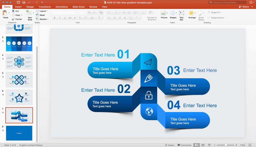
To enhance the gist of your presentation, use visual on the slides. The slides with visual impacts are always superior when compared to heavy-text slides. The visually impacted slides makes the presentation more engaging and holds the audience attention during your presentations. In such a way your message is made easier for the audience to think of. Here are a few other creative ways to list things in PowerPoint.

Breaking free bullet points with visual slide will add additional layers to your presentation and help to convey the message to the audience (while they also enjoy watching out the visuals).
2. Emphasize bullet points with icons & shapes
Drop out relying on display text and emphasize your bulleted content entirely with icons & PowerPoint shapes. The icon is a simple visual that fits in a small space with a text label. The icon free up a lot of space in the slide spending less time to get to the point. The icon also works as a mnemonic device to help the audience to take over your information.

Designing an icon on behalf of bullet points will bring an awesome look for your presentation as standard bullet points are considered as boring. In our content catalog we have plenty of PowerPoint Icons that can be combined to your existing or new presentations. Browsing our catalog you can find icons for a diverse range of presentation topics and purposes, and then use Copy & Paste in PowerPoint to copy the icons into your own presentations.
3. Migrate from bullet points to easy-to-read boxes
You may include a lot of good information on the slide, but overemphasizing a paragraph on a slide will provide hefty information to the audience and leave them confused.
These paragraphs or stacked bullet points can be run-down into easy-to-read boxes. By breaking down the stacked bullet contents will provide room to focus on each point individually. Ultimately, the key purpose of PowerPoint presentation to convey the key messages to the audience will be succeeded.

Boxes and components can help to organize the information in a way that makes the audience understand the message easier.
4. Construct Infographic from bullet points
Infographic a part of the presentation is considered as one of the most effective approaches to tell the story. The infographic will demonstrate the complex information visually. It is always a flexible and brilliant way to convey the information. An infographic can undeniably be used instead of bullet points for the major two reasons – “Infographic are not linear as of bullet points and Infographic provides space for your creativity.”

5. Build Table or Graph from bullet points
Table or graphs in PowerPoint can be used rather than bullet points during numerical data. Table and graphs are considered as one of the easiest and quickest methods to present the data-driven presentation. The table has the capacity to provide visibility of your data in more clear part. Moreover, contrasting lines can be drawn in between the cells to bring more visual effects on the table with rows and columns.
The following sample shows another way to represent the original bullet list. In the sample below you can see how we have converted a traditional bullet list into a new slide with three components. The slide space is better organized, less white-space, and the information can be perceived as a whole. The icons help to grab the audience attention and the number of components help to understand there is a total of three concepts to be presented.

Graphs are another extraordinary tool that visibly exhibits your analysis of the content, including, comparison of different topics, highlighting the before and after experiments, etc.
Tables can help to easily divide the text and show parts of your slides more clearly. By default, tables have rows and columns but you don’t need to insert a table in PowerPoint to achieve this the following design, instead you can organize the shapes in a way that are displayed in rows and columns but without using the built-in table format. If needed, additional lines to divide the cells can be added to the slide, however in cases like the sample below the lines and way shapes are organized is implicit as the padding and space between cells help to achieve a visual separation of the text. This way, traditional bullets can easily be converted into an attractive table.

6. Use other creative layouts as alternatives to bullet points
Another way to replace traditional Bullet Lists is by using other creative slides with components and space to enter the concepts and ideas you want to present. At SlideModel.com we have thousands of presentation layouts and slides that can be used as an alternative to bullet lists. For the following example we have converted a traditional bullet list in PowerPoint to a modern slide about Top 3 Cyber Security Threats. Instead of using bullet points we have organized the slide with three colorful components containing a relevant icon. Here is a creative way to present Bullet Points in PowerPoint.

We can make additional improvements to the previous design in order to visually reflect the percentage values. In the sample below, we have used small pie charts on each component to denote the percentage value associated to each item.

The traditional bullet points highlight the important information within the presentations but forces the people to read the content. Most of the time audience gets turned off if a slide contains the list of bullet points slide after slide or sub-bullets or sub-sub-bullets.

Even if the bullet lists and sub items help to visualize the hierarchy between items, it could create confusion within the reader and may raise questions in the audience’s mind. In order to avoid such list of bullet points slide after slide we can use other creative ideas as alternatives to traditional bullet points.
Using alternative bullet points such as visuals, icons, infographic, table layouts, pictures or diagrams will bring up the desirable format to your presentations. This can help to improve the effectiveness of your presentations.

The source of the information used to represent the samples in this article corresponds to Cyber Security 2016 Snapshot from Isaca.org. This research looks at cybersecurity issues facing organizations from reactions to new cybersecurity legislation, to insights on information sharing and top cyber threats.
Using appropriate alternative bullet points will highlight and communicate the key information professionally and convey your message effectively during a PowerPoint presentation.
The slides used to demonstrate the techniques are based on the following templates:


