Infographics can help explain various concepts with clarity using a visual sequence that can be easy to understand for an audience. This is why infographics are widely used in flyers, brochures, and presentations on social media. If you are a Google Slides user looking to learn how to make infographics, below are four easy methods that you can use to convert simple information into infographic slides. If you are a PowerPoint user, see our tutorial on how to make an infographic in PowerPoint.
How to Design an Infographic on Google Slides with SlideModel Templates
Creating an infographic from scratch is a taxing experience, and it requires advanced graphic design knowledge for font pairing, icon design, and creating a color palette that fits your environment. Instead, we invite you to discover and customize our infographic PowerPoint templates using Google Slides’ native tools.
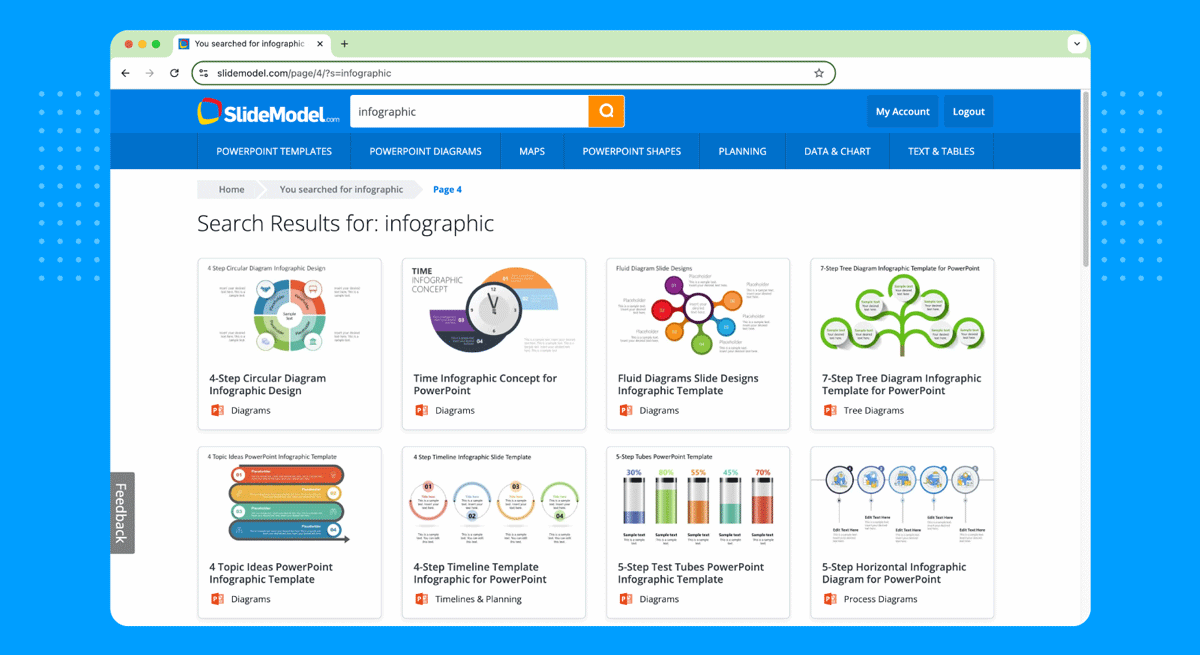
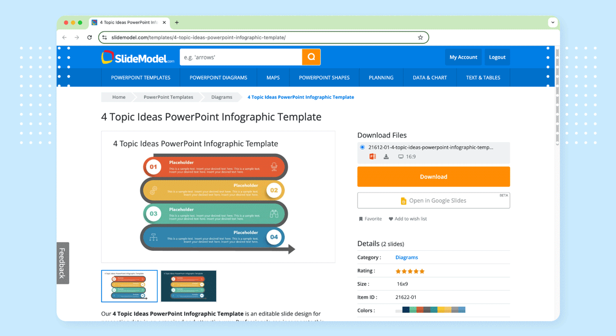
We start by selecting an infographic PPT template from the SlideModel.com website.
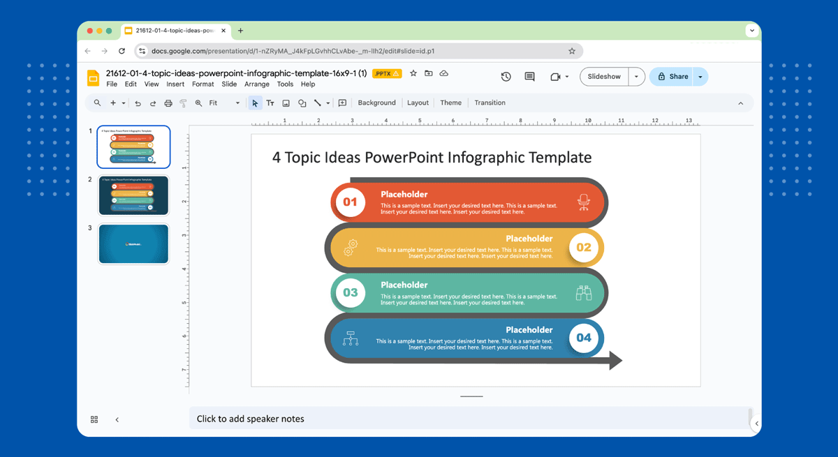
Download the design for the Google Slides version by clicking Open in Google Slides.
You will be redirected and start working on Google Slides from now on.
Since the black circular arrow doesn’t fit our needs for this presentation purpose, we can quickly remove it by selecting the object and deleting it.
Replacing content inside our infographic Google Slides template, we come up with this stage in our slide.

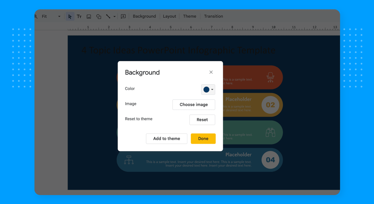
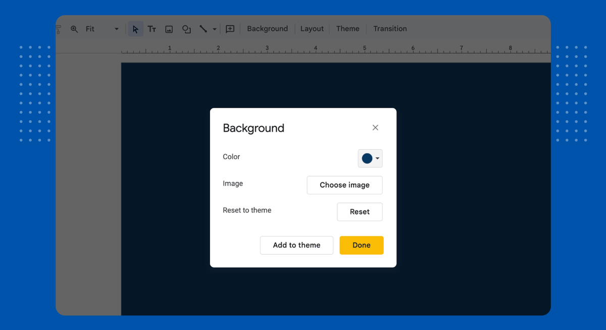
Now, we need to make this design cohesive so the colors evoke a sense of a branding image. In our example, the company creating this slide has navy blue and blue as its corporate colors. Therefore, the first step is to replace the background color for the slide so it aligns with that vision and also reduces the image contrast.
At the Control bar, click on Background and replace the original color to one that suits your presentation needs. For us, it will be navy blue.
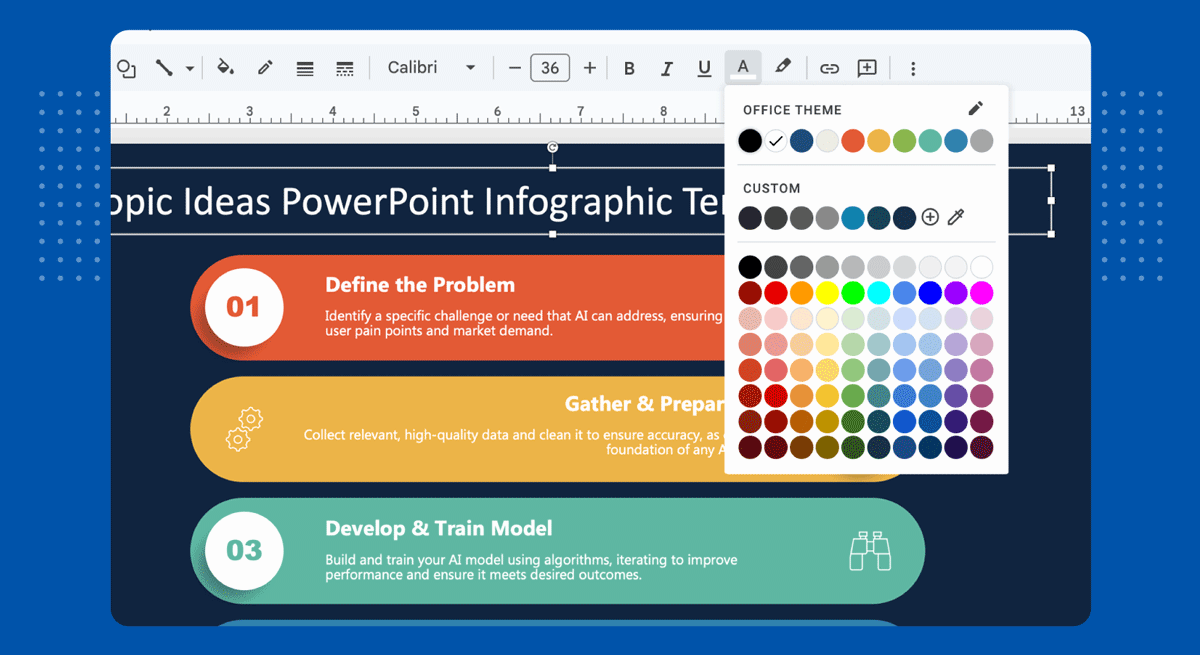
As we can see below, the title looks off because of the template’s original color for the title.

We will replace that by adjusting the text color for the title. To accomplish that, select the title element and select the Type Color tool in the Control bar. We’ll pick a white color to improve the contrast.
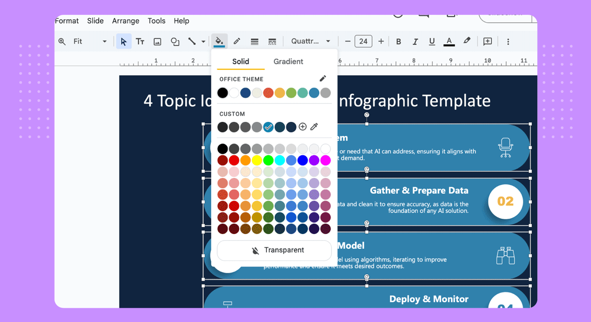
Although the slide looks great, there are still too many colors for a professional corporate look as, ideally, it’s best to stick to three colors top.

Let’s fix that by replacing the boxes’s color with the blue tone used in the last element. That way, all cards preserve cohesion. Select them all and go to the Paintbucket Tool at the Control Bar, then select one solid color. All elements will be updated.
And here’s the end-result for our infographic slide made with SlideModel Google Slides templates.

How to Make an Infographic on Google Slides Using Shapes
You can create an infographic in Google Slides from scratch by using shapes. While this process might take longer than other methods, it can give you more freedom to design your slides. You can start using a blank slide and optionally go to File -> Page Setup to adjust the page size.
While you can also use a white background, a colorful background with shapes can be quite helpful in making your text stand out. You can go to Background to change the default white background.
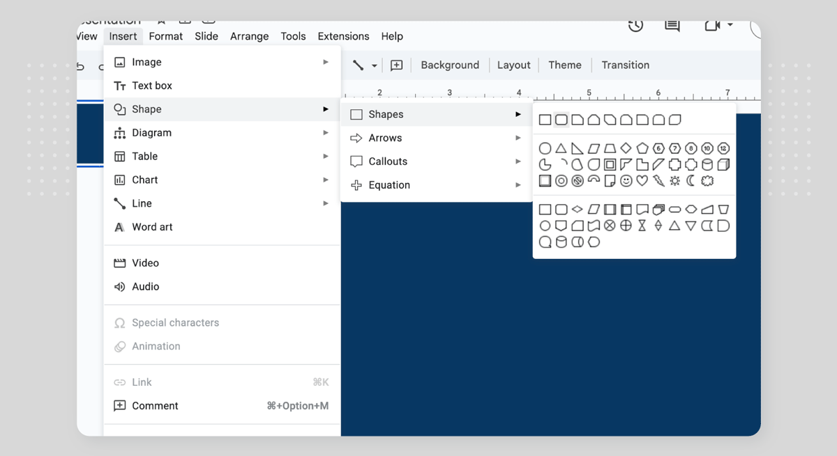
Any infographic design involves shapes, so we’ll replicate the example from above, making cards with rounded rectangles. Go to Insert > Shape > Shapes.
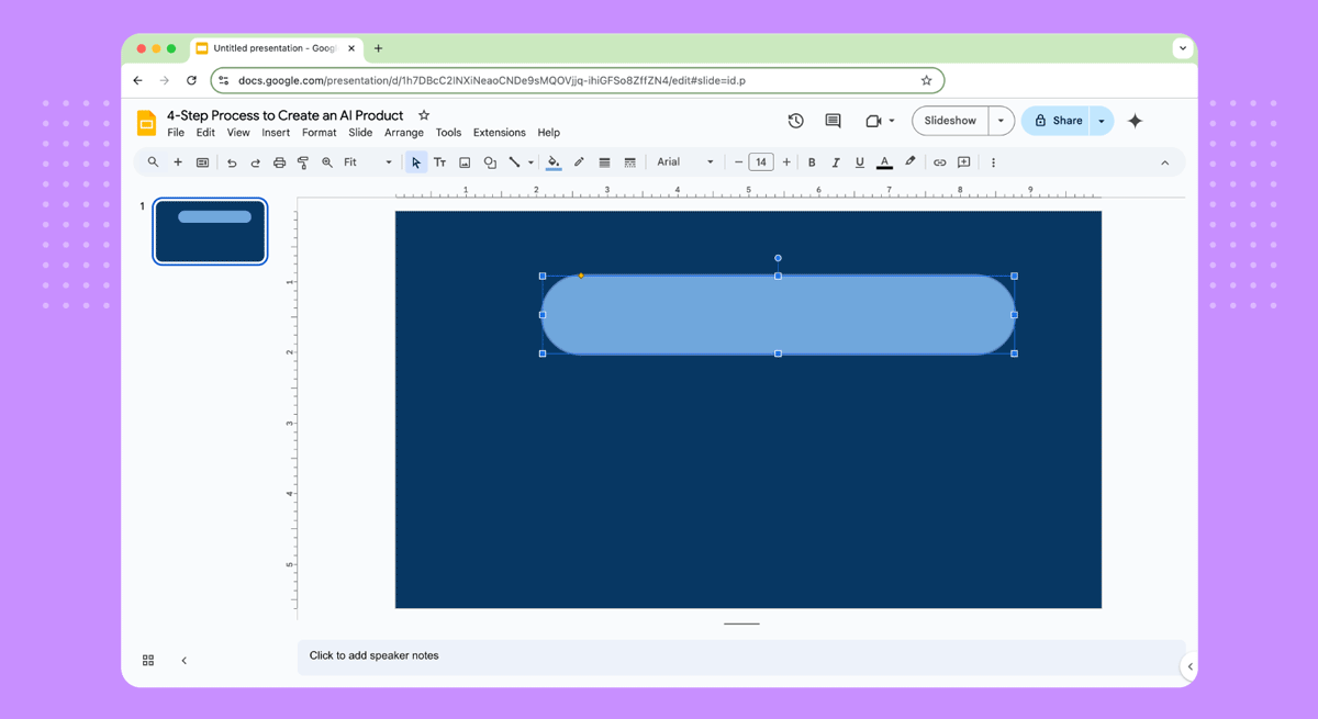
Draw the rounded rectangle so we get enough area to place written content inside it. The fill color can be changed by using the Fill or Paintbucket Tool.
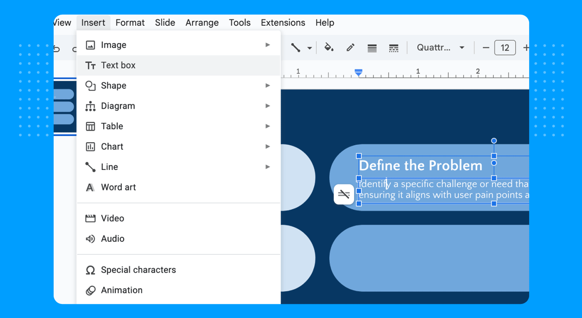
Insert a couple of text boxes to add written content to your infographic. You can manage this by going to Insert > Text Box.
Add circular shapes next to the cards to add the numbered list of elements close to the cards. Then, place text boxes to write the numbers inside of them. As with any text, keep in mind the contrast between background fill and text color.
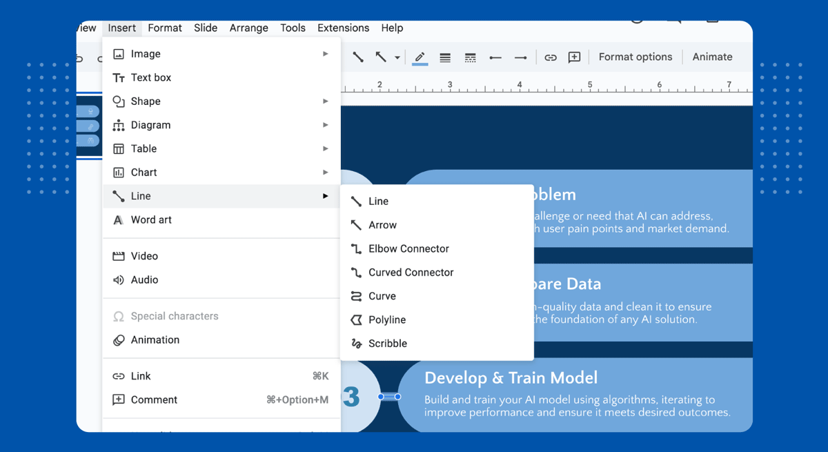
To avoid misplacing elements or mixing up concepts, we can add connectors to our cards, linking them to each one of the numbers. Go to Insert > Line > Line and create lines from the center point of the rounded rectangle section into the center point in the circle’s circumference.
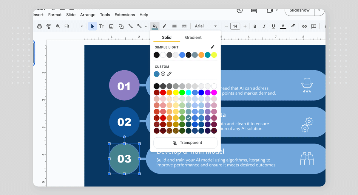
We can also customize the color of said connectors, or even change the color fill of the numbers to attract the audience’s interest.
And finally, our infographic slide looks as the image below.