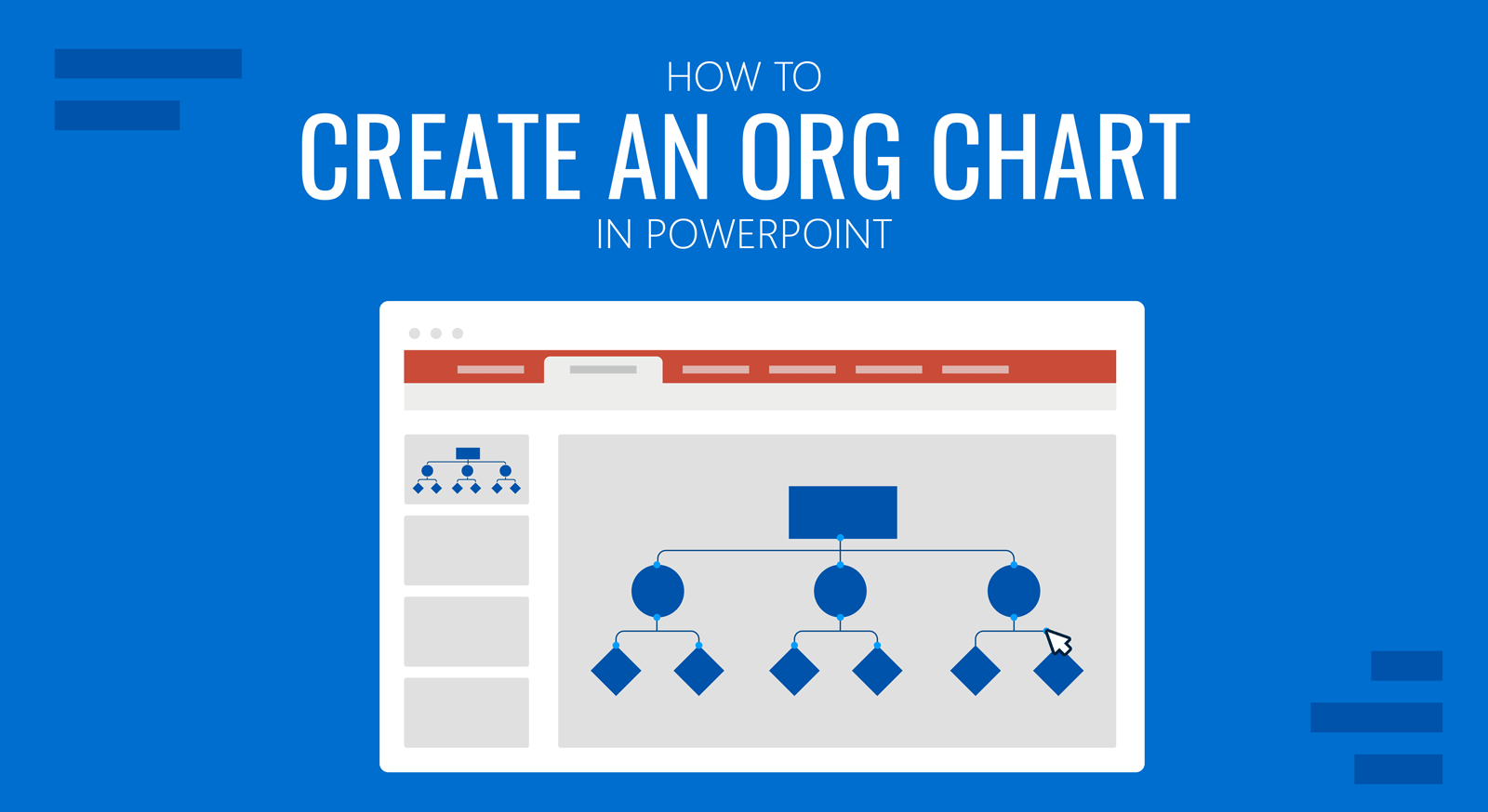
Creating an org chart in PowerPoint is more straightforward than many people might think, and you can do it using multiple methods. PowerPoint also provides built-in options to construct org charts quickly. If you are someone in need of making an org chart, let us show you the different methods by which you can build it in PowerPoint.
What is an Org Chart?
An organizational or org chart is a visual representation that shows the structure of an organization. Whether it’s a business or non-profit organization, an org chart can help visually illustrate the organization’s hierarchy.
Org charts clarify the chain of command, organizational structure, and the different functions of units within the organization.
Org charts are often represented in shapes or boxes, with each box or shape representing an individual in the organizational hierarchy.
Step by Step Guide: How to Create an Org Chart in PowerPoint
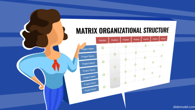
Whether you have a functional, horizontal, divisional, network, or matrix organizational structure, you can construct all these types of organizational chart illustrations using PowerPoint SmartArt. Using SmartArt diagrams is one of the easiest way to make an Org Chart in PowerPoint. Let’s see step by step how to prepare an organization chart in PowerPoint.
Step 1: Insert SmartArt with a Hierarchy Layout or Use a PowerPoint Template
To use SmartArt to create your org chart go to Insert -> SmartArt -> Hierarchy. The Hierarchy menu is one of the easiest ways to create org charts and comes with several chart types that you can conveniently use. Some presenters might also find other options, such as cycle and list chart types, helpful in making organizational charts. The chart types in the Hierarchy menu include a standard org chart, picture org chart, name, and title org chart, half-circle organization chart, horizontal organization chart, hierarchy lists, and charts, etc.
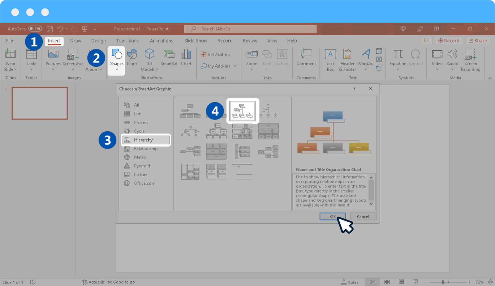
Step 2: Add Text to Placeholders
Once you have picked your desired chart type, add text to show your organization’s hierarchy. You can also add or remove sections to structure your chart.
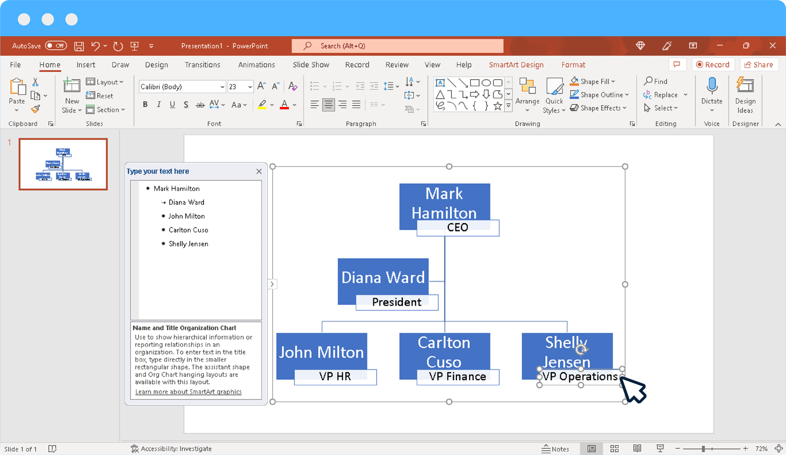
Step 3: Adjust Hierarchies in Proper Order
You can adjust hierarchies in the proper order using the given SmartArt menu. When adding individuals, you can also promote or demote names in the hierarchy.
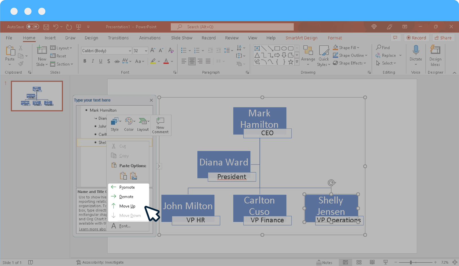
Step 4: Highlight Different Positions in the Org Chart
You can highlight different positions in the hierarchy using color codes and pictures. Differentiating the top tier from the bottom will help make the org chart easier to understand. Though this isn’t necessarily done in every organization, using color codes and/or pictures can help make the chart easier to grasp.
Some organizations might simply prefer using designations and not names to keep the chart consistent in the wake of employees frequently leaving the organization and vacant positions being occupied by external or internal hiring. This is particularly true for medium-size and large organizations.
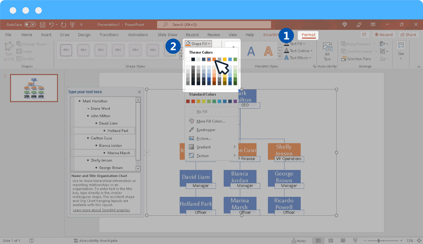
Step 5: Format Org Chart in PowerPoint
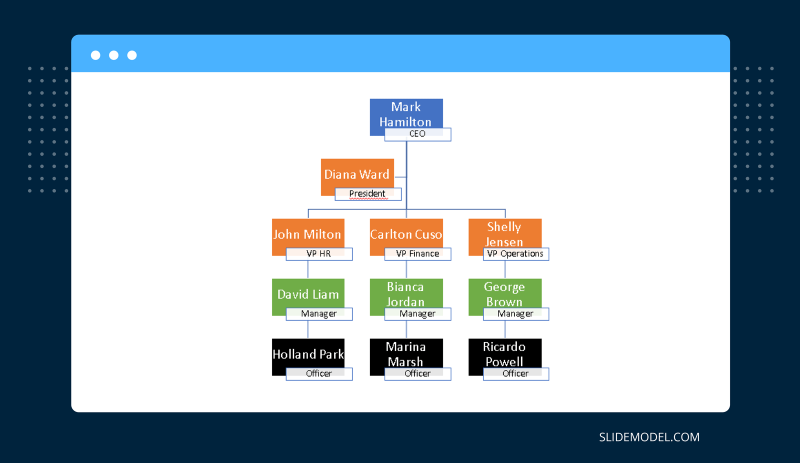
You can format your org chart using various Ribbon menu options such as via the SmartArt Design or Format tab. Below is an example of an org chart created using SmartArt in PowerPoint.
Method 2: Make an Org Chart in PowerPoint Using PowerPoint Shapes
Another simple method for making an org chart in PowerPoint is to use PowerPoint Shapes.
Step 1: Pick a Shape to Represent the Hierarchy
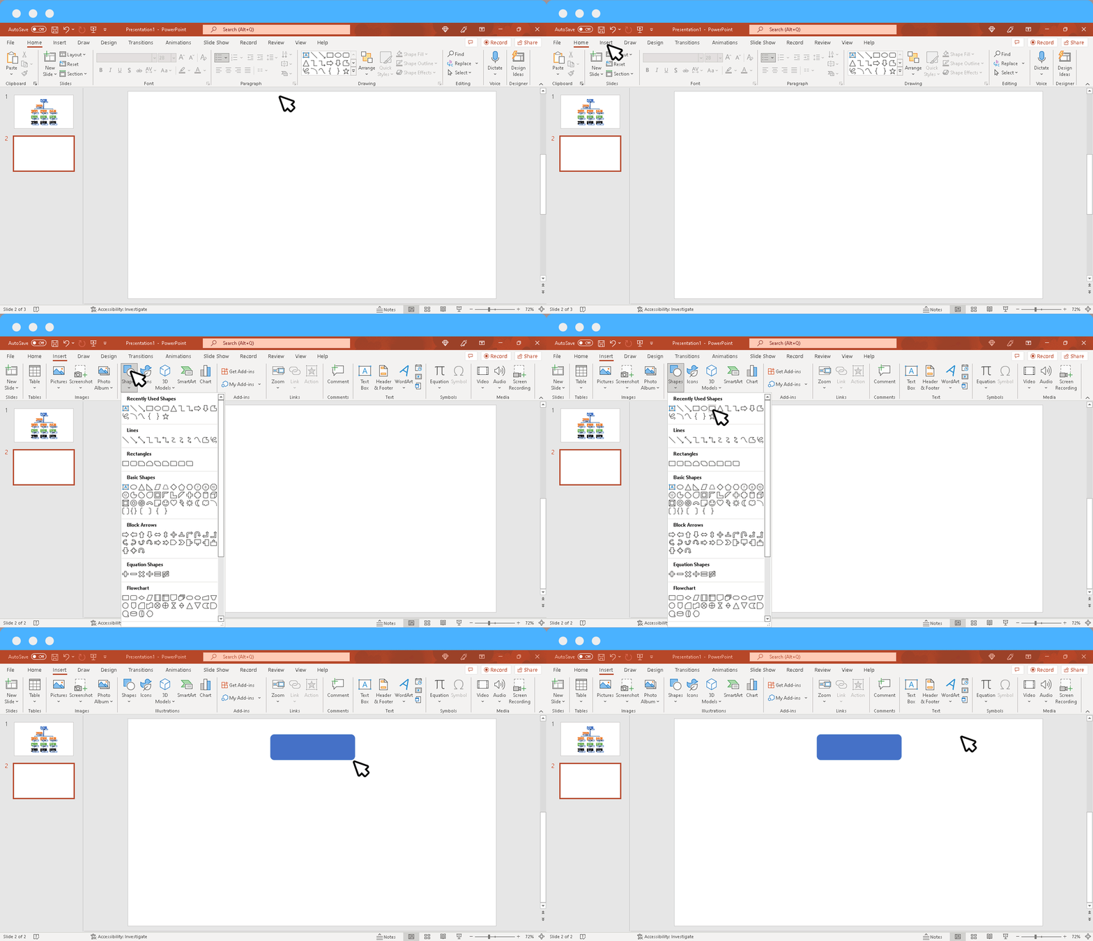
By using different types of shapes you can easily construct an organizational chart. Some org charts use a rectangle shape, whereas others might use an oval, circle, etc. To pick a shape, go to Insert -> Shapes and select your desired shape to add to the slide.
Step 2: Create a Hierarchy
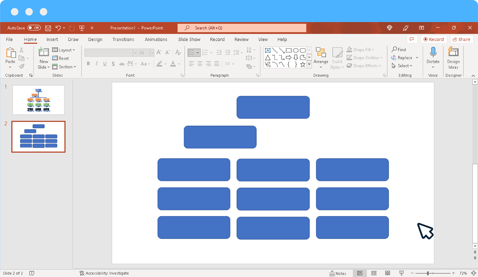
Using shapes in PowerPoint, you can create a hierarchy. You can drag and drop to place the shapes to promote, demote, or horizontally align shapes.
When using shapes to create a PowerPoint organizational chart, you can also copy to duplicate shapes. By copying a complete tier and duplicating it to create the next one, you can also save time. For example, if there are 3 line managers and 3 officers, you can copy the three shapes from the tier above and paste them below to quickly generate a uniform tier consisting of 3 individuals.
When using shapes, you might also want to keep in mind the size of each box. You can make the box for the head of the organization larger, keep a uniform size for all boxes or increase and reduce size according to rank.
Step 3: Use Connectors to Connect the Hierarchy
Once the names are placed in the hierarchy, use a connector to connect the chart. You can use a number of shapes such as Line or Arrow to connect your chart.

Step 4: Highlight Different Positions in the Organization
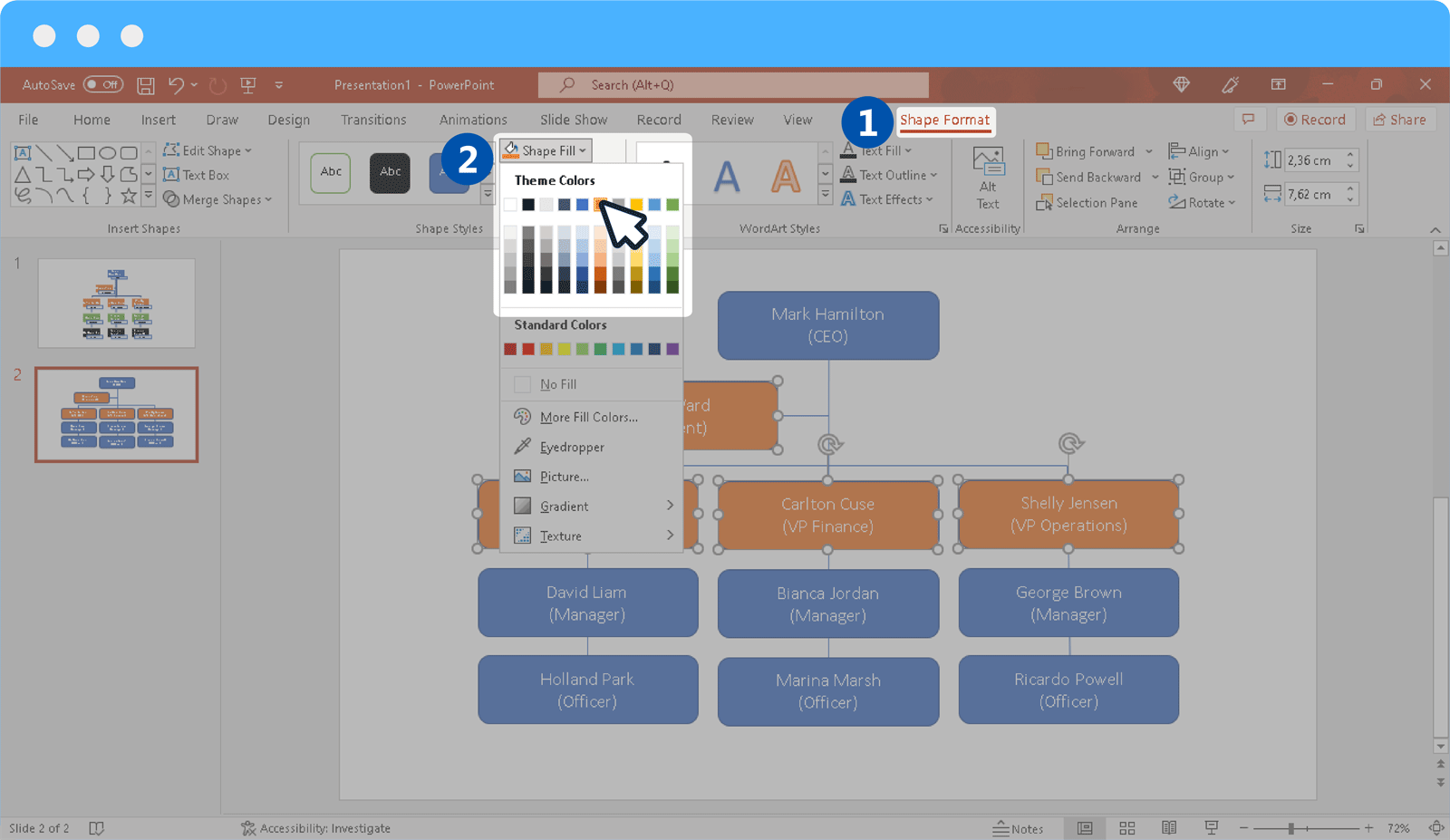
As mentioned earlier, you can color-code different positions in the org chart to represent different tiers of the hierarchy. If you’re using pictures, you can also insert an additional shape within each box to insert an image to give it a neat look.
Step 5: Format Org Chart in PowerPoint
By using Shape Format and other Ribbon menu options, you can format your chart in PowerPoint.
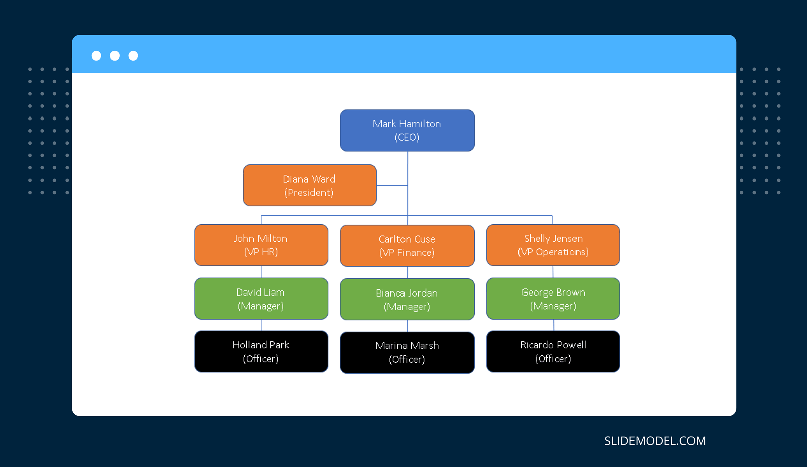
Method 3: Use Org Chart PowerPoint Templates
If you would like to quickly create org charts in PowerPoint without the need to use SmartArt or Shapes, you can make use of PowerPoint Org Chart Templates. Using a readymade template can help you save time and cater to your design needs. SlideModel provides a number of org chart templates that have been professionally designed to help presenters quickly create any kind of org chart by editing readymade layouts
The org chart PowerPoint templates provided by SlideModel allow adding names, designations, pictures, logos, and other key elements of the org chart using attractive graphical layouts where you can add as much or as little information as you require for making your organizational chart in PowerPoint. Using avatar-based PowerPoint templates, you can also use male, female, or gender-neutral characters to create your charts.

Things to Consider When Making an Org Chart
An org chart should accurately represent the hierarchy of the organization and provide an easy-to-understand layout. Below are a few guidelines to help you create an org chart that not only appears standardized but can also be helpful for anyone looking to understand the chain of command.
Accurate Representation of Your Organizational Structure
Your organizational structure plays a key role in constructing an org chart. Making such a chart does not simply imply showing people in the organization across different tiers but also ensuring that the organization’s structure, be it functional, horizontal, matrix, network, or divisional, is accurately represented. Someone looking at the chart should easily determine the segregation of names according to the way your organization is structured.
Differentiating Hierarchical Levels
Differentiating the way the top management is separated from the people located at the middle and the bottom of the organization is essential to creating an org chart. This is because such a differentiation helps identify the authority, roles, responsibilities, etc.
Easy Identification of Line Managers and Subordinates
One of the most convenient aspects of an org chart is its ability to differentiate the chain of command. For employees working in a large organization, in particular, an org chart helps find clarity regarding their reporting line and responsibilities. Furthermore, it helps them better understand the way the organization functions and the way it is structured.
Ease of Reading the Chart
Organizational charts can be quite complex, especially if there are several dozens or hundreds of positions listed in the chart. How you construct a chart will also depend upon the type of information being represented. For example, you can make a chart with designations only, with names and designations, as well as names, designations, and pictures.
A chart with names and pictures along with designations can be easy to help identify the workforce. However, it can be hard to periodically update the chart if the organization consists of many employees. This is because old employees are likely to leave, and new members would join the organization to fill the vacant positions, making it hard to update the chart frequently. This is why a lot of organizations use designations for their org charts.
Other than pictures, you can make your chart easier to grasp by color-coding or highlighting key positions by making the boxes bigger, followed by smaller boxes for each tier.
Final Words
An org chart is a visual representation of how an organization is structured, how it functions, and to help identify the chain of command. Anyone looking at the chart should be able to quickly identify or at least get an overview of the level of authority, roles, responsibilities, and function of each individual represented on the chart.
To create a neat-looking organizational chart, it is essential to not overdo the design. You can use our Free Org Chart Template to take the hassle out of creating an org chart that is accurate and easy to understand. Furthermore, this can also help you tackle complex design requirements by simply filling out the placeholders to create a chart according to your requirements.
