A spider diagram, which is also known as a radar chart, is a visualization tool for displaying multivariate data. Some common uses of a radar chart are in business reports, performance evaluations, competitor analysis, and strategic planning. In this tutorial we will provide a step-by-step guide on how to make a presentation with a spider diagram in PowerPoint, along with customization tips, real-life applications, and best practices for effective visualization.
Why Use a Spider Diagram in PowerPoint?
A spider chart PowerPoint design is beneficial for comparing, visualizing, and assessing performance metrics. Some of the benefits of such a chart include the following:
Comparing Multiple Data Points
A spider diagram in PowerPoint allows for comparing multiple variables within the same visual framework. This is particularly useful for market analysis, where companies can compare product features, customer satisfaction scores, or regional sales performance metrics on a single radar chart.
Visualizing Strengths and Weaknesses for Different Categories
Businesses often use spider charts to evaluate performance in various domains. For example, a company assessing employee skill levels across different competencies, such as leadership, technical expertise, teamwork, and creativity, can quickly identify areas for improvement and excellence.
Assessing Performance Metrics for Business and Project Analysis
Organizations can utilize radar charts to analyze project progress by tracking key performance indicators (KPIs) such as budget adherence, time efficiency, quality control, and stakeholder engagement. This allows project managers to make informed decisions by identifying strengths and potential risks in ongoing projects.
Visually Tracking Progress for a Period of Time
Spider diagrams are handy for displaying trends over a time period. For instance, a fitness trainer could use a radar chart to track an athlete’s progress in endurance, speed, flexibility, and strength over a six-month training period, making it easier to visualize improvements and weaknesses.
Enhancing Reports and PowerPoint Presentations
Spider diagrams simplify complex datasets by making complex data more understandable. Instead of presenting tables filled with numerical values, organizations can use them to visually demonstrate patterns, correlations, and outliers, making it easier for stakeholders to interpret findings and make strategic decisions.
How to Create a Spider Diagram in PowerPoint
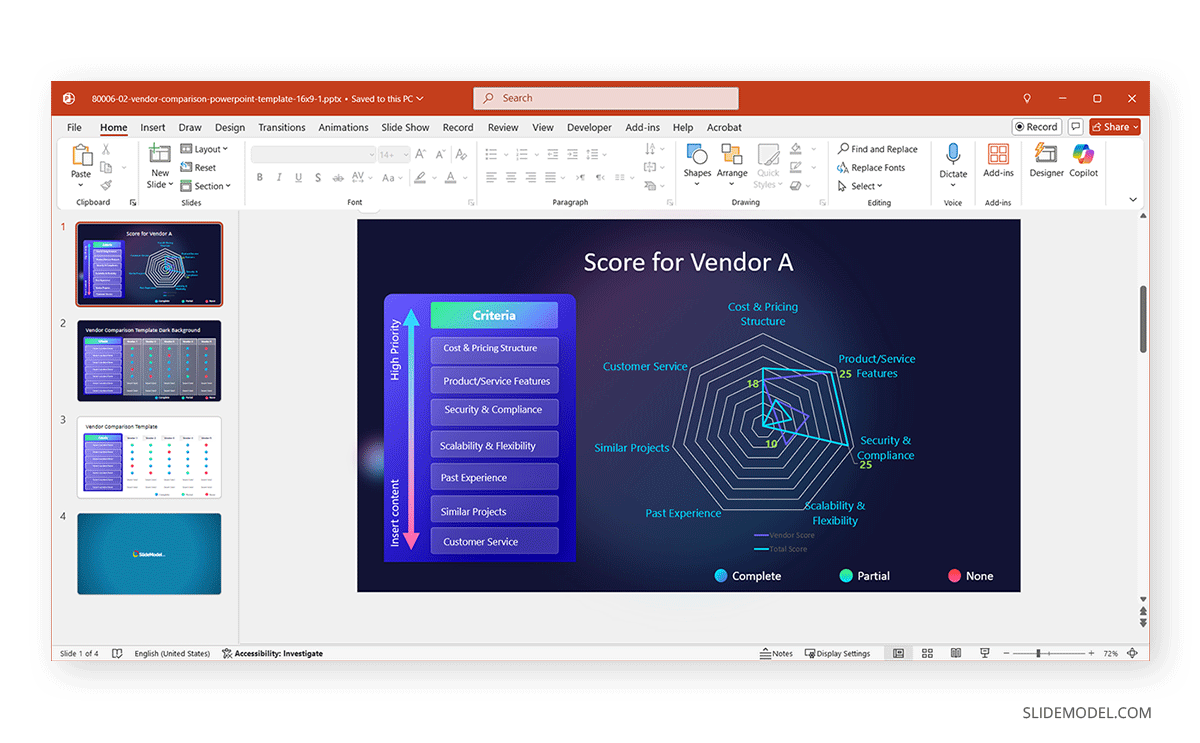
Making a radar chart in PowerPoint is easy and requires a few basic considerations for accurate and effective data visualization. In the example below, we will demonstrate the process for making a vendor scoring radar chart using the Vendor Comparison Table PowerPoint Template, one of the various chart PowerPoint templates at SlideModel with editable chart layouts.
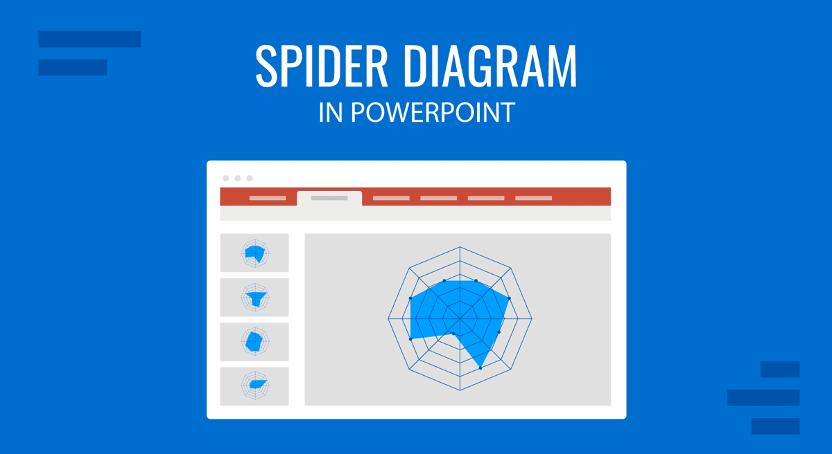
Step 1: Insert a Radar Chart: Open PowerPoint and go to the slide where you want to add the spider diagram; click on Insert -> Chart, and select Radar from the list of chart types. From these charts, choose between a Basic Radar Chart, a Radar Chart with Markers, or a Filled Radar Chart.
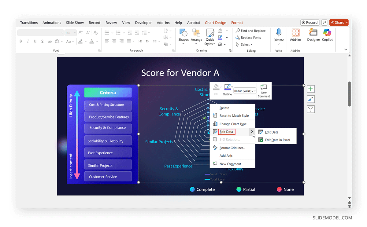
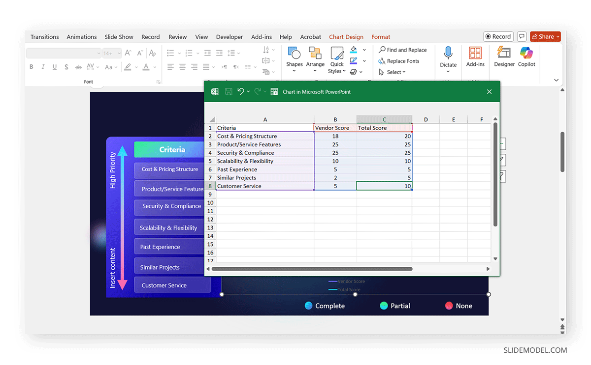
Step 2: Enter Data in the Chart: Once you create a chart, a data spreadsheet will open. Replace the default data with your specific values. Use different rows for each category and columns for data points. Close the spreadsheet once the data is entered.
Step 3: Customize the Spider Chart: Click on the chart to open the Chart Design tab. Use Chart Styles to change the color scheme and adjust axis labels and legends under Chart Elements. Format the data points using the Format Data Series option.
The image below shows a PowerPoint radar chart depicting a vendor score based on hiring criteria.
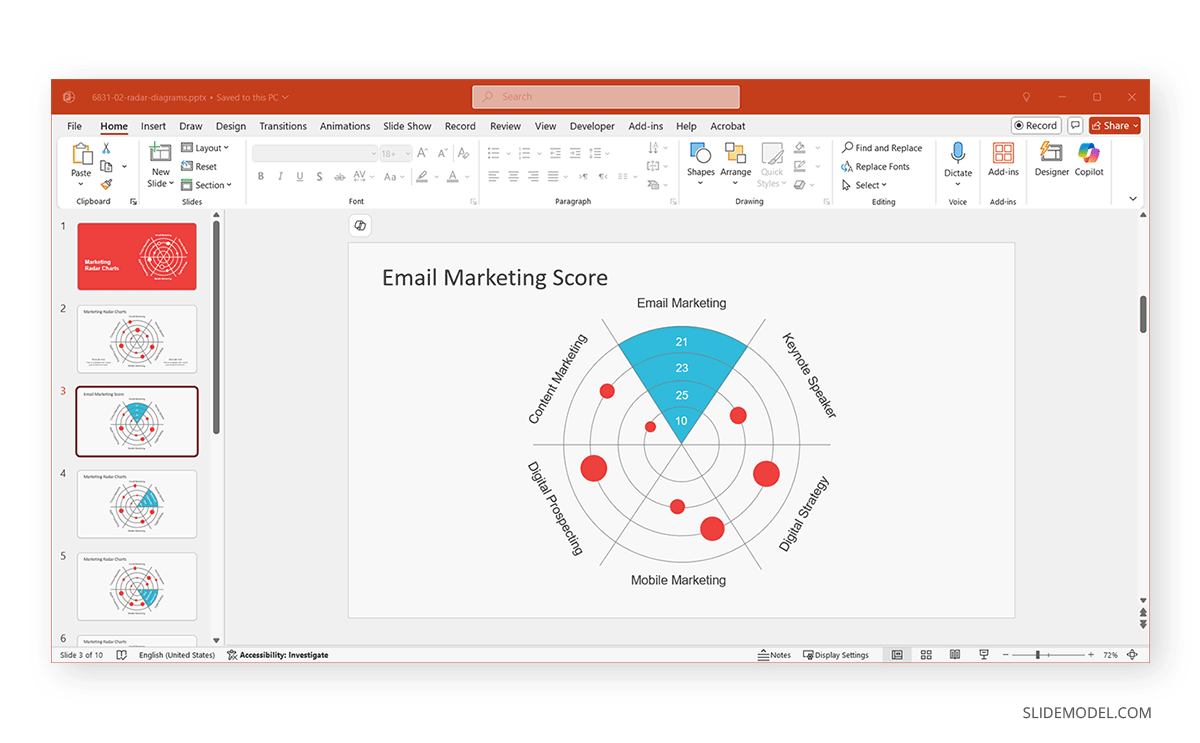
Manually Drawing a Spider Diagram in PowerPoint
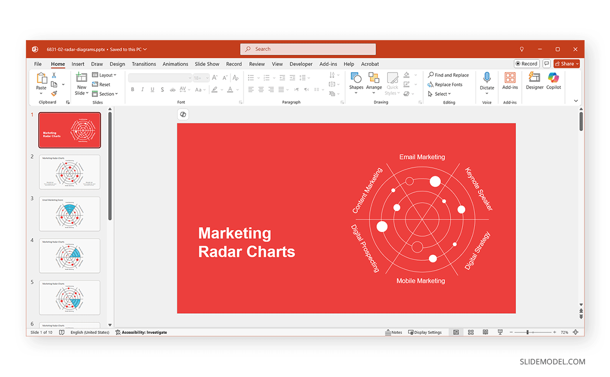
If you need a custom spider diagram, you can manually draw one using PowerPoint Shapes. The below-mentioned process is demonstrated with the help of the Marketing Radar Charts for PowerPoint, which is among the Spider Chart PowerPoint Templates that you can use to quickly create these types of charts.
Step 1: Go to Insert -> Shapes and select a Polygon shape. Draw a symmetrical shape with equal angles.
Step 2: Use Lines via Shapes to connect the center to each outer point.
Step 3: Label each axis accordingly. When designing a spider chart PPT manually or using a readymade template design, you should consider how to start a presentation and end a presentation. This might include considering dividing slides into different charts and emphasizing different chunks of data individually.
Real-Life Applications of Spider Diagrams
Spider charts can be used to represent important information in many ways visually. Below are a few real-life examples.
Employee Performance Evaluation
Spider charts are commonly used in HR and talent management to evaluate employee skills in different categories, such as teamwork, leadership, technical skills, and creativity. During performance evaluations, managers can visually compare an employee’s strengths and weaknesses, making it easier to tailor professional development plans.
Market Research & Competitor Analysis
Businesses use spider charts in PowerPoint to compare competitors based on pricing, product quality, customer service, and innovation. These visual comparisons provided a clear snapshot of competitive advantages and helped consumers make informed purchasing decisions. In such a case, radar charts can be quite helpful for demonstrating this type of data, particularly for internal analysis by a company.
Project Management Dashboards
Project managers use spider charts to track KPIs like efficiency, risk assessment, cost-effectiveness, and deadline adherence. NASA’s report titled Space Research Project Management Can Benefit from Engineering Technology Selection Methods, mentions radar charts as a method to display criteria in technology selection processes. It highlights the utility of radar charts for visually representing multiple performance metrics, aiding in comparing and selecting technologies.
Sports Performance Analysis
Athletes and coaches use spider charts to analyze strengths and weaknesses across different fitness attributes, such as speed, endurance, flexibility, and agility. During the 2018 FIFA World Cup, sports analysts and data scientists used radar charts to track player performances across key metrics. These visual tools allowed for an in-depth comparison of passing accuracy, sprint speed, defensive contributions, and goal-scoring efficiency. By mapping out strengths and weaknesses in an easy-to-interpret format, radar charts became essential for strategy development and player evaluation.
Best Practices for Creating a Spider Diagram in PowerPoint
A well-designed spider diagram (or radar chart) ensures clarity, effectiveness, and engagement in your presentation. Here are some best practices to follow:
1. Limit the Number of Variables for Readability
While radar charts can compare multiple data points across different categories, adding too many variables can make the chart cluttered and difficult to interpret. The number of variables should be between 5 and 7 to maintain readability and visual clarity.
Example: A marketing performance analysis comparing search engine optimization (SEO), pay-per-click (PPC), social media, email campaigns, and customer engagement might be ideal, but adding too many subcategories might overwhelm the audience.
2. Use Contrasting Colors for Different Data Series
When comparing multiple data sets in a spider diagram, using distinct colors is essential for differentiation. You can opt for high-contrast colors for different datasets to enhance visibility, especially for presentations viewed on projectors or screens.
Example: If you are comparing three different sales teams, you can use different colors, such as blue for Team A, green for Team B, and red for Team C, instead of shades that are too similar.
3. Label Each Axis Clearly to Avoid Confusion
Without proper labels, a spider chart can become difficult to interpret. Each axis represents a unique variable; clear labeling helps viewers understand the data points. Ensure that each axis is clearly labeled and positioned so it does not overlap with other elements.
Example: When analyzing customer satisfaction across different service aspects (e.g., pricing, product quality, customer support, and reliability), each axis should be boldly labeled with short, precise descriptions for clarity.
4. Avoid Excessive Gridlines to Prevent Clutter
While gridlines help gauge metrics, too many can make the chart look busy and hard to read. Use light, subtle gridlines or dashed lines to provide reference points without overpowering the data visualization.
Example: Instead of using thick, dark gridlines, opt for thin, gray lines to subtly guide the audience’s eyes toward the data without distraction.
5. Highlight Key Takeaways with Callouts or Annotations
A spider diagram should present data and tell a story. Adding annotations helps guide the audience toward key insights. Use callouts, arrows, or text boxes to emphasize essential findings.
Example: If a competitor analysis shows that one company excels in innovation but falls behind in customer service, you can add an annotation pointing to the lower score and suggesting areas for improvement.
Final Words
A spider chart is a powerful tool for data visualization, helping presenters compare multiple data sets effectively. In professional settings, you can create compelling slides that improve decision-making and storytelling by using built-in radar charts, drawing a custom diagram, or using spider diagram PowerPoint templates or Google Slides templates.
You can create engaging and professional spider charts in PowerPoint that effectively communicate data insights. Furthermore, by clearly labeling data and using professionally designed layouts, you can create engaging presentations presenting radar charts in clean, easy-to-understand slides.