Slide 16 of 22 from Free Professional Thesis PowerPoint Templates
Free Professional Thesis Results Template
Results Pie Chart for Thesis Presentation
- Chart
- Pie Chart
- Evaluation Slide
- 16:9
- 100% Editable
The Results Pie Chart slide from the Free Professional Thesis PowerPoint Templates offers a clear visual tool for presenting survey results and statistical data. This slide layout includes editable shapes and color-coded segments, making it suitable for academic and business presentations that require precise data visualization within a professional slide deck.
What’s on This Slide
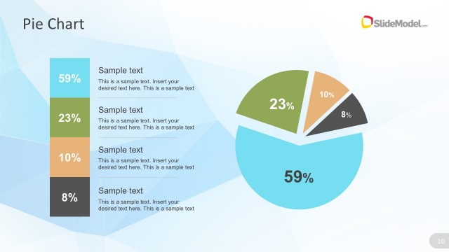
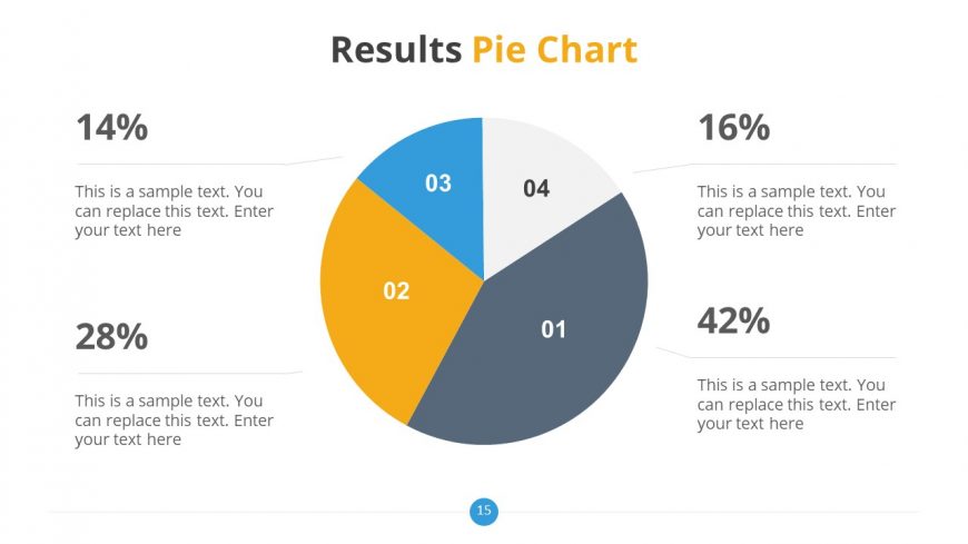
The slide features a pie chart centered in the middle, divided into four segments representing different percentages: 14%, 16%, 28%, and 42%. Each segment is labeled with a number from 01 to 04, with the first segment in orange, the second in blue, the third in gray, and the fourth in white. Text placeholders are positioned to the left and right of the pie chart, aligned horizontally, allowing for descriptive text related to each segment. The overall layout is balanced, with a title at the top and a footer at the bottom.
How to Use It
This layout serves as a visual representation of data distribution, ideal for presenting survey results or statistical findings. It fits well in a presentation sequence after introducing a problem or hypothesis, providing a clear visual summary of results. This slide is useful in academic or business contexts where data visualization is essential for understanding trends or comparisons among categories.
Text Placeholders & Capacity
Keep your copy within these limits so it fits without resizing. Node labels can hold about 2 characters each, while body slots can accommodate roughly 50 characters.
| Placeholder | Count | Max characters (approx.) |
|---|---|---|
| Slide title | 1 | 30 |
| Item heading | 4 | 2 |
| Item body | 4 | 50 |
Slide Keywords
Download unlimited PowerPoint templates, charts and graphics for your presentations with our annual plan.
DOWNLOAD