Slide 14 of 32 from #2 Editable Data Driven Maps Bundle
Eurpoe Continent Map Editbale PowerPoint
Continents Map Demographic Timeline Slide
- Map
- Country Map
- Context Slide
- 16:9
- 100% Editable
The Continents Map (Demographic) Timeline slide from the #2 Editable Data Driven Maps Bundle offers a clear layout for demographic analysis using editable slides. It features a detailed population map and visual data elements ideal for geographic presentations and business presentation contexts, supporting effective communication of population statistics and trends.
What’s on This Slide
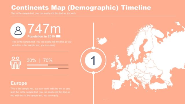
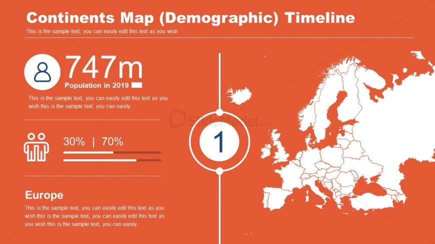
The slide features a demographic map of Europe on the right side, with a vibrant orange background. A large circular node on the left displays '747m' with a person icon, indicating the population in 2019. Below this, a horizontal bar graph shows two segments labeled '30%' and '70%', representing demographic proportions. The number '1' is centered within a circle, serving as a visual marker. Text placeholders are present for titles and descriptions, aligned to the left and bottom, respectively, providing a structured layout for information.
How to Use It
This layout serves as a demographic timeline, effectively presenting population data and statistics for a specific continent. It fits within a presentation that discusses geographic or demographic trends, particularly in a business or analytical context. Ideal for showcasing population changes over time, this slide can be used in reports, presentations, or discussions focused on demographic analysis, regional studies, or market research.
Text Placeholders & Capacity
Keep your copy within these limits so it fits without resizing. Body slots can accommodate around 20-25 words each.
| Placeholder | Count | Max characters (approx.) |
|---|---|---|
| Slide title | 1 | 30 |
| Body paragraph | 3 | 150 |
| Item heading | 1 | 5 |
| Item body | 1 | 50 |
Slide Keywords
Download unlimited PowerPoint templates, charts and graphics for your presentations with our annual plan.
DOWNLOADReturn to #2 Editable Data Driven Maps Bundle.