
First impression is the last impression, and rightly so. In almost every facade of life, and especially in professional areas. When it comes to making a first good impression, you must take out some time to perfect your look by choosing smart appearance that will flatter your professional look with the perfect color scheme according to the audience. Similarly, when you need to give a presentation, it needs to be created perfectly with fascinating color schemes. The choice of colors for a presentation, is one of the important factors that must be considered as you initiate the process. An effective creation of a presentation deck can help in building a direct relationship between the presenter and the audience.
People are judged by their physical appearance, similarly, your message will be judged on the basis of its design elements, color combinations, and font styles used even before it is read by the audience. Therefore, it is important to create an interactive and vibrant presentation with the best selection of a PowerPoint color scheme based on the topic you’re presenting to your audience. This way, you can find colors that would look good in a slide presentation.
So let’s get down to study some color theory basics for a PowerPoint presentation.
Basic Colors Theory

The Color Wheel was the first model used to demonstrate the relationship between different colors. In which, red, blue, and yellow are the basic and are called as primary colors. After the primary colors, secondary colors are formed with the combinations of the primary colors and they are violet, orange, and green.
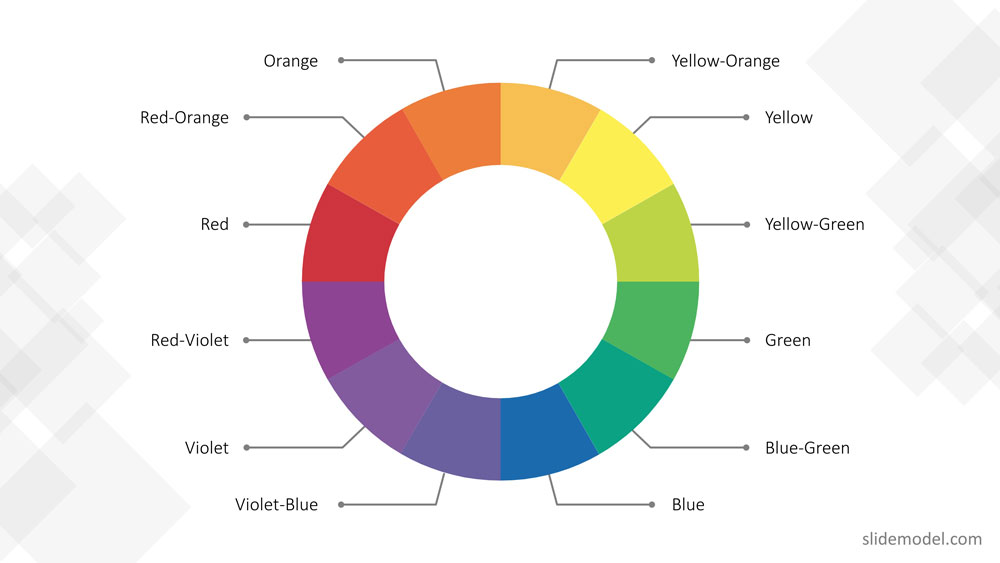
In the end, with the combination of primary colors and secondary colors tertiary colors are formed, which results in these colors, red-violet, blue-green, red-orange, blue-violet, yellow-orange, and yellow-green.
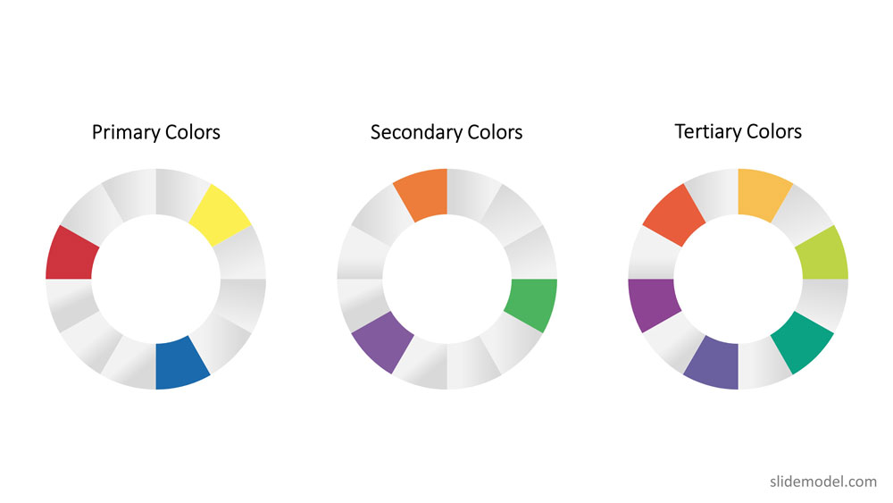
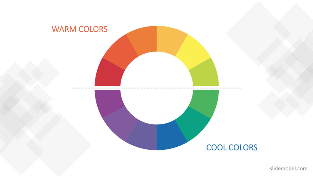
Hence, the color wheel or color circle is composed of 12 colors including, red, green, orange, yellow, violet, blue, red-violet, blue-green, red-orange, blue-violet, yellow-orange, and yellow-green.
This color circle is divided into warm and cool colors indicating vividness, energy and calm, soothing respectively. There are three other terms related to color theory those are tint, shade, and tone.
- In tinting, a color is made lighter by adding white.
- In shading, black is added to get the darker version of the color.
- And intoning, gray is added to get a different tone.
How to Choose the Right Color Scheme for your Presentation
Using the basic color theory described before you can apply the following rules of thumb:
Color Schemes – The use of harmonious color
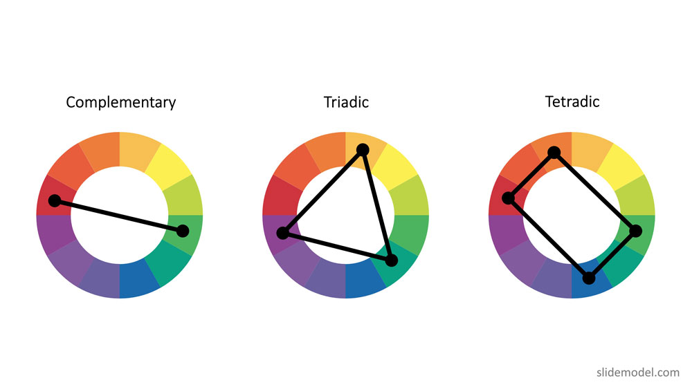
To create a professional color scheme, pick two colors opposite each other on the color wheel (these are called complementary colors), three colors equally spaced around the color wheel forming a triangle (these are called triadic colors) , or four colors forming a rectangle (these are called tetradic colors). Complementary colors are ideal for high contrast. Triadic colors generates a more balanced contrast, used for example for title and subtitles in the same canvas. Finally, tetradic colors allow to have a theme with two vectors of complementary colors. After the basic color scheme is formed, you can tint , shade or intone those colors to expand your palette.
Though Color Theory covered almost everything related to the color scheme, there are few other things you need to keep in mind while choosing a color scheme for presentations.
Since, poor color choice in presentations results in ugly visuals, which put a bad impression on the audience resulting in bad feedback from them.
Some handy tips to keep in mind to choose a good presentation color palette:
Follow high-contrast color scheme
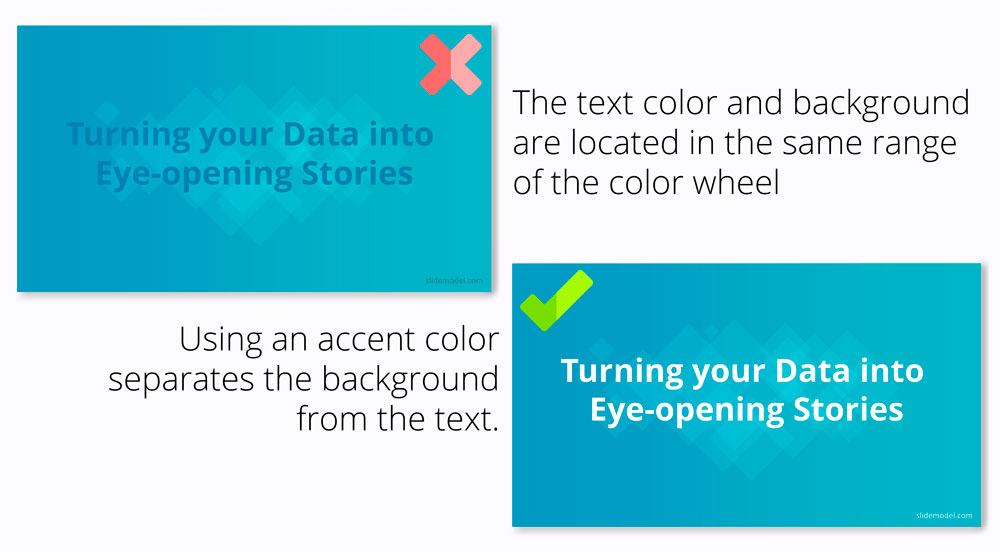
The common mistake found in presentations is color contrast. The presentation slides don’t have enough contrast between the colors chosen for the background and the text or graphics. For professionals, it is very important to create a PowerPoint presentation in high contrast with the background color to attract the audience.
If you have chosen dark background then choose light text and graphics or vice-versa to blend the content with the background and not to make it float above the background. The more contrast you will have and the easier it will be for your audiences to see the text or graphic you are using.
For example, you can take the following slide. The PowerPoint theme uses monochromatic colors (black, grey, white) using high contrast between black, grey and white to differentiate text from the background, and producing a clear contrast on slides. It adds two highlighting colors green and fuchsia in order generate contrast and help focusing the audience view in other sectors.

Follow simplicity
Don’t make it gaudy! When it comes to professionalism, simple yet attractive color combinations are the most preferred and recommended. Try to keep the design as simple as possible with a perfect blend of colors and graphics. It is recommended that three to four colors are sufficient for a presentation.
Follow the 60-30-10 rule
The 60-30-10 rule is an interior design color scheme best practice, which adaptation to graphic design has become very popular. It states that the appropriate color proportion of a space (in this case the presentation canvas) should comply with the 60%, 30%, 10% distribution, in order to be considered balanced. The main color (60% distribution) should cover background, the secondary color (30% distribution) will be used for shapes fill or images filter, finally the 10% is allocated as the accent color, used in outlines and text.
In recent studies, it is found that 90% of the decisions are made on the basis of color schemes. In another study regarding branding, states that there is a great relationship between brand and the color being used to represent it. The audience gets attracted only if the color “perfectly fits” to what is being sold.
When you choose a perfect color scheme for a presentation, it comes out to be the most effective. While other color combinations make your presentations difficult to watch and understand.
Here are some mistakes you should avoid while choosing the color combination for a PowerPoint presentation.
Mistakes to Avoid While Combining Colors in PowerPoint
Here are three common mistakes that you must avoid while choosing colors for your PowerPoint presentation:
Illegibility
It becomes difficult to see slides due to color choice. A presentation with a bad or wrong combination of colors could be illegible under specific lighting conditions or monitors. The simplest color combinations that make presentations readable are dark text with a light background and vice-versa.
Unclear graphics
In graphics or charts, use colors to distinguish associations or data points or relationships between entities. You can use a single color to represent similar data groups to distinguish from others. This is the best way to make things clear and understandable to viewers.
On the other hand, different colors confuse viewers and make it difficult to understand the things shown in slides.
Too much of everything is bad
Whether it is too much of text or images, it isn’t good for your presentation. Slides with a summarized form of data allow viewers to concentrate more on the presenter, who is explaining the topic than the presentation slides.
Text, images, and graphics strengthen your presentation so make sure the text color contrasts as much as possible with a majority of the picture colors and background as well. These tips work well to choose a proper color palette for PowerPoint, but also for presentations in Google Slides.
FAQs
Why is choosing the right color scheme important for a PowerPoint presentation?
The color scheme impacts the audience’s perception, readability, and engagement. A good color scheme enhances the presentation’s professionalism and ensures the message is delivered effectively.
What is the color wheel, and how does it help in choosing a color scheme?
The color wheel is a visual representation of colors, including primary (red, blue, yellow), secondary (green, orange, violet), and tertiary colors. It helps identify complementary, triadic, and tetradic color combinations for balanced and visually appealing schemes.
What are warm and cool colors, and how do they influence presentations?
– Warm Colors: Red, orange, yellow – evoke energy and excitement.
– Cool Colors: Blue, green, violet – create a calm and soothing effect.
Using warm or cool colors can influence the emotional response of the audience and set the tone of the presentation.
How do high-contrast color schemes improve a presentation?
High-contrast color schemes make text and graphics stand out against the background, ensuring readability and preventing audience strain. For example, light text on a dark background or vice versa works well.
How can simplicity enhance the effectiveness of a presentation?
Keeping the color scheme simple (using 3-4 colors) ensures clarity, prevents visual clutter, and maintains a professional appearance. Overcomplicated designs can distract the audience.
How can I create a harmonious color scheme for my presentation?
Use the following techniques:
– Complementary Colors: Colors opposite each other on the color wheel for contrast.
– Triadic Colors: Three colors evenly spaced on the wheel for balance.
– Tetradic Colors: Two complementary pairs for a vibrant palette.
How can I avoid unclear graphics in my presentation?
Use consistent colors to represent similar data groups and ensure distinct colors are used for contrasting elements. Avoid overloading charts or diagrams with too many colors.
Color Palette Ideas to Take Inspiration From
Sure you can create your own color combinations with all these tips that we’ve lined out. But it will make your life more easy if you take inspiration from pre-combined palette and presentation templates.
1. Modern Gradient Backgrounds for PowerPoint

Gradient backgrounds can act as a fuel for your presentations. These are powerful templates that you can choose. This very template presents an elegant and artistic slide deck. Gradient backgrounds are basically a gradual blend of two or more colors which progress and merge from one to another. They are also known as fountain fills or blends.
2. Presentation Template for Business Deck

A business presentation must flow well and look clean. With this particular template you can craft professional business decks. It can help you compile all the necessary information in a professional manner.