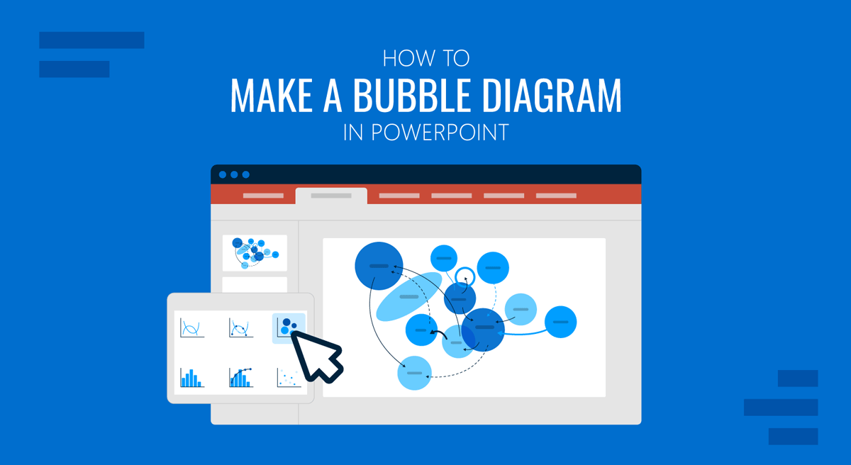
Bubble diagrams are often used in presentations to simplify ideas, organize concepts, and explain relationships. A bubble diagram in PowerPoint uses circles or bubbles to depict connected ideas, categories, or processes in an easy-to-understand format. Whether you’re presenting a brainstorming session, planning workflow, explaining organizational relationships, or mapping concepts, bubble diagrams can help make your slides more engaging and structured. In this guide, we will explain what a bubble diagram is, how it differs from a bubble map and bubble chart, and how to add one to a PowerPoint presentation.
What is a Bubble Diagram
A bubble diagram is a visual layout that uses circles connected by lines or arranged in proximity to represent relationships among ideas, functions, or concepts. Each bubble typically contains a keyword, category, or concept.
Bubble diagrams are commonly used not only for brainstorming sessions and concept maps but also for organizational planning and educational presentations. Furthermore, bubble maps can be used in other types of presentations, such as design and architecture planning slide decks. Unlike traditional charts, bubble diagrams focus more on relationships and structure rather than numerical data. In PowerPoint presentations, both styles are usually created using circles, connectors, icons, and text.
Bubble Diagram vs Bubble Map vs Bubble Chart
The terms bubble diagram, bubble map, and bubble chart are often confused because they all use circles or bubbles. However, these visuals serve different purposes and are used in different presentation scenarios. Understanding the distinction can help you choose the right format for your PowerPoint slide deck.
Bubble Diagram
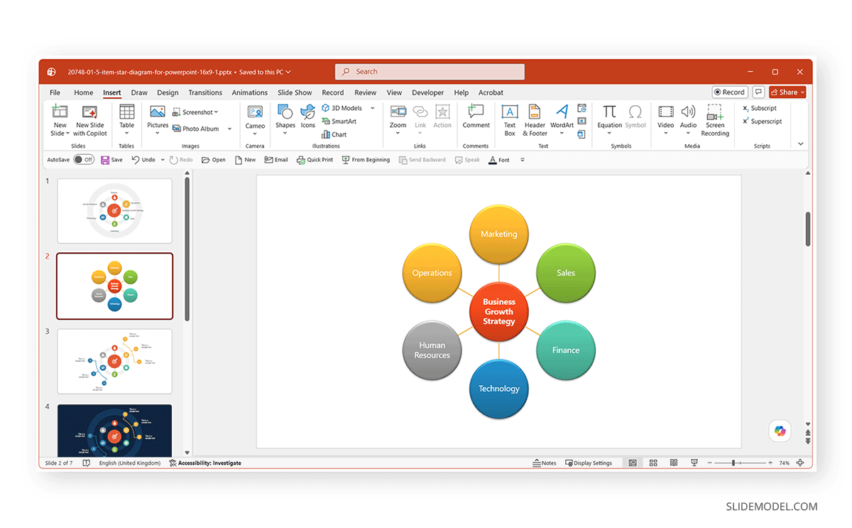
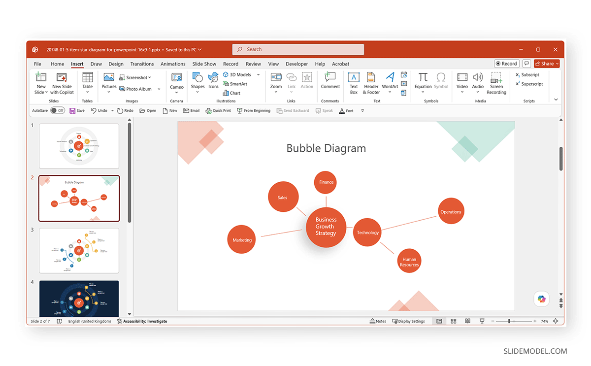
A bubble diagram is primarily used to show relationships between concepts, departments, functions, or ideas. It usually includes a central topic connected to surrounding bubbles that represent related elements. Bubble diagrams are commonly used in business strategy presentations, organizational planning, workflow visualization, and conceptual discussions. For example, a central bubble labeled Business Growth Strategy might connect to supporting bubbles such as Marketing, Sales, Finance, and Operations. The goal is to visually explain how different concepts relate to one another rather than display numerical data.
Bubble Map
A bubble map is often used for brainstorming or mind mapping. It typically starts with one main idea at the center, surrounded by bubbles representing thoughts, attributes, or supporting ideas related to that topic. Bubble maps are widely used in education, brainstorming sessions, creative planning, and idea generation. Unlike structured business diagrams, bubble maps tend to feel freer and more exploratory. They are useful when organizing thoughts before turning them into a formal process or structure.
Bubble Chart
A bubble chart is different from both a bubble diagram and a bubble map because it is a data visualization tool rather than a conceptual layout. Bubble charts are a variation of scatter plots that use bubble size to represent a third numerical variable in addition to the X- and Y-axis values. This makes bubble charts useful for comparing performance metrics, trends, or business data.
How to Make Bubble Diagrams in PowerPoint
Bubble diagrams work especially well in presentations because they simplify information. They help organize complex ideas, show relationships between concepts, improve audience engagement, and support storytelling. Since PowerPoint includes built-in shapes, SmartArt, and formatting tools, it is well-suited for creating customizable bubble diagrams.
Method 1: Create a Bubble Diagram Using Shapes
This is the most commonly used method. You can create such a diagram using circular shapes.
Step 1: Go to the presentation slide you want to add the diagram to and insert circles for the Bubbles by going to Insert -> Shapes -> Oval.
Step 2: Hold Shift while dragging to create a perfect circle. Repeat the process to create multiple bubbles.
Step 3: Click inside each circle and type your content, for example, Marketing, Operations, Design, Sales, Strategy, etc.
Step 4: Position the circles according to the relationships you want to show. Common layouts include the following:
- Central main idea with surrounding bubbles
- Linear process flow
- Clustered categories
Step 5: To connect the bubbles, go to Insert -> Shapes -> Lines. Use connectors or curved lines to show relationships between bubbles.
Step 6: Customize colors and styles using Shape Fill, Shape Outline, Shadow effects, and other options as needed.
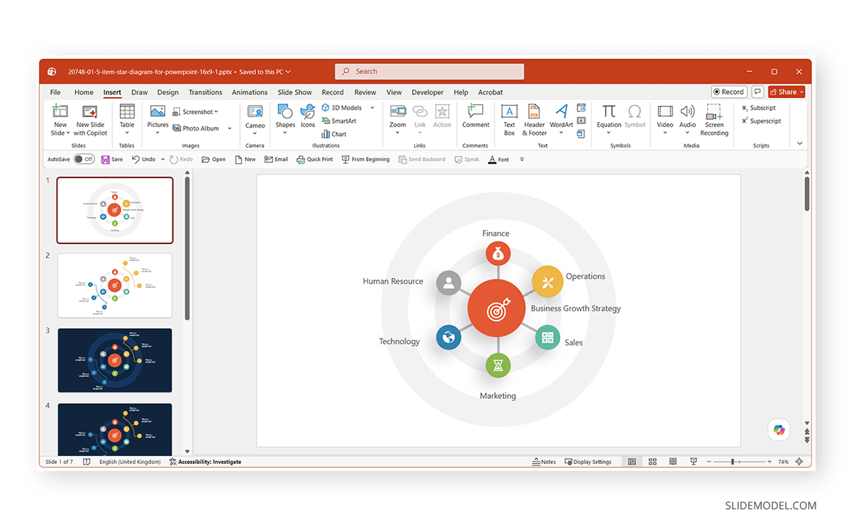
Note: If you don’t want to spend a lot of time designing slides, you can use a bubble diagram template. We converted the 6 Step Star Diagram Concept for PowerPoint into a bubble diagram presentation by editing the sample slide shown below.
Method 2: Create a Bubble Diagram with SmartArt
PowerPoint SmartArt provides a faster way to create structured, bubble-style diagrams. By using SmartArt, you can save time, ensure consistent alignment, and have spacing automatically adjusted.
Step 1: Go to the Insert tab to open SmartArt.
Step 2: Choose a circular Relationship diagram type, e.g., Basic Radial.
Step 3: Add your labels directly into the SmartArt placeholders.
Step 4: Customize the layout by using the SmartArt Design tab, changing colors, and SmartArt Styles.
Method 3: Create a Bubble Diagram Using PowerPoint Bubble Chart
PowerPoint also includes a built-in Bubble Chart option for creating data-driven bubble visuals. Unlike traditional bubble diagrams that focus on conceptual relationships, bubble charts are designed to compare numerical values using the size and position of bubbles. This method is useful for visualizing information such as market share, financial data, performance comparisons, risk analysis, or statistical relationships.
Step 1: Go to Insert -> Chart –> X Y (Scatter) -> Bubble. PowerPoint will open an Excel spreadsheet where you can enter your data.
Note: The bubble size visually represents the importance or magnitude of each data point, so ensure the data you enter aligns accordingly.
Step 2: Edit the Excel sheet to enter relevant data to generate an initial chart.
Step 3: Use the Chart Design and Format tabs to modify colors, bubble transparency, labels, and background. You can also remove unnecessary chart elements to create a cleaner visual appearance.
Step 4: To improve readability, add data labels. Additionally, consider increasing bubble transparency slightly and using contrasting colors. This helps viewers distinguish between different data points more easily.
Step 5: Go to Insert -> Shapes, then add shapes to convert the Bubble chart into a Bubble diagram by positioning additional bubbles to form a central idea and connecting them with lines. Use circles or additional shapes to create a central concept and connected supporting bubbles.
Step 6: Add text to the newly added shapes to guide your audience.
Step 7: Select the chart and go to Chart Filters to remove gridlines and axes.
Note: Once you have converted your bubble chart to a bubble diagram, you can also copy and paste it as an image to finalize the design in a format that does not look like a chart but rather an illustration that can be used as a proper bubble diagram.
Final Words
A bubble diagram in PowerPoint can help you present ideas in a structured way. Whether you use shapes, SmartArt, or a bubble diagram template, PowerPoint offers several handy methods to create engaging diagrams. By combining thoughtful layout, visual hierarchy, and simple formatting, you can create bubble maps and diagrams that make complex information easier for your audience to understand.