Data visualization in presentations is often perceived as tedious or difficult to grasp, as we frequently overuse certain graphic types. Pie charts and bar charts, while helpful, become ineffective when working with hierarchical or highly segmented data. Therefore, to maintain a high level of understanding in our data presentations, we invite you to explore an alternative method of presenting comparative data: treemap charts. They are not a gimmick or design trend but a tool grounded in function and structure. In presentations where quick cognition and contextual interpretation are crucial, treemaps streamline complex data, allowing your audience to grasp relationships and proportions instantly.
This article focuses on the strategic and practical use of treemap charts in presentations. Instead of treating them as a decorative chart option, we will explore how and where they bring actual clarity and purpose. We will also provide a comprehensive technical walkthrough for building treemaps in Excel, integrating them into PowerPoint, and customizing them to align with your brand or narrative.
Table of Contents
- What is a Treemap Chart?
- What are Treemap Charts Used for in Presentations?
- Step-by-Step Guide to Creating a Treemap Chart in Excel
- How to Import a Treemap Chart in PowerPoint
- How to Customize a Treemap Chart in PowerPoint
- Working with Treemap PowerPoint Templates
- Common Mistakes in Treemap Charts
- FAQs
- Final Words
What is a Treemap Chart?
A treemap chart is a two-dimensional, space-filling visualization technique that displays hierarchical data using nested rectangles. Each rectangle represents a branch or leaf of a data tree, with the size of the rectangle proportional to a given metric, such as revenue, cost, or quantity. The chart begins with larger rectangles symbolizing parent categories, which are subdivided into smaller rectangles representing child elements. This nesting continues based on the depth of the data hierarchy.
The effectiveness of treemaps lies in their ability to represent complex hierarchies in a compact and visually interpretable format. While bar and pie charts require multiple instances to compare categories and subcategories, a single treemap chart can visualize both categories and subcategories simultaneously. In Excel, creating a treemap begins with structured columns: typically, the first column defines the primary category (e.g., product line), the second column defines subcategories (e.g., product types), and a third column provides the quantitative value that drives the rectangle size. In PowerPoint, we can work with treemap presentation templates that integrate Excel variables. We would only need to change the data (not the formulas), a task that can be accomplished in just a few minutes.
Color plays a dual role. It’s commonly used to reflect additional variables, like growth rates, margins, or performance deltas. However, color should be used conservatively. Oversaturation or excessive gradients can distract from the core function of the treemap, which is to represent size and structure. With careful use of size and color, treemaps offer an immediate sense of composition and priority across datasets.
What are Treemap Charts Used for in Presentations?
Treemaps serve a distinct role in slide decks: providing high-density, proportional comparisons across hierarchically structured categories. Unlike line charts (which show progression) or bar charts (which show discrete comparisons), treemaps illustrate how parts relate to a whole and each other, all within the same visual frame. Their ideal placement is in slides that demand quick scanning, minimal explanation, and multidimensional comparisons.
In executive summaries, they shine by condensing entire datasets into an easily digestible block. For example, imagine a multinational company breaking down global revenue by region, then by country. Instead of a table or stack of bar charts, one treemap instantly reveals which region dominates and which countries contribute most within that region.
In financial presentations or sales analysis sections, treemaps offer precise value perception, showing how different product lines or service types stack against each other in monetary terms. They’re also common in risk analysis, where categories of risks or issues are shown relative to impact or frequency, enabling quick prioritization.
Step-by-Step Guide to Creating a Treemap Chart in Excel
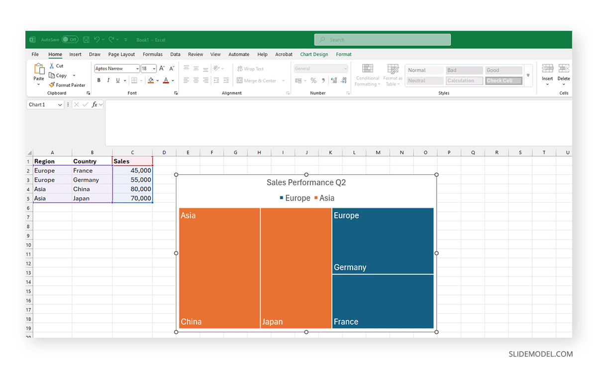
Treemaps can be generated quickly in Excel if the data is structured correctly. Let’s consider the scenario where we need to express sales by region and then by country.
Step 1: Preparing the Data
Inside Excel, set up a table with three columns.
- The first column should include the primary hierarchy level, such as “Region.”
- The second should include the secondary level, like “Country.”
- The third column should contain numeric values that define size (e.g., revenue or sales volume).
| Region | Country | Sales |
| Europe | France | 45,000 |
| Europe | Germany | 55,000 |
| Asia | China | 80,000 |
| Asia | Japan | 70,000 |
Step 2: Selecting the Data
To create a treemap, click and drag to select all three columns, including headers. Avoid any blank rows or columns, as this will result in an error when generating the treemap.
Go to Insert > Hierarchy Charts > Treemap. Excel will immediately generate the chart based on the nested structure.
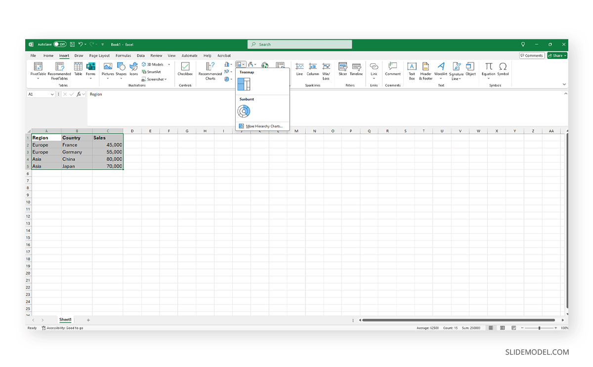
By default, Data Labels are enabled. However, if you wish to remove them or re-enable them (if they were previously deactivated), you can change this setting by going to Chart Elements > Data Labels > Show.
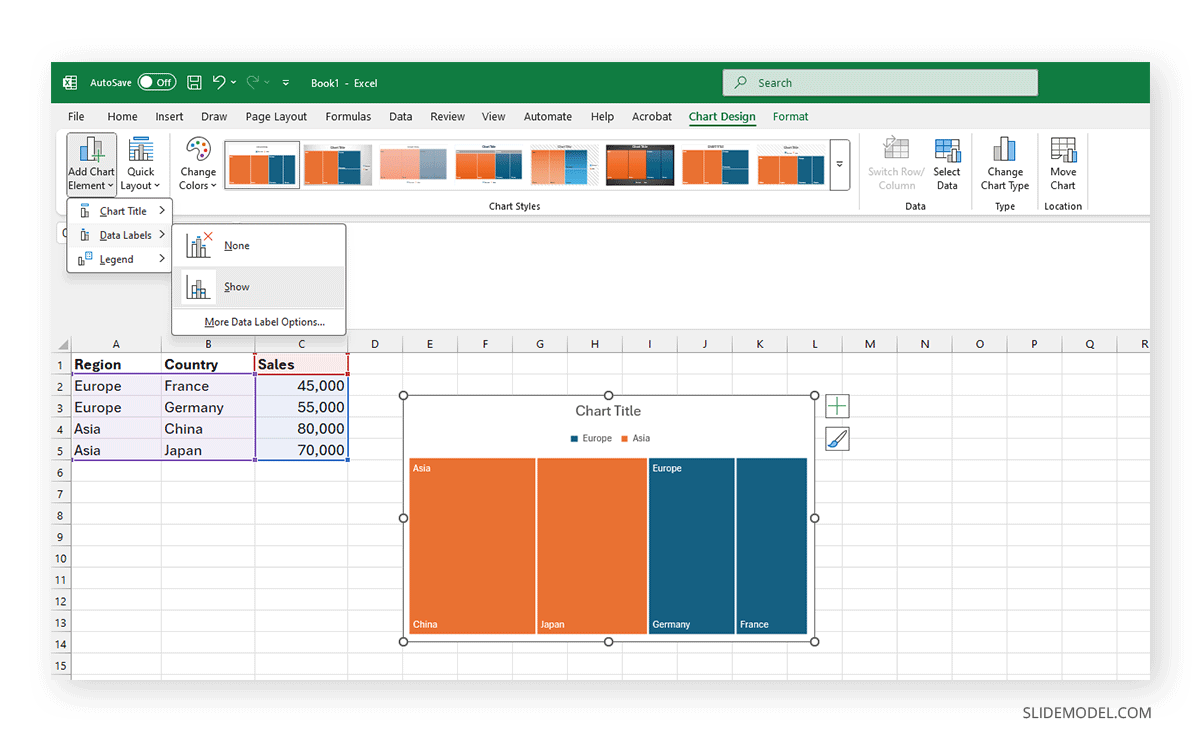
Step 3: Customizing the Layout
Inside the Chart Design tab, we can customize multiple options for our treemap chart:
- Layout
- Color
- Background
- Style
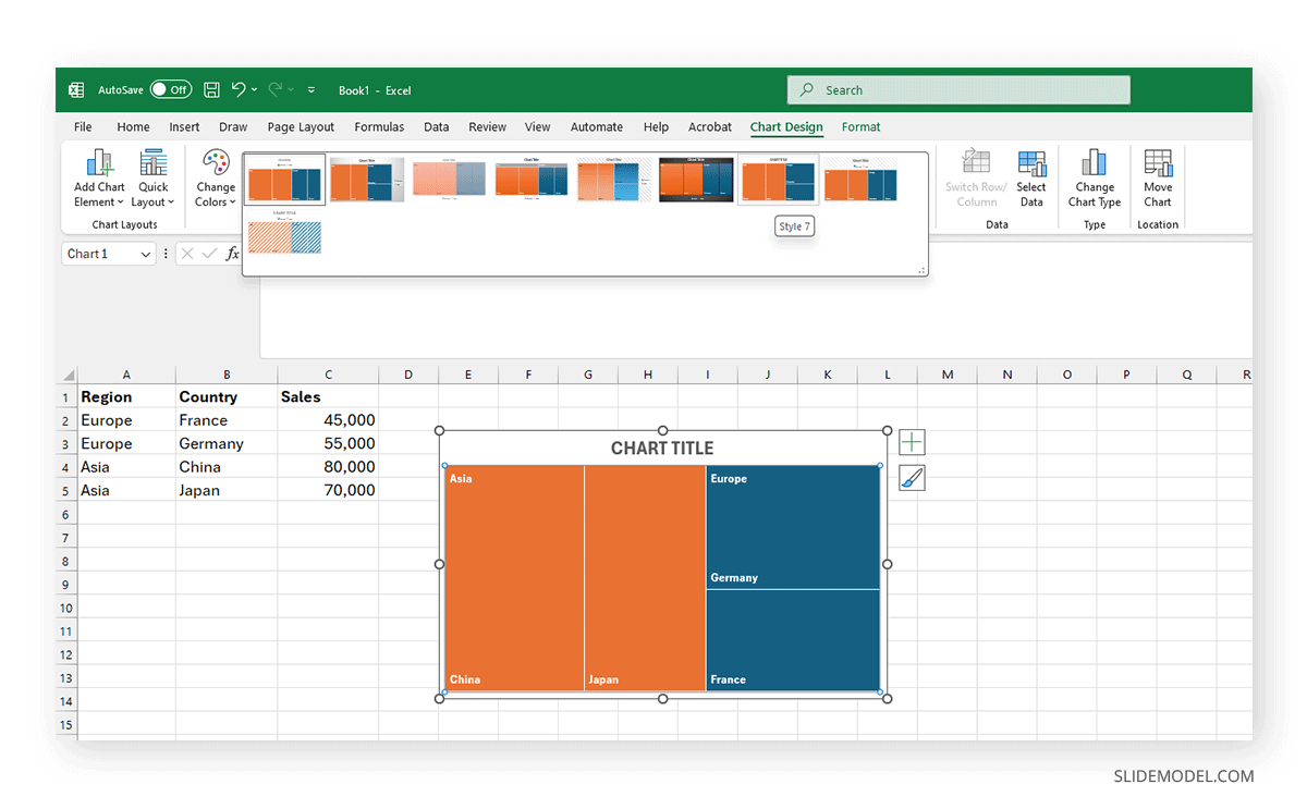
Place your cursor inside the chart and click on the paintbrush to access the Chart Styles contextual menu. Switch to the Color tab, and you can replace any color with your preferred color scheme.
How to Import a Treemap Chart in PowerPoint
Once your treemap is finalized in Excel, it can be imported into PowerPoint via several methods.
Method 1: Copy-Paste as Embedded Object
- In Excel, click on the treemap chart.
- Press Ctrl + C or right-click and choose Copy.
- In PowerPoint, go to the target slide.
- Press Ctrl + V or right-click and choose Paste.
- Select Embed Workbook if prompted. This keeps the Excel data accessible within the PPT file.
Method 2: Copy as Static Image
- Follow Steps 1–2 above.
- In PowerPoint, use Paste Special > Picture (Enhanced Metafile).
- This creates a vector image that remains crisp when resized.
Method 3: Export as an Image in Excel
- Right-click the chart > Save as Picture.
- Choose PNG or EMF format.
- Insert into PowerPoint via Insert > Picture.
Recommended Approach: For editable charts, use Method 1. For lighter file sizes and faster presentations, use Method 2 or 3.
How to Customize a Treemap Chart in PowerPoint
Once in PowerPoint, customization depends on whether you’ve embedded an Excel chart or imported it as an image.
If the Chart is Embedded (Method 1)
- Double-click the chart to enter Excel editing mode.
- You can modify values, colors, labels, and size.
- Use the Chart Design and Format tabs to change layout, colors, and styles.
Best Customizations for Presentations
- Color Scheme: Match brand colors or use color gradients to signal performance.
- Label Visibility: Increase font size and reduce label clutter. Show only essential categories.
- Borders: Add thin white or light borders to separate blocks visually.
- Background: Use a light neutral slide background to make the chart readable.
- Legend: Only include a legend if color encodes more than one variable. Otherwise, use direct labeling.
- Animation: Avoid animating individual rectangles. Use simple fade-in or zoom-in transitions.
If the Chart is Static (Image)
- You can crop or scale it, but you can’t edit internal data.
- Use PowerPoint shapes or annotations to call out specific areas.
Always validate readability on the actual presentation screen size. Test your slide in full-screen mode to ensure every segment is legible.
Working with Treemap PowerPoint Templates
Now that we have explored all the technical aspects of creating a treemap in Excel and the workflow to import it into PowerPoint, we can ask ourselves: Is there a faster method? The short answer is: Yes.
SlideModel’s tree map templates help presenters speed up this entire process by simply customizing a pre-made slide layout containing a treemap chart. For instance, we need to present a market share analysis of the IT industry, highlighting the relative positioning of six key competitors in terms of their presence and influence. It is ideal for use in strategic planning meetings, investor presentations, or competitive benchmarking reports.
Each block size visually reflects the market share held by each competitor, ranging from major players to emerging entrants. This overview enables stakeholders to quickly identify market leaders, assess market fragmentation, and inform decisions on partnership opportunities, investment focus, or areas for innovation and growth.

The best part? You don’t need to go back and forth with Microsoft Excel. You can customize the treemap chart PPT template data directly within PowerPoint, making the elements entirely editable and adaptable to advanced visualization effects, such as PowerPoint animations and transitions.
Common Mistakes in Treemap Charts
Treemap charts, while efficient and compact, come with their own set of usability pitfalls. Misapplying or misconfiguring them can lead to confusion, misinterpretation, or even complete communication failure.
Wrongful Application of Hierarchy
The most frequent issue stems from misalignment between the dataset’s structure and the treemap’s purpose. Treemaps are inherently hierarchical; using them with flat or unstructured data often results in a chart that looks visually fragmented and fails to provide meaningful insights. When no clear parent-child relationship exists, the nested rectangles lose their logical context, leaving your audience puzzled about what’s being compared.
Infinite Set of Subcategories
Another frequent mistake is visual overload. It’s tempting to include every subcategory in the dataset, but this quickly results in a patchwork of tiny, unreadable rectangles. Treemaps are not immune to the limits of human perception; beyond a certain number of segments, the visual loses cohesion.
The solution is to curate: aggregate minor categories into a collective “Other” group or filter the dataset to include only the most impactful contributors. This improves clarity without sacrificing representational integrity.
NB: You may see some data visualization of stock portfolios using the treemap chart model. These kinds of illustrations are created with specialized online tools that can handle a multitude of variables, culling data in real-time. Yet, for plenty of people, these data viz files are messy and won’t help to take informed decisions; they just picture a landscape of the overall situation (i.e., when markets are crashing)
Color Palette
Color misuse is another common misstep. A treemap should not look like a mosaic of random hues. If each rectangle is assigned a distinct, saturated color with no logical gradient or grouping, the chart becomes noise instead of a signal.
Always use color to represent an additional layer of meaning, such as a performance trend, risk level, or deviation from target, rather than as decoration. And never rely solely on color to communicate critical information; colorblind users may miss it, and projection environments may distort hue accuracy.
Abusing Text Labels
Text labels pose their own set of challenges. Small rectangles often lack the space to accommodate readable labels, especially when both category name and value are displayed. Crowded text diminishes the visual accessibility and overwhelms the viewer. A better approach is to label only top-level or high-impact rectangles and use tooltips or callouts for deep dives. If necessary, provide a complementary table or breakdown on a follow-up slide.
FAQs
What types of data are best suited for treemaps?
Hierarchical, categorical data with measurable values, such as sales by product line or costs by department.
Can treemap charts show changes over time?
No. Treemaps are not temporal by nature. They are designed to show the structure and proportional relationships of hierarchical data at a single point in time. If your objective is to visualize change over time, a line chart, stacked area chart, or animated transition between charts will better serve that purpose. Trying to represent time-based trends within a treemap misuses its core function and leads to confusion.
Are treemaps suitable for live dashboards?
Yes, particularly in tools like Power BI or Tableau. For PowerPoint, they work well for snapshots.
How many levels of hierarchy can a treemap handle?
Excel handles two levels well (parent and child). More than that reduces readability significantly.
How do I make small values visible in a treemap?
Group them into a single “Other” category or adjust the value scaling.
Can treemaps be animated in PowerPoint?
Avoid complex animations. Use a subtle zoom or fade for a better user experience.
Final Words
Treemap charts are a graphical element intended to serve strategic purposes. They enable presenters to condense a complex hierarchy of data into a single visual that conveys both structure and scale spatially and proportionally. This ability to distill complex relationships into quickly interpretable formats makes them a powerful tool in corporate decks, particularly when used in contexts such as executive summaries, performance dashboards, and financial snapshots. But that power is contingent on correct use.
You cannot treat a treemap like a plug-and-play graphic. Its utility depends on the integrity of your data structure, the clarity of your hierarchy, and your design decisions around labeling, color use, and placement. Use them when scale matters more than trend. And most importantly, use them when you need to present a complete system at a glance without drowning your audience in detail. That’s what makes treemaps not just a chart, but a decision-making accelerator.