Whale Curve Customer Profitability PowerPoint Template
Present your company’s customer profitability data using our creative Whale Curve Customer Profitability PowerPoint Template. A whale curve is a simple and effective line chart that can help you demonstrate your customer profitability in detail. It can explain the critical information about which of your customers are profitable, which are on the break-even line, and which are unprofitable. Its name, Whale Curve, is derived from its resemblance to a whale’s back. We have crafted this engaging PPT template for professionals and marketers to present this statistical data using creative data visualization. Once the data visualization is obtained, organizations can implement better strategies to increase the profit margins from break-even customers. It can help them streamline the processes by making informed decisions to retain profitable customers and enhance the profitability of other customers.
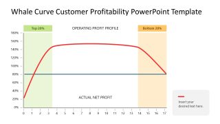
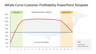
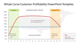
The Whale Curve Customer Profitability PowerPoint Template consists of three slides with the same data chart but with slight differences. The title slide shows a graph with the percentage of customers ranked by profitability (most to least) on the x-axis and the percentage of cumulative profit on the y-axis. A red line indicates information about different points corresponding to the x and y axes. Moreover, there are also labels for the operating profit profile and actual net profit on the line chart. We have provided legends on the bottom right side where significant information can be displayed. In the second slide, the whale diagram corresponds to the chart. In the last slide, presenters can use editable text boxes to showcase the brief details about different points of the data chart.
Professionals can change the labels, legends, shapes, and other PowerPoint features according to their choice. So download this PPT template to make appealing presentations for your executive sessions!


