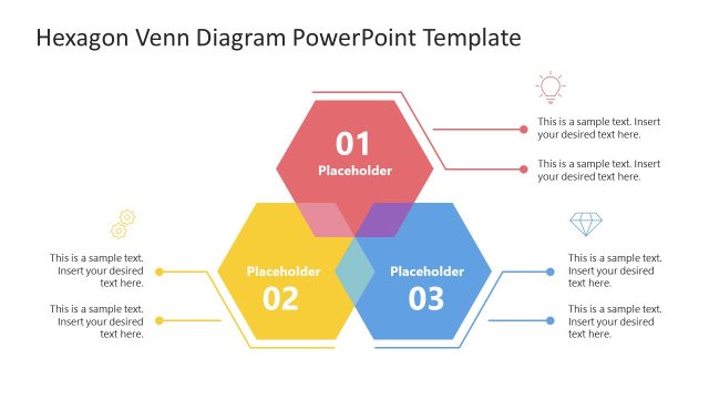
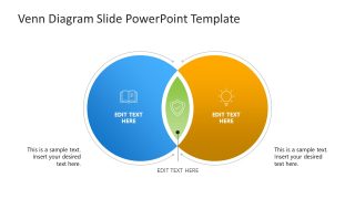
Venn Diagram Slide PowerPoint Template
Present the commonalities in two sets of data using our Venn Diagram Slide PowerPoint Template in your business meetings. A Venn diagram contains overlapping circles that visually show comparisons, such as similarities, differences, or other relationships. Professionals can visualize the relationships between two data sets, concepts, or products using this Venn diagram. For instance, data experts can compare two sales datasets to identify the standard sales bracket across the two campaigns. Product developers can showcase the comparison between two SaaS products and differentiate between them in their team meetups. Project managers can compare two techniques or the performance of teams or systems using this template. In the center, you can highlight the common components, while in the non-overlapped segment, you can present the differences.
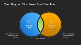
Our Venn Diagram PowerPoint Template includes two slides with the same diagram, but with different background colors. The first slide has a white background, while the second slide has a dark background. The diagram shows two overlapping circular shapes. The left one is blue, while the right one is yellow. The overlapped segment has a distinct green color to highlight the similarities, along with an infographic icon that visually demonstrates the concept. There are small, thin outlines around both circles. Further, we have provided modern graphical icons and text placeholders to display the content effectively. You can change the colors and icons in the Venn diagram to match your theme and preferences. You can also check our templates with different charts and graphs to present your data effectively. Download the Venn diagram slide PPT template and show the similar entries of your data easily. Try it today!


You must be logged in to download this file.
DOWNLOAD- Category
- Diagrams
- Rating

 Loading...
- Size
- 16x9
- Item ID
- 23398-02
- Colors
Subscribe today and get immediate
access to download our PowerPoint templates.