Presentation Slide for Area Plot
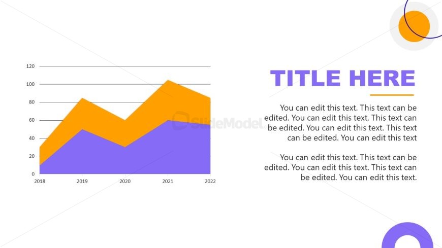
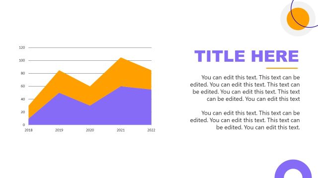
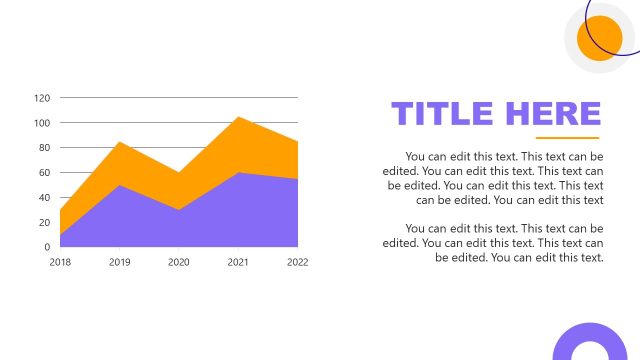
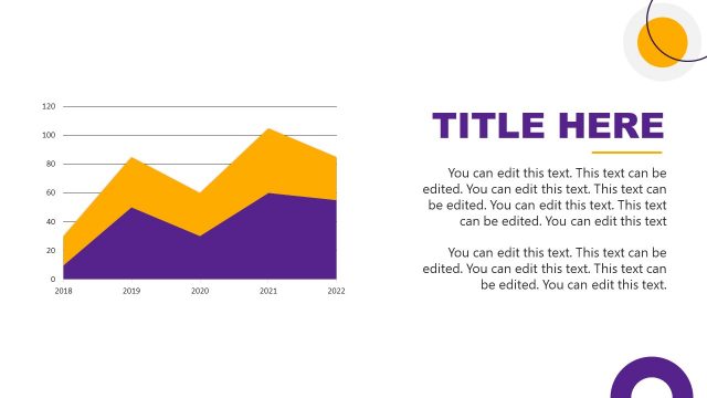
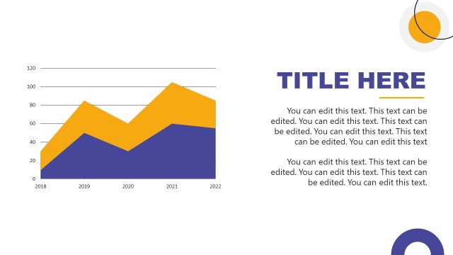
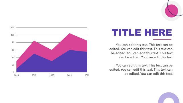
The image depicts a PowerPoint slide primarily intended for presenting statistical data through a graph. The slide contains a title placeholder, “TITLE HERE,” in large, bold font on the right side, suggesting that the specific topic of the graph can be inserted here. This is accompanied by multiple lines of editable text below the title, which can be used to provide a description or interpretation of the data presented in the graph.
On the left side of the slide, there is an area chart that compares data over a five-year period, from 2018 to 2022. The chart features two layers — one in purple and another in orange, likely representing two different sets of data or variables. The y-axis of the chart is labeled with numerical values ranging from 0 to 120, allowing for quantification of the data points, while the x-axis is marked with the years in question.
The design of the slide is simple and clean, with a white background and minimal decorative elements, which helps to keep the focus on the data. The use of contrasting colors for the data layers enhances readability and helps to differentiate between the two data sets.
This slide template is versatile and can be used in various contexts, such as business presentations for sales data, academic settings for research results, financial reports, or any situation where trend analysis over time is required. The clear layout makes it easy for the audience to understand and interpret the data at a glance.
Return to Therapeutic PowerPoint Template.
Download unlimited PowerPoint templates, charts and graphics for your presentations with our annual plan.
DOWNLOADReturn to Therapeutic PowerPoint Template.
