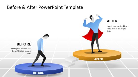
Then & Now PowerPoint Infographic Template
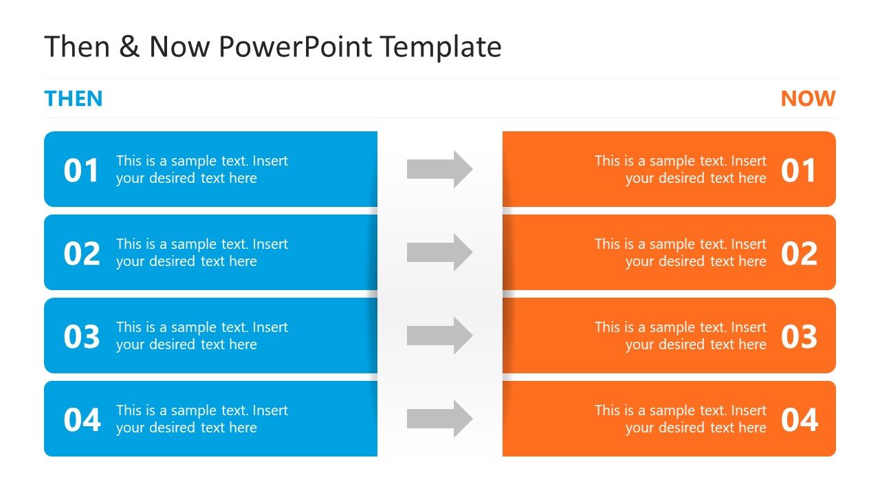
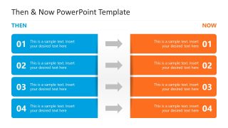
Compare two states of a business with this modern Then & Now PowerPoint Infographic Template in your stakeholder meetings. After a new business implementation or a successful project completion, organizations monitor changes and prepare reports for their strategy sessions. The purpose of such comparisons is to analyze what worked and what needs improvement. Professionals use various infographics and diagrams to highlight the before-and-after conditions of a workflow or system. They can visualize different metrics in the then vs. now presentations, such as changes in sales volume, organic traffic, productivity, products developed, or customer satisfaction. We have designed this then and now comparison slide template with a simple five-row diagram. There are two columns, the left one is for showing the points of ‘Then’, and the second column displays the ‘Now’, i.e., current conditions.
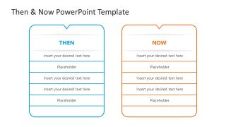
The first component has a blue color, while the other one has an orange color. Between each pair of rows, there is an arrow diagram showing the transition from left to right. In addition, the second slide of the Then & Now PowerPoint Infographic Template features two vertical blocks, each with a header and five rows. In each row, we have provided a digit to mark the step or point number, with placeholder text to describe each point in detail. Marketers can use this template to display how various metrics changed because of some adjustments, for example, they can mention how ROAS, CTR, CPA, or other data points changed because of a new ad creative or format. Project managers can track the project progress using this template.
Moreover, we have a collection of comparison PPT templates so that you can outline your similarities, diffenecres or changes effectively. Download the then and now slide template and craft modern presentations quickly. Grab it today!

You must be logged in to download this file.
DOWNLOAD- Category
- Multi-purpose
- Rating

 Loading...
- Size
- 16x9
- Item ID
- 23556-01
- Colors
Subscribe today and get immediate
access to download our PowerPoint templates.