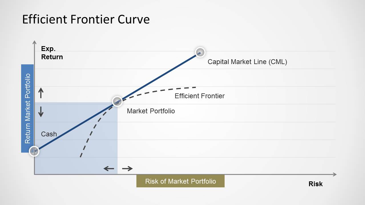
Simple Efficient Frontier Curve for PowerPoint. Create curves to depict the best possible expected level of return in comparison to the level of risk with this PowerPoint Template.
With this template you can construct the most elaborate curves and create easy to grasp presentation slides with a Simple Efficient Frontier Curve by editing the given sample models and rearranging the diagrams according to your requirements.
What’s inside this template
Example presentation scenarios
- An investment analyst can use the efficient frontier curve to explain how expected return changes as portfolio risk increases during an asset allocation review.
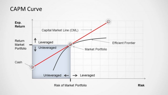
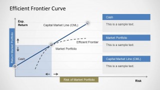
- A financial advisor can use the Cash, Market Portfolio, and Capital Market Line labels to teach clients the difference between low-risk holdings and market exposure.
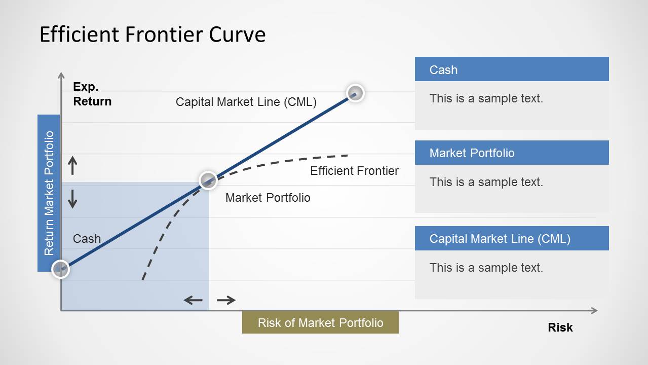
- A finance instructor can use the annotated callout slide to introduce CAPM concepts and clarify the role of the market portfolio in risk-return analysis.
- A portfolio manager can use the shaded risk-return area and directional arrows to frame a discussion about borrowing, lending, or moving toward an optimal portfolio mix.
Features
- 100% editable presentation template
- Compatible with Microsoft PowerPoint and Google Slides
- Scalable vector shapes, icons and illustrations
- AI-Ready for Microsoft Copilot and Claude
- Instant access and download
Frequently asked questions
Q: How should a presenter explain the curve without overwhelming a non-specialist audience?
A: Start with the axes before naming the theory: vertical movement means expected return, horizontal movement means risk. Then introduce Cash as the low-risk anchor, Market Portfolio as the reference point, and the Capital Market Line as the main takeaway. Use the second slide's callout boxes to define each term in plain language.
Q: Who is this template best suited for in a business or finance presentation?
A: It works best for analysts, advisors, portfolio managers, and finance educators who need to explain a single risk-return concept clearly. The layout is not a full investment dashboard; it is strongest as a teaching or briefing slide inside a broader asset allocation, CAPM, or risk management presentation.
Q: Why does the design use both a solid line and a dashed curve?
A: The solid Capital Market Line gives the audience a clear reference path, while the dashed efficient frontier suggests the set of possible portfolios. This contrast helps separate the theoretical boundary from the selected market relationship. The labeled markers reduce ambiguity and keep attention on the risk-return logic.
Simple Efficient Frontier Curve for PowerPoint
2-slide PowerPoint presentation template for efficient frontier curves, risk-return tradeoffs, and portfolio analysis
Simple Efficient Frontier Curve for PowerPoint is a 2-slide finance diagram template for explaining portfolio risk and expected return. It includes an efficient frontier curve, Capital Market Line, market portfolio marker, cash point, shaded risk-return area, and an annotated callout version for investment or risk management discussions.


 Loading...
 Microsoft PowerPoint
  Microsoft Copilot
  Claude for PowerPoint
 Other formats supported
Subscribe today and get immediate
access to download our PowerPoint templates.