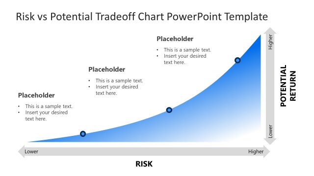
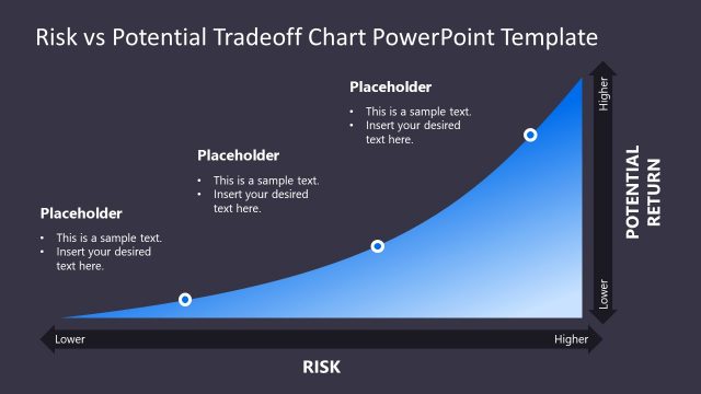
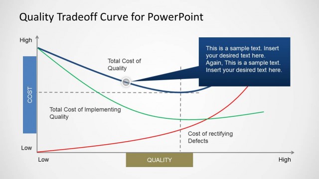
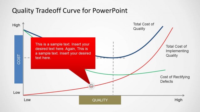
Risk vs Potential Return Slide Template
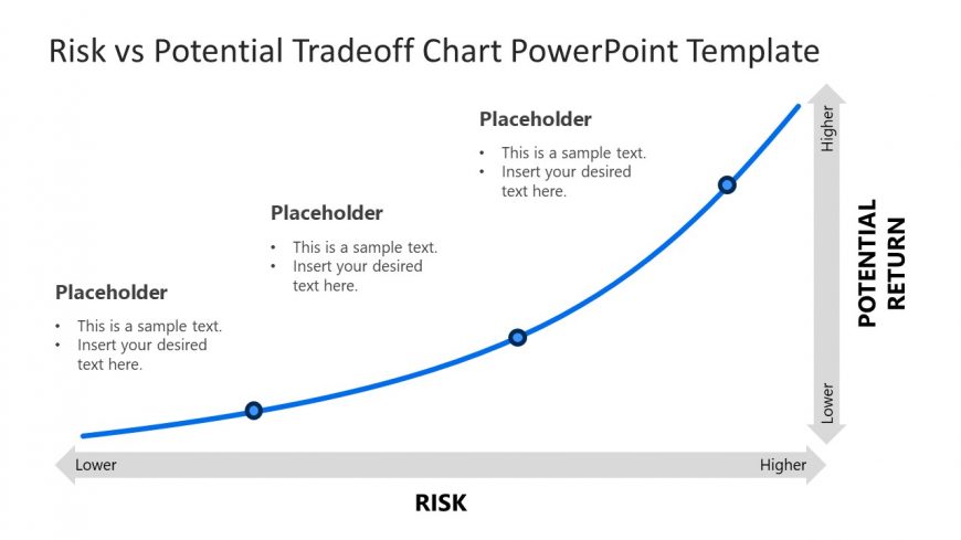
The PPT Diagram of Risk vs Potential Return Graph is a presentation slide template featuring a clean and professional color scheme with a curved line style. The slide layout includes a simple curve chart that illustrates the tradeoff between risk and potential return, with risk on the horizontal axis and potential return on the vertical axis.
It combines blue and gray colors, with a curved line connecting three nodes, each marked with a placeholder for text. The nodes are evenly spaced along the curve, representing different levels of risk and return. In this slide, the curved line is bolder, when compared with the graph used in the first slide of this presentation, and there is no gradient background below it.
This slide is suitable for creating presentations about investment strategies, risk assessment, and financial planning. It is included in the Risk vs Potential Tradeoff Chart PowerPoint Template, which can be downloaded from Risk vs Potential Tradeoff Chart PowerPoint Template.
The slide can also be used for other purposes, like explaining business models and concepts related to risk management. The visual metaphor of a curve rising from left to right captures the essence of increasing risk and return.
Return to Risk vs Potential Tradeoff Chart PowerPoint Template.