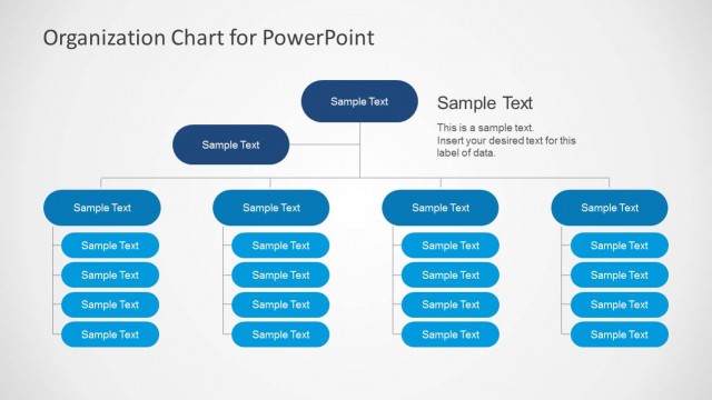
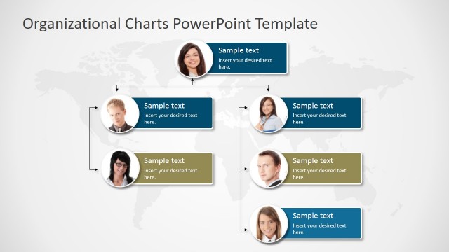
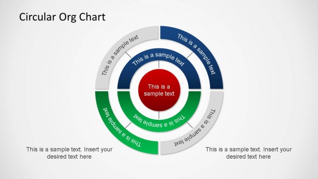
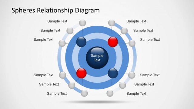
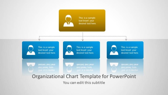
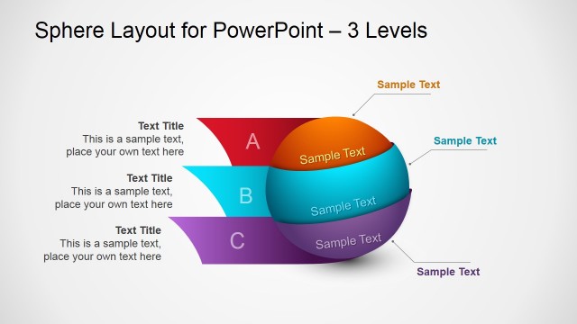
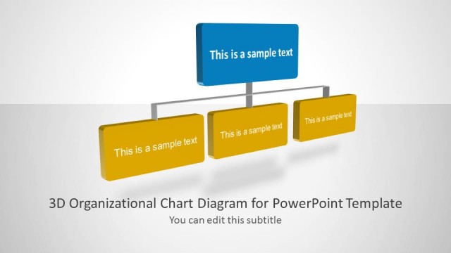
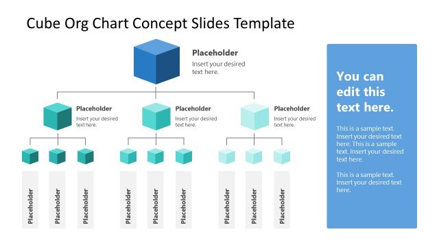
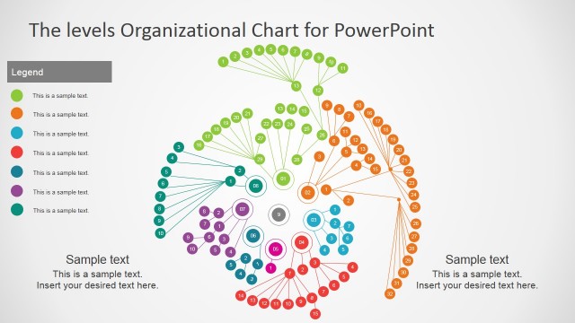
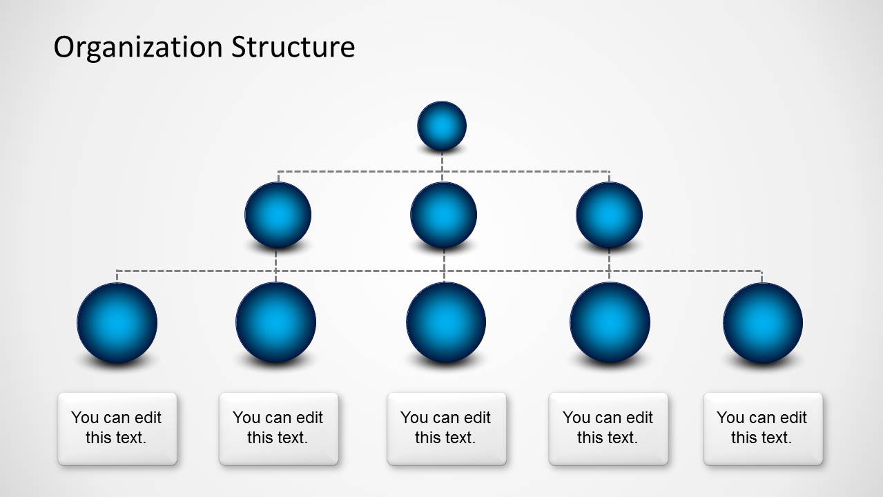
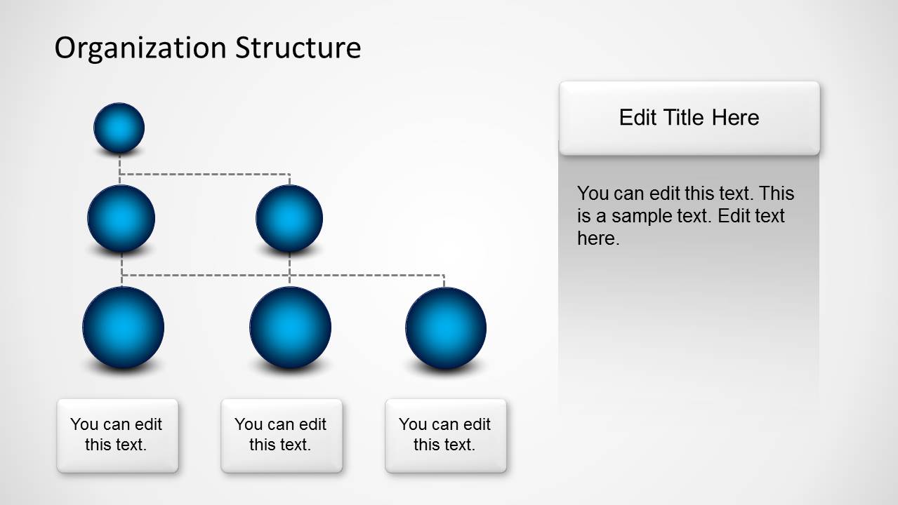
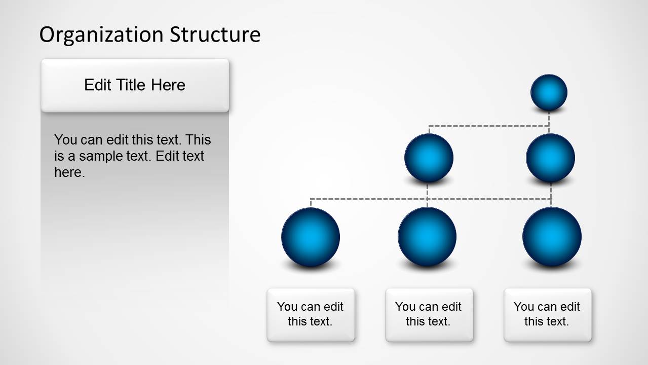
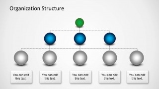
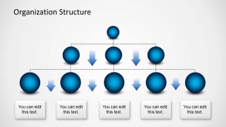
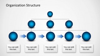
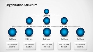
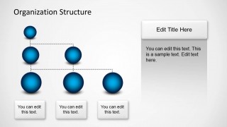
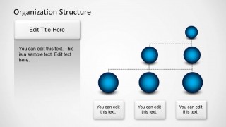
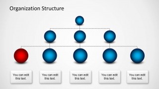
Organizational Structure design with Spheres for PowerPoint is a creative Org Chart template for Microsoft PowerPoint presentations that you can download to present the organizational structure in your company, present a team or create a simple but impressive Org Chart slides in PowerPoint. The Org chart designs in this template includes multiple layouts and three levels. The Org chart items are represented with spheres in PowerPoint. The org chart tree diagram was created with PowerPoint shapes and the sphere effect was achieved using PowerPoint shape effects. You can easily replace the color used to fill the spheres to match any desired color scheme.
Alternatively, you can download other Org Chart templates for PowerPoint including tree diagram designs for presentations like the simple tree diagram template for PowerPoint.
What’s inside this template
Example presentation scenarios
- An HR manager can introduce a new department structure by showing the three-level org chart and replacing the bottom captions with role names or team responsibilities.
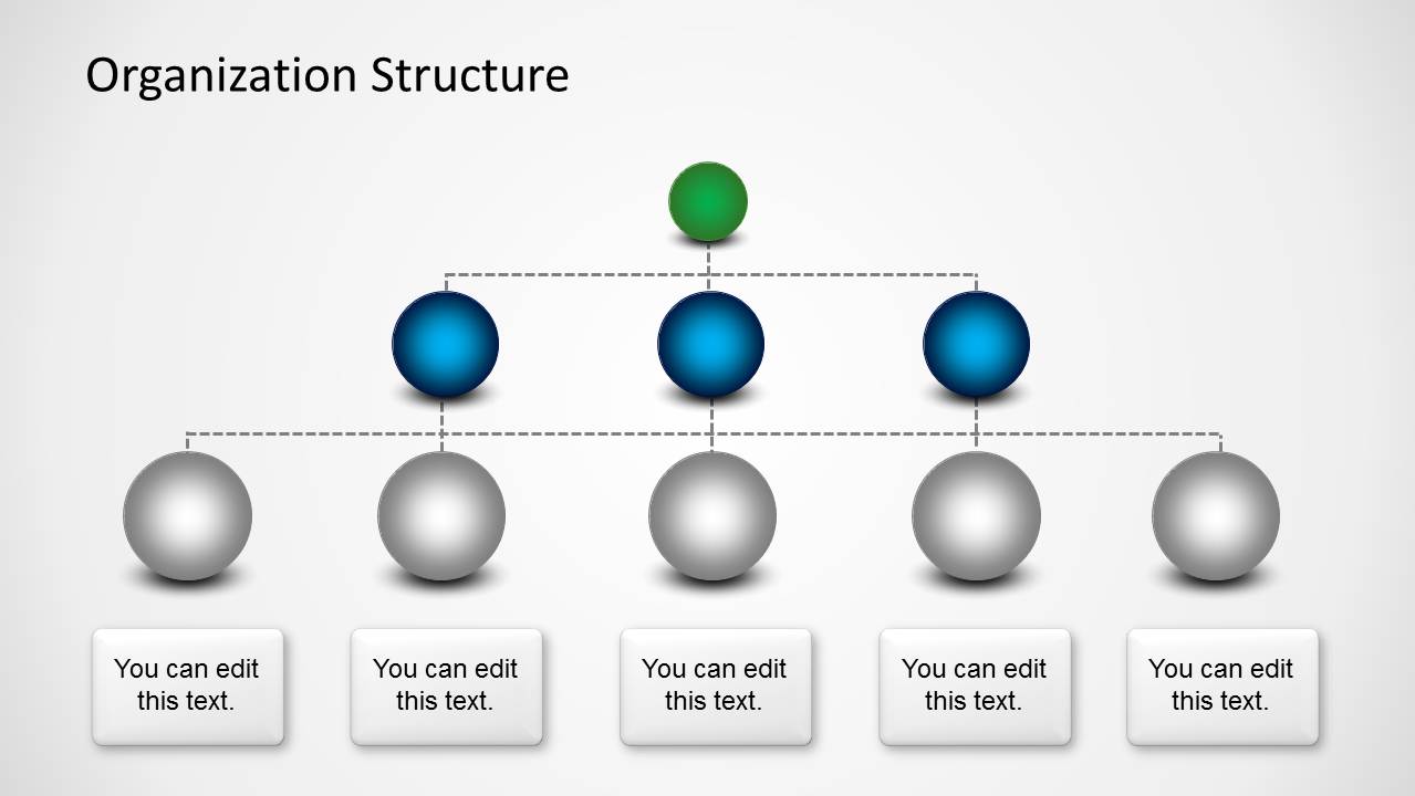
- A department head can explain reporting changes during a leadership meeting by using the highlighted-node slide to call attention to a new manager, function, or vacancy.
- A consultant can map a client organization in a diagnostic workshop using the dotted hierarchy lines and side-panel slides to pair structure with written observations.
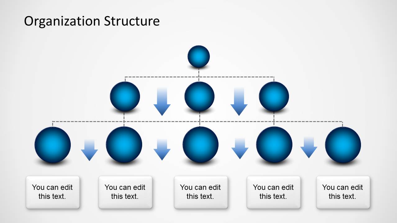
- An operations leader can brief cross-functional teams on workflow ownership by using the arrow-based org chart layouts to show movement across peer roles or levels.
Features
- 100% editable presentation template
- Compatible with Microsoft PowerPoint and Google Slides
- 16:9 aspect ratio slides
- Scalable vector shapes, icons and illustrations
- AI-Ready for Microsoft Copilot and Claude
- Instant access and download
Frequently asked questions
Q: How should a presenter make the hierarchy easy to understand with this template?
A: Start with the clean three-level org chart, then move to a highlighted-node version only when a specific role needs attention. Keep each sphere to one role, team, or function, and use the bottom captions for short responsibilities. The dotted connectors already show reporting logic, so avoid adding long explanations directly on the diagram.
Q: Who is this template best suited for in a business presentation?
A: This template is best for HR leaders, department heads, operations managers, and consultants who need to explain who reports to whom. It fits company overview decks, restructuring briefings, onboarding sessions, and team introductions where a simple hierarchy is more useful than a dense employee directory or spreadsheet-style roster.
Q: Why use sphere nodes instead of a standard box org chart?
A: The sphere metaphor makes each role feel like a distinct unit while keeping the overall tree structure visible. The glossy nodes create strong focal points, and the dotted lines keep reporting relationships light. This helps the audience read hierarchy, peer groups, and highlighted positions without the visual weight of stacked rectangles.




Organization Structure Template with Spheres for PowerPoint
9-slide presentation template for org charts, hierarchy levels, and sphere-based tree diagrams
This 9-slide organization structure template presents hierarchy diagrams with glossy sphere nodes, dotted reporting lines, three-level org charts, highlighted positions, directional arrows, and text panels. It is designed for managers, HR teams, and executives who need to explain company structure or team relationships in Microsoft PowerPoint and Google Slides.
- Category
- Tree Diagrams
- Rating


 Loading...
- Aspect ratio
- 16:9
- Item ID
- 6185-06
- Colors
 Microsoft PowerPoint
  Microsoft Copilot
  Claude for PowerPoint
 Other formats supported
Subscribe today and get immediate
access to download our PowerPoint templates.