Slide 7 of 18 from Market Share Diagrams for PowerPoint
6168-01-market-share-diagrams-7
Market Share Comparison Diagram for Presentations
- Diagram
- Circular Cycle
- Strategic Analysis Slide
- 16:9
- 100% Editable
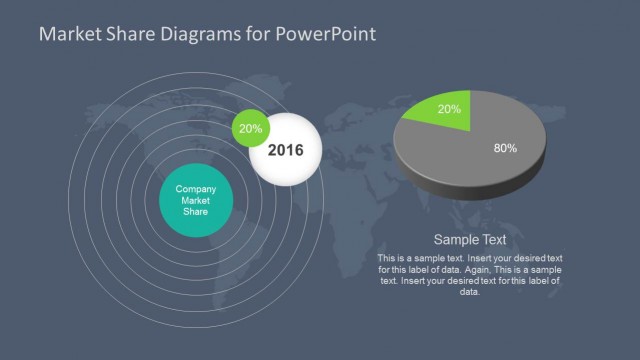
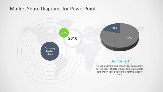
The Market Share Comparison Diagram from the Market Share Diagrams for PowerPoint template offers a clear visual for strategic analysis, combining editable slides with vector icons to illustrate competitive positioning. This slide layout supports business presentations focused on market analysis and strategic planning, integrating a circular diagram with a 3D pie chart to highlight company market share effectively within a corporate presentation or pitch deck template.
What’s on This Slide
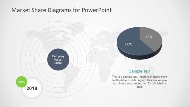
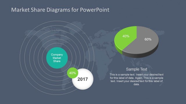
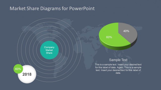
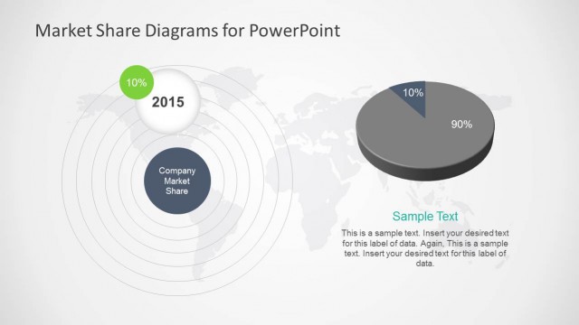
The layout features a circular diagram on the left with concentric rings representing market share. The central node is labeled 'Company Market Share' and is surrounded by a green circle labeled '2017' with a percentage of '40%'. To the right, a 3D pie chart displays two segments, one representing '40%' and the other '60%'. Below the pie chart, there is a text placeholder for additional information. The background is light with a subtle gradient. The visual hierarchy emphasizes the central node and the pie chart.
How to Use It
This layout serves as a market share comparison tool, effectively illustrating a company's market position relative to competitors. It fits well in presentations discussing market analysis or strategic planning. This format is useful for business scenarios such as quarterly reviews, competitive analysis, or market entry strategies. It can also be adapted for reports on market trends and performance metrics.
Text Placeholders & Capacity
Keep your copy within these limits so it fits without resizing. Body slots can hold about 20 words each.
| Placeholder | Count | Max characters (approx.) |
|---|---|---|
| Slide title | 1 | 30 |
| Item heading | 1 | 20 |
| Item body | 1 | 100 |
| Data label | 2 | 5 |
| Body paragraph | 1 | 150 |
Slide Keywords
Download unlimited PowerPoint templates, charts and graphics for your presentations with our annual plan.
DOWNLOADReturn to Market Share Diagrams for PowerPoint.