Gradient Column Chart PowerPoint Infographics
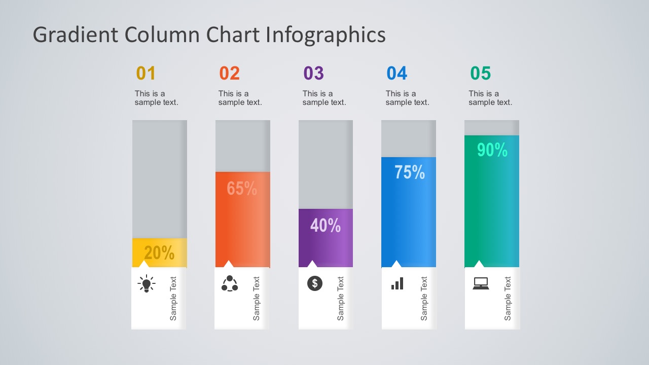
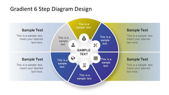
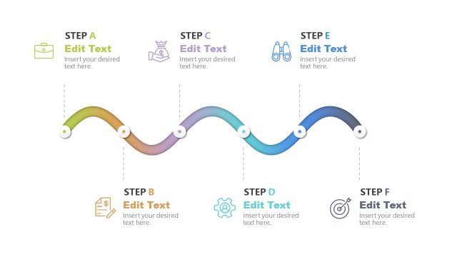
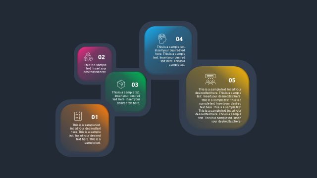
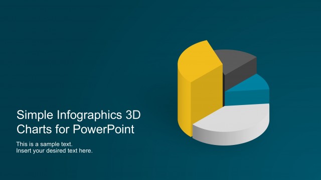
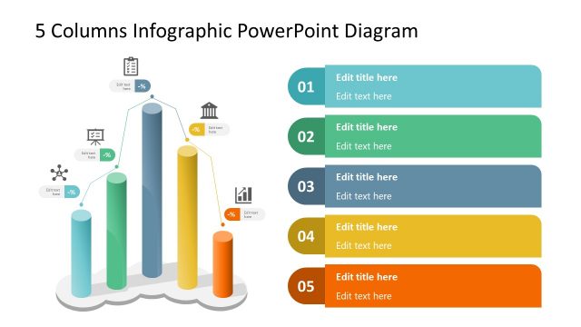
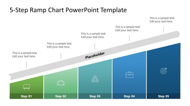
Gradient Column Chart is a 5-steps diagram in PowerPoint. A single slide presentation which illustrates the percentage of completion in a particular step or milestone. It follows a sequential process with number steps. Thus, the Gradient Column Chart PowerPoint Infographics is ideal for a system or a step-by-step business method.
In addition, here are many reasons to use infographic charts to visualize information in a PowerPoint presentation.
- First of all, charts are easy to read.
- Easy comparison between 2 or more categories.
- The audiences will immediately detect minimum and maximum values.
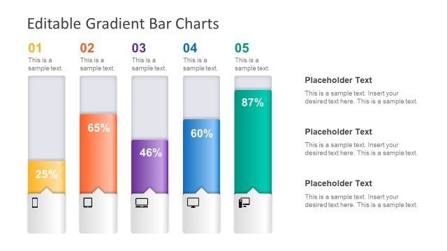
The column chart uses an awesome linear gradient palette. The color progression gives a good visual aesthetic on the diagram compared to a textbox or table. The audiences will immediately spot a discrepancy in the data. Hence, they will have an immediate overview of coherent categories by using colors.
The Column Chart is data driven. The user can edit its value through an excel spreadsheet. This provides the user a simple and effective tool for regular presentations. With a simple edit in excel numbers, the user can refresh the data for the meeting. All the elements are created as PowerPoint objects. This feature allows the user to resize and customize the infographics and place them in existing dashboards.
The Gradient Column Chart is flexible in design besides its good visual. The PowerPoint icons, shapes and text placeholders in every step are editable. The users are able to adjust the presentation according to the project status, or the business data. They have the option to change the default chart layout. Otherwise, check more easy-to-use PowerPoint charts and diagrams to choose from.
