Editable PowerPoint Column Chart Featuring Crude Oil Prices
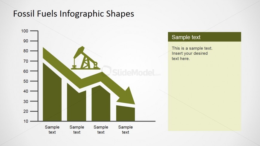
This slide represents the Crude Oil Prices changes with a chart that compares the oil prices with a certain attribute; a downward arrow designed using PowerPoint shapes presents the price trend. It has rounded numbers and can have either a positive arrow or a negative arrow based on the number of inputs. This power point presentation themed with a green palette, but different colors can be used both for the background and the chart. It also has an additional text area on the right side of the graph for the user to edit. It has a header of dark green color and has a text area of pale green color but their colors can be customized.
Return to Fossil Fuels Infographics for PowerPoint.
Download unlimited PowerPoint templates, charts and graphics for your presentations with our annual plan.
DOWNLOADReturn to Fossil Fuels Infographics for PowerPoint.
