Flat Business Thin Bar Chart Slide Design
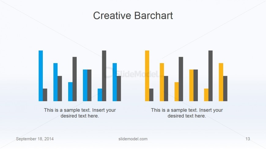
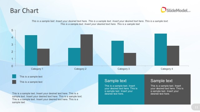
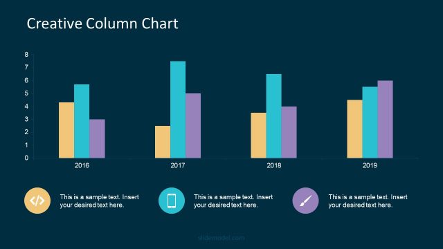
The presenter can use the Flat Business Thin Bar Chart Slide Design to show two sets of bar charts at the same time. The simultaneous presentation allows the viewers to easily compare the two sets of data, noting significant trends between the two. This type of data presentation is ideal in sales trends analysis. It helps financial analysts detect patterns that aid in statistical forecasting.
The two charts are distinguished by color. The left chart is shown in blue, while the other is in yellow. This incites visual cues which aid both the presenter and the audience in remembering the information. All PowerPoint objects are 100% customizable and can be edited to suit the presenter’s needs and preferences.
Return to Flat Business PowerPoint Template.
Download unlimited PowerPoint templates, charts and graphics for your presentations with our annual plan.
DOWNLOADReturn to Flat Business PowerPoint Template.
