Data Driven Campaign Analysis Infographics
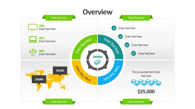
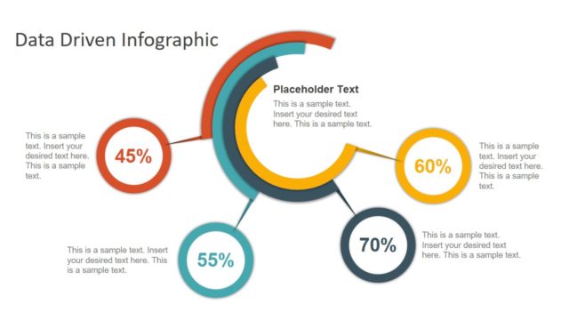
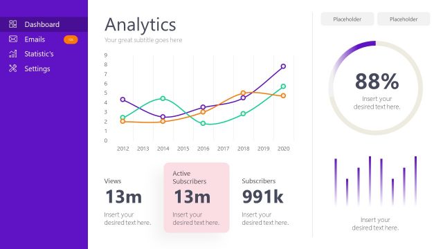
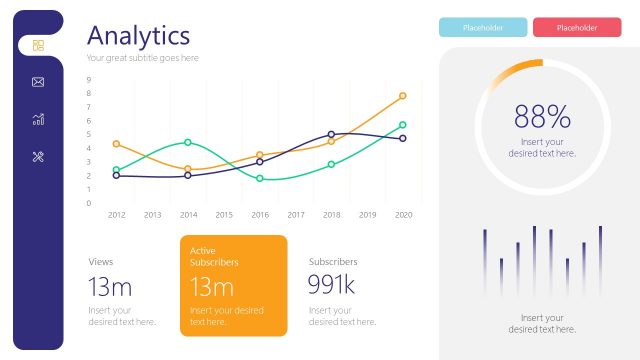
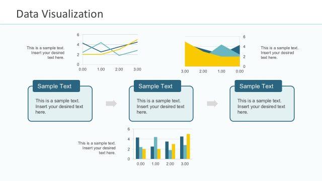
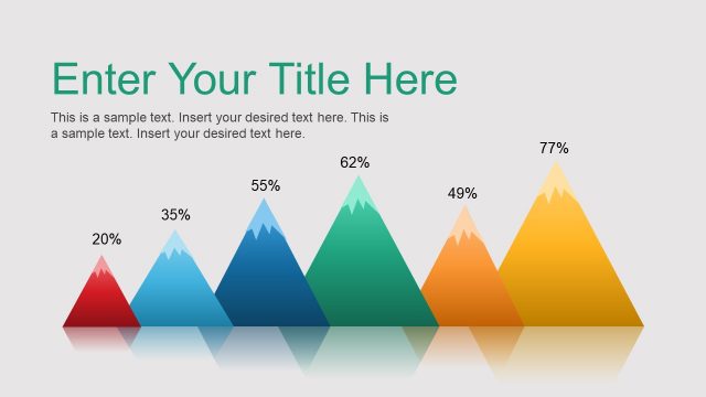
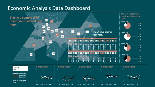
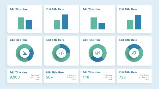
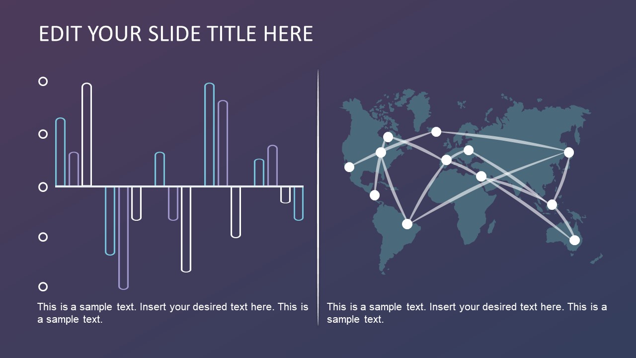
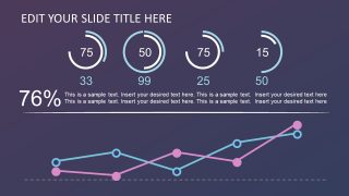
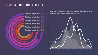
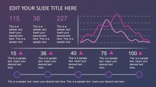
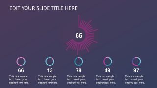
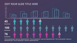
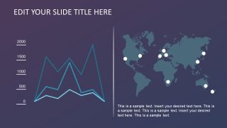
The Data Driven Campaign Analysis Infographics are the dashboard style business slides. These are the eight slides to present business, sales and marketing analysis through charts and graphs. Every slide of campaign analysis contains at least one data-driven chart. However, these are mostly the custom combination of one or more charts. Therefore, the slides display an appealing layout through the unique design and eye-catching colors. In business, the campaign analysis often refers to an outcome of strategic marketing. The purpose of data-driven campaign analysis in PowerPoint is to provide a layout to effectively present the marketing metrics. Further, each slide contains a text placeholder to add the supporting data or keynotes.
The Data Driven Campaign Analysis Infographics assists in generating sales and marketing reports for the audience. For example, the marketing manager presenting the annual growth of business and generate revenue. The professionals can choose a relevant slide to present their analysis as a part of the main presentation. Moreover, the editable PowerPoint has many customization options. The users can change the properties like colors, sizes, themes etc. The data-driven campaign analysis PowerPoint is ideal for digital and telemarketing along with other processes. The presentation of complex data in interactive charts enables an audience to view the rate of growth in seconds. This way, they can make informed decisions without going through the extensive documentation.
The infographic PowerPoint of data-driven campaign analysis can aid as feasibility to small businesses. The data-driven infographic charts allow users to enter numerical data into excel sheet and perform calculations. These charts show plus symbol, brush and funnel on the right side. Here, the plus symbol contains editing options for chart elements. The brush is for design customization and funnels to edit the data and formulas. Use of these data-driven campaign analysis slides can improve the quality and effectiveness of the marketing plan.


You must be logged in to download this file.
DOWNLOAD- Category
- Business PowerPoint Templates
- Rating

 Loading...
- Size
- 16x94x3
- Item ID
- 13004-02
- Colors
Subscribe today and get immediate
access to download our PowerPoint templates.