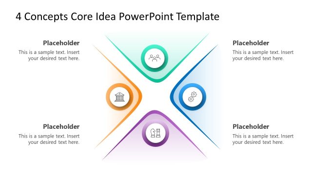
Download and customize our creative CRAP Design Principles PowerPoint Template for presenting the four principles of designing. Robin Patricia Williams proposed the CRAP design model that promotes four basic principles to consider when creating a design piece. CRAP is an acronym that stands for these principles, i.e.,
- Contrast: This principle indicates using colors, fonts, or shapes to emphasize certain things. The popping effect aims to make things prominent in a post, banner, landing page banner, or visiting card.
- Repetition: Repetition means repeating several graphical elements, such as logos or shapes for branding. In other words, this principle is important for creating a pattern in the design that makes it brand-specific.
- Alignment: It is important for making the design well-presentable. Alignment means to arrange everything with proper scaling so that everything seems coherent with each other.
- Proximity: This principle promotes the idea that similar things should be grouped in a design.
On the first slide of this CRAP Design Principles PowerPoint template, there is a four-column layout for presenting the CRAP elements. Each carries a bold first letter, a bar for mentioning the title, a meaningful graphical icon, and bullet points for adding a description. The following slide has a simple structure with four letters of the model. From each word arises a thin line leading to the text box for adding the titles. Icons are also added for visual representation.
Professionals can thus use this presentation template to communicate the importance of CRAP designing principles and their application for effective design development. It can be used to train graphic designers and discuss how the four principles can be implemented to ensure the stable delivery of design products. Users can change the color scheme and other elements on these slides.
Alternatively, you can download other presentation templates for PowerPoint, Canva and Google Slides to enhance your slide, or other multi-column letter model slides for PowerPoint representing different models and making it easy to present the concepts to an audience.
What’s inside this template
Example presentation scenarios
- A design instructor can use the acronym connector diagram to introduce students to contrast, repetition, alignment, and proximity before showing examples of layout decisions.
- A creative director can use the four-column matrix to align a team around design critique criteria during a brand, landing page, or banner review.
- A marketing manager can use the icon-labeled principle sections to explain why campaign visuals need consistent patterns, clear grouping, and visual emphasis.
- A UX or UI presenter can use the color-coded columns to frame a quick training session on readable interface layouts and organized content blocks.
Features
- 100% editable presentation template
- Compatible with Microsoft PowerPoint and Google Slides
- 16:9 aspect ratio slides
- Scalable vector shapes, icons and illustrations
- AI-Ready for Microsoft Copilot and Claude
- Instant access and download
Frequently asked questions
Q: How should a presenter explain the four CRAP principles with this template?
A: Start with the acronym diagram to define contrast, repetition, alignment, and proximity in plain language. Then use the four-column matrix to add specific examples, such as font contrast, repeated brand elements, aligned page sections, and grouped related content. Keep each text area short so the audience connects the principle to the visual structure.
Q: Who is this template best suited for?
A: This template fits design instructors, creative leads, marketing managers, and UX presenters who need a quick teaching aid for visual hierarchy and layout discipline. It is most useful when the audience already sees design work but needs a shared vocabulary for reviewing banners, landing pages, social graphics, or brand materials.
Q: Why does the acronym layout help communicate the design model?
A: The large CRAP letters act as memory anchors, while the repeated icon, title, and text pattern reinforces the model itself. The four-column version compares all principles side by side, and the connector version reduces detail for a cleaner introduction. This pairing helps presenters move from recognition to explanation.


CRAP Design Principles PowerPoint Template
2-slide presentation template for CRAP design principles with four-column matrix and acronym diagram layouts
The CRAP Design Principles PowerPoint Template is a 2-slide visual model for explaining contrast, repetition, alignment, and proximity. It includes a four-column principle matrix and an acronym connector diagram with icons and text boxes. It is intended for design training, creative reviews, and classroom instruction in Microsoft PowerPoint and Google Slides.
- Category
- Models
- Rating

 Loading...
- Aspect ratio
- 16:9
- Item ID
- 22313-01
- Colors
 Microsoft PowerPoint
 Microsoft Copilot
 Claude for PowerPoint
Other formats supported
Subscribe today and get immediate
access to download our PowerPoint templates.