Slide 2 of 6 from Candle Light Shapes & Charts for PowerPoint
6090-01-candle_light_charts-2
Candle Light Chart for PowerPoint
- Chart
- Bar Vertical
- Evaluation Slide
- 16:9
- 100% Editable
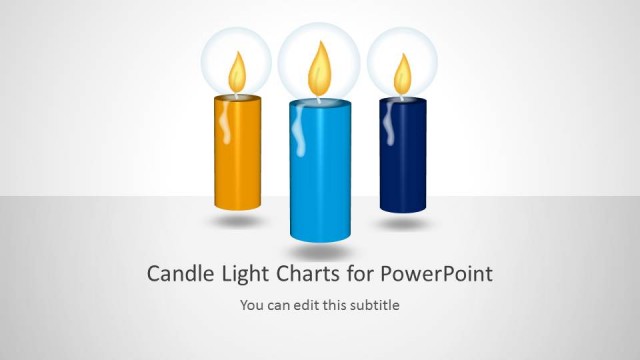
The Candle Light Chart slide from the Candle Light Shapes & Charts for PowerPoint template offers a clear visual tool for evaluating sales performance, project milestones, and yearly growth. This slide layout uses editable shapes and vector icons shaped like candles with flame icons to represent data values, making it suitable for business presentations and pitch deck templates that require effective comparison charts within slide decks.
What’s on This Slide
The layout features three vertical candle-shaped charts arranged side by side. Each candle has a flame icon at the top, with varying heights representing data values. The leftmost candle is blue, the middle one is dark blue, and the rightmost is yellow. Below each candle, there are text placeholders aligned centrally, indicating where to insert desired text. The background is light gray, providing contrast to the colorful candles. The visual hierarchy emphasizes the candles, with the flames drawing attention at the top.
How to Use It
This layout serves as a comparison chart, showcasing data trends across three categories over time. It fits well in presentations that require visual representation of growth or performance metrics. Use it in business contexts such as sales reports, project milestones, or performance evaluations. The layout can effectively communicate changes in data across multiple years or categories, allowing for clear visual comparisons.
Text Placeholders & Capacity
Keep your copy within these limits so it fits without resizing. Node body slots can hold roughly 10 words each.
| Placeholder | Count | Max characters (approx.) |
|---|---|---|
| Chart title | 1 | 30 |
| Item body | 3 | 50 |
Slide Keywords
Download unlimited PowerPoint templates, charts and graphics for your presentations with our annual plan.
DOWNLOADReturn to Candle Light Shapes & Charts for PowerPoint.