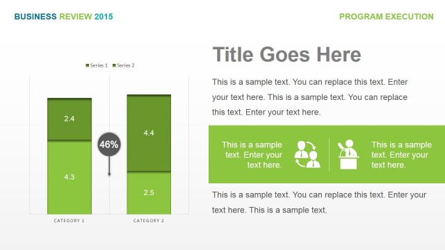
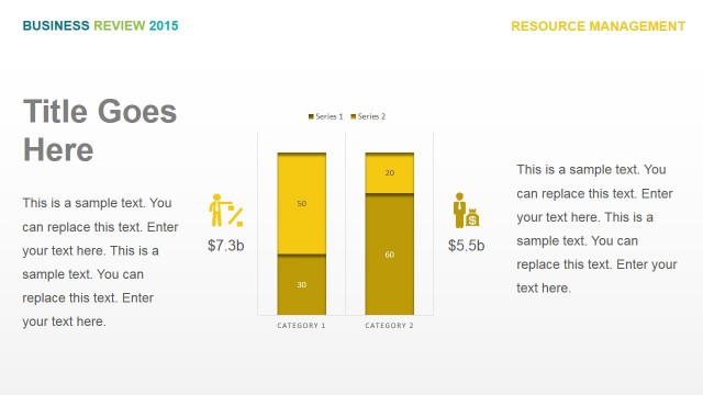
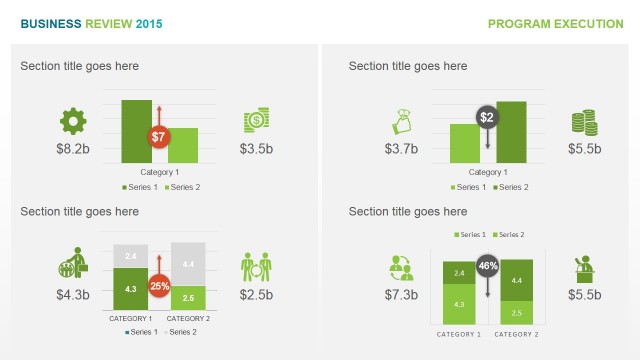
Executed vs Remaining Values Stacked Chart
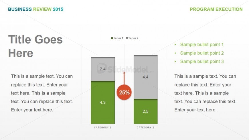
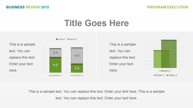
The stacked chart for PowerPoint may be used to compare different sets of data, such as executed and remaining values for specific statistical data. This is shown through the use of two sets of bars in a stacked column presentation.
The two bars are separated by a circular PowerPoint graphic showing percentage data. There are text placeholders found near the PowerPoint shapes where the labels for the columns and legends may be inserted. There are two sets of text placeholders found on the PowerPoint slide, one on each side of the diagram. The set found on the left may be inserted with the title for the presentation design and a description. The right set of text placeholders may be replaced with additional relevant information which may be important to the clarity of the presentation. All PowerPoint objects are 100% customizable to suit the presenter’s needs and preferences.
Return to Business Review PowerPoint Template.