Excel
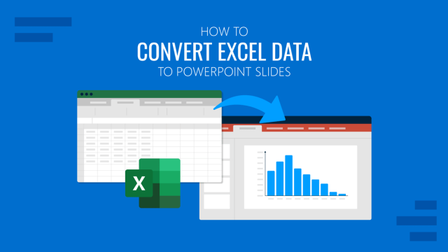
How to Convert Excel Data to PowerPoint Slides
Master the process of turning complex Excel datasets into polished PowerPoint slides with these efficient techniques.
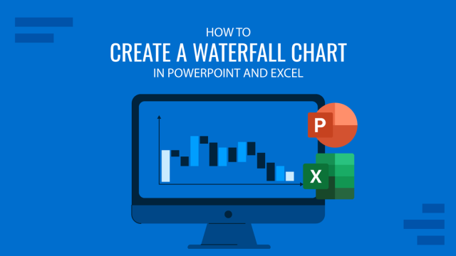
How to Create a Waterfall Chart in PowerPoint
A waterfall chart shows how the starting value changes over time due to a series of positive and negative contributions. Commonly used in finance and business reporting, this chart type helps the audience clearly understand how different factors impact a final result. If you’re wondering how to create a waterfall chart in PowerPoint, the guide […]

How to Insert an Excel Sheet into PowerPoint
Optimize your presentation slides with accurate data from spreadsheets. Learn how to insert an Excel Sheet into PowerPoint with this guide.
How To Create a Waterfall Chart in PowerPoint and Excel
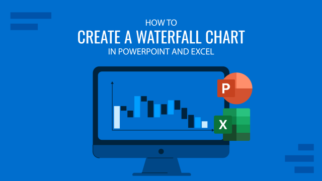
What Is a Waterfall Chart? Waterfall Charts are a special representation of Stacked Bar Charts that resemble a waterfall due to its decreasing or increasing values moving from left to right. This kind of chart is usually used to describe cash flow fluctuations. The first bar describes the initial value of the flow (starting point). […]