Radar charts, also known as spider charts, are used for showing multivariate data on a single diagram. Radar charts are useful for comparing performance metrics, skill levels, feature sets, or survey dimensions across categories. PowerPoint includes radar charts in its built-in chart tools, making it easy for presenters to add them directly to slides.
This guide explains how to insert a radar chart in PowerPoint, edit its data, and adjust its formatting to fit cleanly within a professional presentation. For more advanced design options, we’ll also point you to ready-made radar chart PPT templates and additional resources.
What Is a Radar Chart?
A radar chart displays data across multiple variables that radiate outward from a central point. Each variable forms an axis, and data points are connected to create a polygon. This makes patterns, strengths, and gaps easy to spot at a glance. Common examples of radar charts include feature comparisons, skill assessment matrices, customer satisfaction charts, performance benchmarks, and product evaluations.
How to Add a Radar Chart in PowerPoint
Step 1: Start by selecting a slide layout that provides your chart with sufficient space. If you’re using a blank slide, layouts like Title and Content or Blank are usually ideal for adding charts.
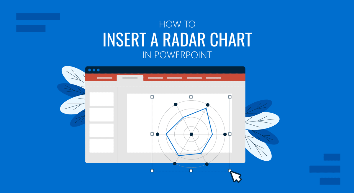
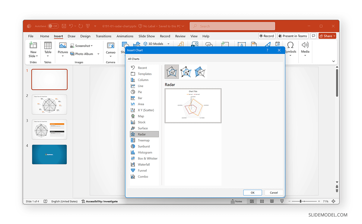
Step 2: Go to Insert -> Chart, scroll down the chart categories on the left, and select Radar.
Step 3: Choose one of the three built-in radar chart types. The categories include the following:
- Radar: This is a standard Radar chart with a minimalist look. It connects data points with lines only, making it ideal for showing overall patterns without visual distractions. Best used when you want the audience to focus on the shape of the data rather than individual values.
- Radar with Markers: This variation adds small markers at each data point, making category-by-category differences easier to spot. It’s useful when precise values matter or when you want to highlight specific strengths and gaps across variables.
- Filled Radar: A more visually impactful option, the Filled Radar chart displays each data series as a shaded area. The filled shapes make differences stand out immediately, which is especially useful when comparing products, skill sets, or performance metrics where the overall magnitude matters.
How to Edit a Radar Chart in PowerPoint
Once you have a functional radar chart in your slide, you can edit the data. Once the chart appears, PowerPoint opens a small Excel window that shows the default categories and values. To customize:
- Replace the placeholder labels with your own category names.
- Enter the data points for each series (competitor, product, skill set, etc.).
- Close the Excel window, and your radar chart updates instantly.
Tip: Keep all categories measured on the same scale (e.g., 1–5 or 0–100) to avoid making a misleading radar chart.
Formatting Your Radar Chart for Clarity
With Radar charts, minor formatting adjustments can make a big difference in clarity. Here are a few tips to help you format Radar charts.
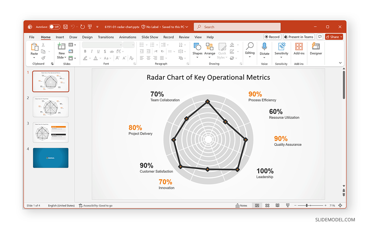
1. Add Radar Chart Title: Label your chart clearly (e.g., “Radar Chart – Skill Assessments” or “Radar Chart – Product Feature Comparison”).
2. Change the Chart Colors: Use your brand colors for series polygons and outlines.
Select the chart and go to the Format tab to adjust colors, fill, shape outline, and other settings.
3. Add Markers for Emphasis: If you want data points to stand out, switch to Radar with Markers or manually enable markers under Chart Design -> Change Chart Type.
4. Adjust Axis Labels: Choose a readable font size and ensure category names do not overlap.
5. Use Filled Radar for Impact: A filled radar chart can emphasize differences more clearly when comparing two or more data sets. To create radar charts without worrying about the design and formatting, you can use pre-designed templates such as the Radar Chart Template for PowerPoint shown below. This can significantly reduce the time required to create radar charts and provide pre-formatted designs that require minimal effort.
Final Words
Adding a radar chart in PowerPoint is simple. With straightforward formatting, you can transform raw data into a clean-looking chart in no time. This can help you show performance, compare alternatives, survey results, and more. For a more in-depth breakdown of spider diagrams and their use cases, see our tutorial on how to create a spider diagram in PowerPoint.