Free Simple Venn Diagram PowerPoint Template
Download Free Simple Venn Diagram PowerPoint Template & Google Slides


Do you need to present the similarities and differences between two data sets with clarity? Edit our Free Simple Venn Diagram PowerPoint Template to communicate your comparisons in your sessions effectively. A Venn diagram contains overlapping circles that help presenters compare the common and dissimilar items related to a concept or data. In corporate training, mentors can visualize how the two processes overlap and identify the significant differences in their execution. This free presentation template includes customizable PPT elements that professionals can edit to suit their needs and match their theme.
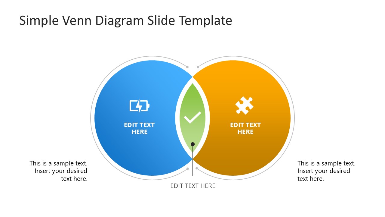
The Free Simple Venn Diagram PowerPoint Template features a two-circle overlapping diagram. The left circle is blue, while the right one is yellow. The overlapping segment between the circles helps identify commonalities between the two data sets. Project managers, product developers, data experts, and other professionals can use this template in various ways. Marketers can edit this free PPT template to present the performance comparison of two marketing channels for brand growth. The template also allows mathematicians and scholars to use Venn diagrams for their academic meetups. If you have more than two data sets, professionals can easily add additional circles and icons to convey their information effectively. Moreover, we have provided placeholder text lines both inside and outside the circles so you can briefly mention the details.
In addition, individuals can modify the shapes, icons, or text fonts used in the design to fit their needs perfectly. Download the Free Simple Venn Diagram template for free and use it in your educational or business presentations to communicate data effectively!
FEATURES
- 100% Editable PowerPoint Templates & Google Slides.
- Compatible with all major Microsoft PowerPoint versions, Keynote and Google Slides.
- Modern 16:9 Aspect Ratio.
- Scalable Vectorial PowerPoint Shapes and PowerPoint Icons.
- Instant Access and Download.
- New Templates every week.
Google Slides Preview
Our PowerPoint Templates are compatible with Google Slides. Take the most of every platform using the tool you like.
