Slide 7 of 11 from Free Product Showcase PowerPoint Template
Data Driven Charts Product Showcase PPT
Data Visualization Comparison Slide
- Chart
- Comparison Split
- Evaluation Slide
- 16:9
- 100% Editable
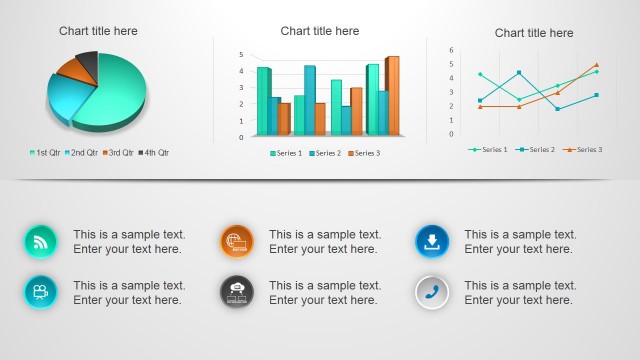
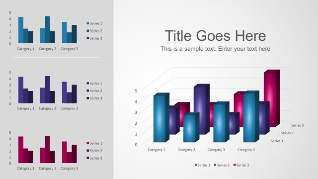
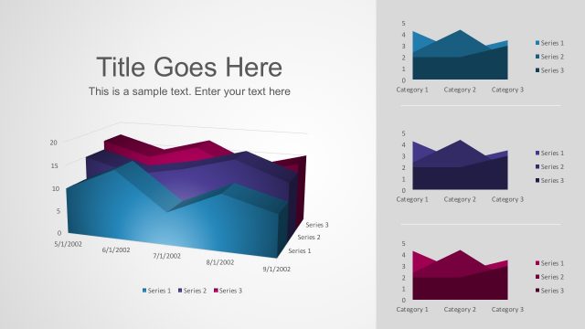
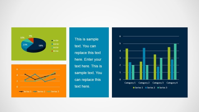
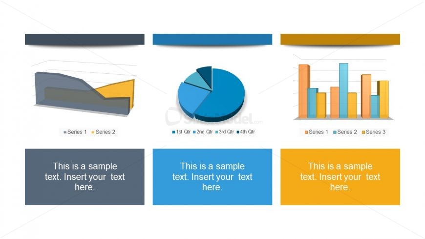
The Data Visualization Comparison slide from the Free Product Showcase PowerPoint Template offers a clear layout for evaluating multiple data sets using 3D line, pie, and vertical bar charts. This slide template is ideal for business presentations such as quarterly reports and sales pitches, providing editable slides that facilitate side-by-side data analysis. Its design supports effective communication of performance metrics within a professional slide deck.
What’s on This Slide
The layout consists of three main sections arranged horizontally. The left section features a 3D line chart with two series, while the center section displays a pie chart divided into four segments. The right section contains a vertical bar chart with three series. Each section has a placeholder for text below the visual elements, centered and aligned. The background is white, with colored headers above each chart. The visual hierarchy is clear, with charts taking precedence over text placeholders, which are labeled as 'Insert your text here.'
How to Use It
This layout serves as a comparative analysis of different data visualizations, suitable for presenting performance metrics or sales data. It fits well in a presentation sequence after introducing key concepts or problems, allowing for a visual breakdown of data. This structure is useful in business scenarios such as quarterly performance reviews, product comparisons, or sales pitches, where multiple data types need to be showcased side by side for clarity.
Text Placeholders & Capacity
Keep your copy within these limits so it fits without resizing. Text slots can hold a few sentences each, roughly 10-15 words.
| Placeholder | Count | Max characters (approx.) |
|---|---|---|
| Chart title | 3 | 30 |
| Body paragraph | 3 | 50 |
Slide Keywords
Download unlimited PowerPoint templates, charts and graphics for your presentations with our annual plan.
DOWNLOADReturn to Free Product Showcase PowerPoint Template.