
What Is a Waterfall Chart?
Waterfall Charts are a special representation of Stacked Bar Charts that resemble a waterfall due to its decreasing or increasing values moving from left to right. This kind of chart is usually used to describe cash flow fluctuations. The first bar describes the initial value of the flow (starting point). The next series of bars describes the periods or the categories of the flows. For example, if the chart describes business cash flow, it will represent each month’s net value; if the Waterfall Chart represents how money has been spent in different areas of the company, the series will represent each area. Finally, the last bar represents the final value after applying each cash flow in order.
The Bar Chart X Axis contains different series labels, and the Y Axis starts at a certain level and each series moving right starts reducing/increasing the value until it reaches a final value. The graphical representation clearly describes the cumulative effect of positive and negative amounts.
Waterfall Charts are not native charts provided by PowerPoint or Excel. In order to create this charts is necessary to create a Stacked Bar Chart and edit some of the series to create the effect of the waterfall.
In this tutorial, we will show how to edit one of our Data-Driven PowerPoint Bar Chart Templates, based on an initial set of values. We will create different series that will provide the effect of the waterfall, and after some editing tricks, the chart will look like the expected results.
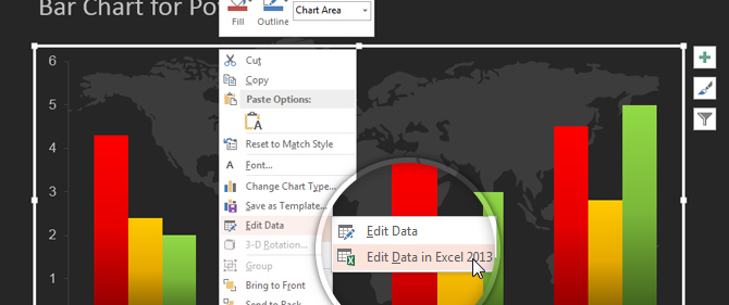
Step 1. Editing the Waterfall Template
We will start editing the base template Bar Chart Template for PowerPoint. Please make sure to edit the data using Microsoft Excel, and not the pop-up window of PowerPoint. This will help the formulas understanding.
We have an initial set of data, in this case is an example of cash flows. Write down directly in the editable cells the data values that are going to be used used for the flows. In the series Column, we have added the Start and End Labels, in order to understand the initial and final value of the flows. In this example the flow starts with a value of 5000.
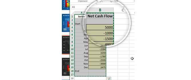
This cashflows will be the base data for the Waterfall Chart, so each bar should represent one of this values.
Step 2. Preparing the Stacked Data
As we mentioned before, the Waterfall Chart will be a special case of PowerPoint Stacked Bar Chart. We are going to create special series that will allow the Stacked Bar Chart to create the ideal bar, as a composite of different series values. Later, the user can edit the series and hide the ones that do not add visual value to the representation.
The columns added are the following:
- Series: This columns will have the Labels of the value Series. In this example the series is a “monthly” cash flow and each row has a month label, but this names could be anything the user wants to represent in the X Axis of the Waterfall Chart.
- Cummulative: As the name describes, this columns stores the cummulative value applied till the series step. This is just a simple add operation of the value in the order sequence of the flow. The Cummulative column starts and ends with fake values (cells B2 and B17) used to create an invisible column to set the chart scale.
- End: The end series is a column that will store the final value of the commulative flow.
- Negative: This column will store all the values of the flow that represent a decrease.
- Positive: This column will store all the values of the flow that represent an increase.
- Start: This series will store the starting value of the flow.
- Net Cash flow: This column stores the values of the flows. This are the values that should be shown in the PowerPoint Waterfall Chart.
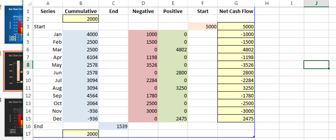
Note that the only manually populated columns are the Series column and the Net Cash Flow columns. All the other are formula based.
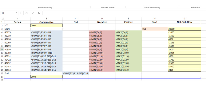
Step 3. Inserting the formulas
In order to populate the new columns some formulas need to be used.
The Cummulative column is the addition of the flows.
B4 = G3 + G4. Replicate this cell across the column.
The Negative column will contain the negative values of the flow. It can be computed with an IF statement.or a Min function:
D4 = Min(G4,0)
The Positive Column contains the positive values of the flow. An IF statement or a Max function can be computed.
D4 = Max(G4,0)
The Start and End Column contain the initial and final values of the flows respectively.
The following image shows all the formulas applied to the data.
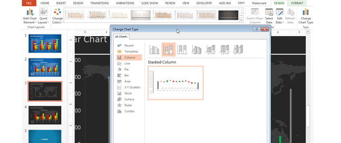
Step 4. Editing the chart series to represent the waterfall
Once the data has been prepared, we need to tweak the series bars. We are going to hide the base series and customize the colors of the increasing and decreasing values.
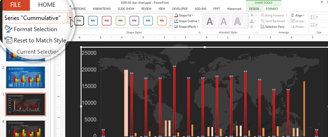
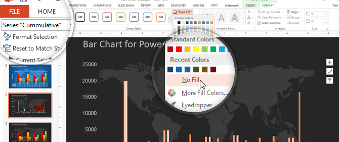
Click on any of the bars and select the Chart Format option Ribbon. In the selection combo select the series you want to update. In this case lets start with the Cummulative Series.
Then just Click in the “Shape Fill” button and configure the “No Fill” Option. You will se how the bars of the Cummulative Series remain transparent.
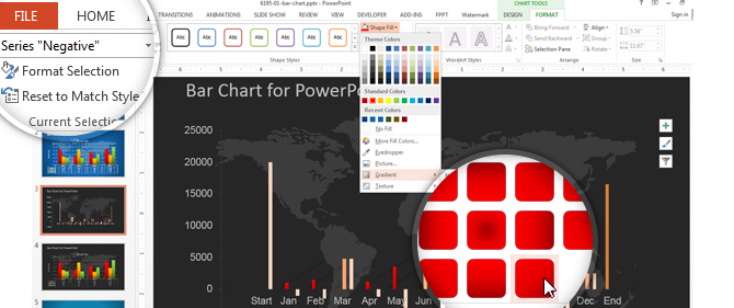
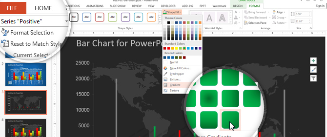
We repeat this procedure for the series “Net Cash Flows“. Then we color the Series “Start” and “End” with a grey color, so they are easily differentiated in the chart, and the Positive and Negative Series with colors Green and Red (gradients) respectively.
Finally, as we mentioned in the initial step, this chart is a customization of a Stacked Column chart, so we update the chart type of the PowerPoint Template.
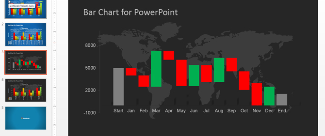
Waterfall Chart Final Result
The following image describes the Final Result of the Waterfall Chart. In this particular example, we updated the Gap between bar in order to increase the visibility of them. You can perform this tasks from the “Format Selection” option in the “Format Chart” Ribbon option. We are using a 20% Gap in this particular example.
Differences Between Waterfall PPT Charts and Waterfall Diagrams
While both “Waterfall PPT Charts” and “Waterfall Diagrams” aim to visualize sequential data and processes, they serve distinct purposes and have different visual structures:
Waterfall PPT Charts
- Purpose: Primarily used in financial or numerical data analysis to show cumulative effects of sequential positive and negative values, such as cash flow, revenue, or expenses.
- Structure: Resemble a bar chart with incremental or decremental bars. Each bar represents a specific stage or value, starting from an initial value and culminating in a final result.
- Components: Includes series like positive values (increases), negative values (decreases), and cumulative totals.
- Applications: Ideal for financial analysis, project evaluations, and business metrics that require a clear illustration of gains and losses.
Waterfall Diagrams
- Purpose: Used to outline a sequential process or workflow, such as project phases or development lifecycles.
- Structure: Often depicted as a step-by-step diagram with arrows or connectors showing dependencies or transitions between stages. It resembles a cascading waterfall, emphasizing a logical flow.
- Components: Includes labels for each step and arrows to illustrate the direction of progression.
- Applications: Commonly used in project management, software development (e.g., Waterfall Model), and process optimization to explain sequential workflows.
Conclusions
Waterfall Charts are a powerful tool for visualizing cumulative changes in data, making them an essential addition to any professional slideshow presentation that involves financial or operational analysis. While creating a Waterfall Chart in PowerPoint requires some technical know-how and data preparation, the results are visually impactful and highly effective at communicating key insights. By leveraging formulas and editing stacked bar charts, you can create a clean, polished, and visually compelling chart that aligns with your data visualization needs.
Whether you’re illustrating cash flow, analyzing performance metrics, or explaining changes over time, understanding how to create and customize Waterfall Charts will enhance your ability to deliver clear and insightful presentations.