Data Driven Bar Chart Slide
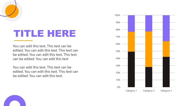
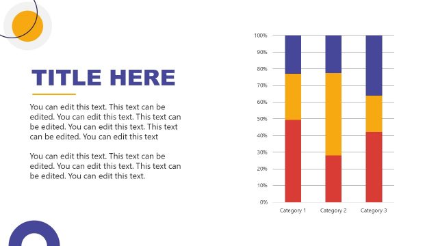
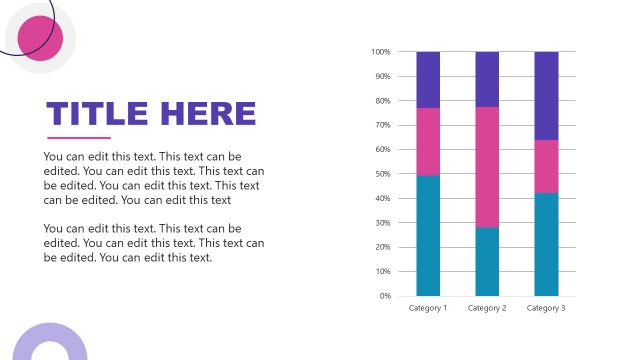
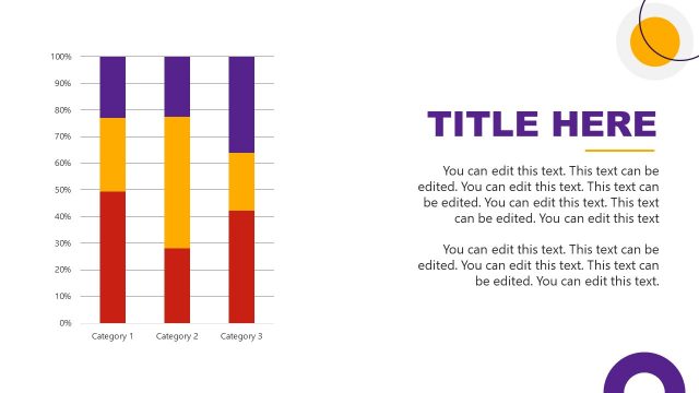
The image presents a PowerPoint slide designed for data representation, featuring a large, bold title placeholder “TITLE HERE” at the top right, indicating where a presentation title is meant to be inserted. Below the title are several lines of editable text, where additional information, descriptions, or context can be provided.
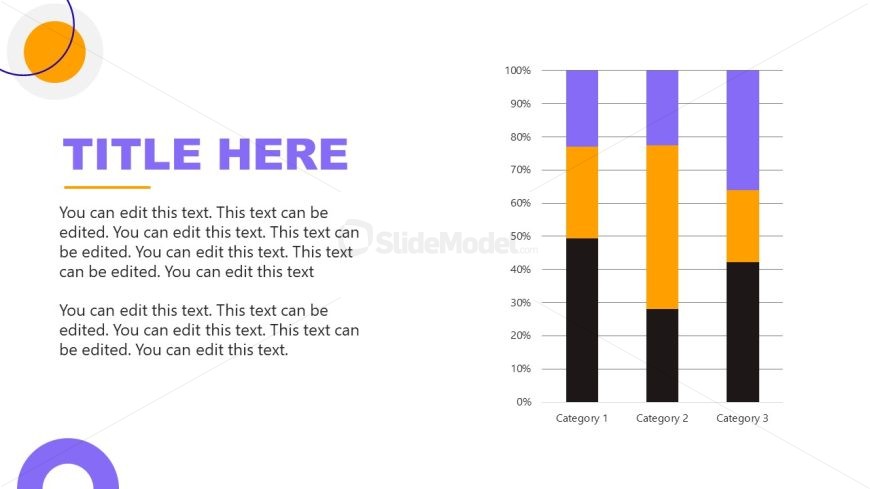
On the left side of the slide, there is a stacked bar chart. The chart has three categories on the x-axis, labeled “Category 1”, “Category 2”, and “Category 3”. Each category has bars composed of three different colors: black at the bottom, orange in the middle, and purple at the top, representing different data segments that contribute to a total value. The y-axis is marked with percentage values ranging from 0% to 100%, indicating that the data is shown as a proportion of a whole.
The layout of the slide is straightforward and professional, with a white background that ensures the chart is the focal point. The color scheme of the chart is designed to be visually striking while also clearly differentiating between the segments of data.
This slide is suitable for business presentations, academic lectures, or any scenario where it’s important to illustrate how individual components contribute to total percentages across different categories. The design is conducive to making complex data more accessible and understandable for any audience.
Return to Therapeutic PowerPoint Template.