Column Chart Slide – Therapeutic Template for PowerPoint
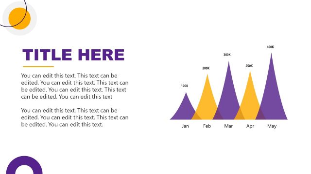
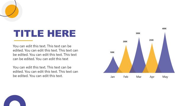
The image showcases a PowerPoint slide designed for displaying data in a graphical format. At the top of the slide, there is a prominent space for a title, indicated by the placeholder “TITLE HERE” in bold, uppercase letters. Below the title area are additional placeholder texts for detailed descriptions or explanatory content, suggesting areas where the presenter can include more specific information related to the title.
The central feature of this slide is a colorful triangular bar graph that visually represents data over a five-month period, from January to May. Each month is labeled at the base of the graph, and each triangular bar is associated with a specific value, ranging from 100k to 400k, with the bars increasing in height to correspond with these values. The graph uses two colors, purple and orange, to perhaps differentiate between two data sets or to highlight specific trends or comparisons within the data.
The layout is clean, with a white background and circular design elements in the corners that match the color scheme of the graph. This minimalist design ensures that the focus remains on the data being presented.
This slide could be applied to a range of presentations that require data visualization, such as sales performance reviews, website traffic analytics, financial reporting, or any scenario where it’s beneficial to display growth trends over consecutive months. The design is professional and adaptable, making it suitable for business, academic, or personal use.
Return to Therapeutic PowerPoint Template.
Download unlimited PowerPoint templates, charts and graphics for your presentations with our annual plan.
DOWNLOADReturn to Therapeutic PowerPoint Template.


