Percentage Infographic PowerPoint Template
Presenting the partial roles of different segments in the system is now easier with our Percentage Infographic PowerPoint Template. This percentage infographic template is designed using 100% editable PowerPoint Shapes. It displays a series of sections that fit into each other like the components of an automobile engine. This illustration indicates the correlation and coordination among several parts to generate a collective effect. For instance, several aspects join up for an organization’s development, i.e., funds, resources, teams, management faculty, and machinery. Likewise, there are collaborative efforts of people and departments to make a business flourish. All such concepts and their additive efforts in percentages can be shown using this creative percentage infographic diagram.
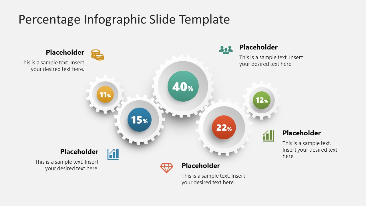
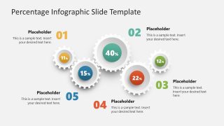
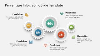
This Percentage Infographic PowerPoint Template slide carries five circular gear structures arranged in a proper orientation. In these white-colored shapes, there are small circles with placeholder text to mention the percentages. We provided placeholder text boxes with each shape to add the titles and descriptions. So, presenters can conveniently present the titles of the components and their respective percentage contribution values. Both slides of this best PPT template have a similar structure, but the first slide shows color-coded bold numbering, and the following one has representative graphical icons. Users can change these infographic icons based on their requirements. Likewise, they can edit the provided text boxes to mention their data.
Presenters can edit this infographic slide template according to their needs. They can change the colors, font styles, and background color shades. In addition to business and company presentations, it can be used for educational and real-estate purposes. Professionals can find other useful applications of this template diagram accordingly. Download and personalize this engaging PowerPoint presentation template in a single click!

