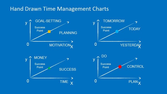
Success Rate in Comparing Money vs Time Chart Design
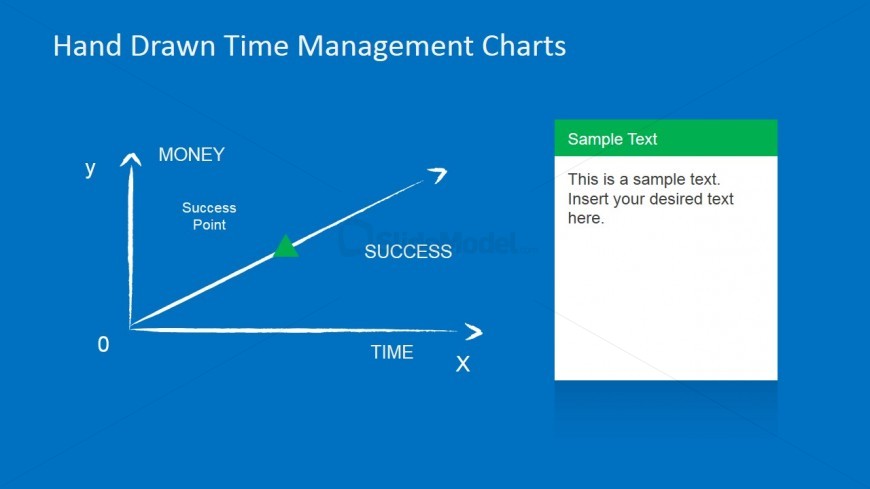
The slide demonstrates a success rate. It is done through Comparing Money vs Time Chart Design. It shows success in relation to money and time. The chart is white and hand drawn. A green triangle on the diagonal line marks success rate. The y-axis denotes the amount of money. The x-axis, on the other hand, shows the amount of time spent in saving or earning money. A white text box with a green header is on the right side of the slide.
The ideal success rate is a balance between money and time. It shows both efficiency and effectiveness. The PowerPoint objects are flexible and easy to adapt.
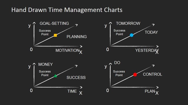
Return to Hand Drawn Time Management PowerPoint Charts.