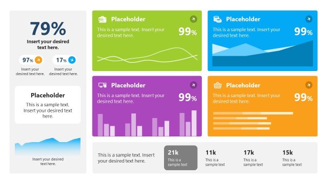
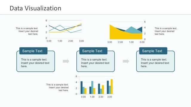
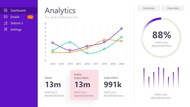
Impress corporate audiences with the information found on the Economic Analysis Data Dashboard for PowerPoint. The slide design acts a hub of information ranging from graphs, charts, to visual models. The amount of data on this slide is ideal for providing an overview for a complex collection of facts in any business presentation which needs to be handled later as a deck.
Economic analysis is a comprehensive method of determining the economic status of a particular area. This information is useful for the management teams for global business plans, as it lets them to track the state of the region representing their target market. It can be used by marketing professionals to determine the degree of advertising efforts and their corresponding results in a specific area.
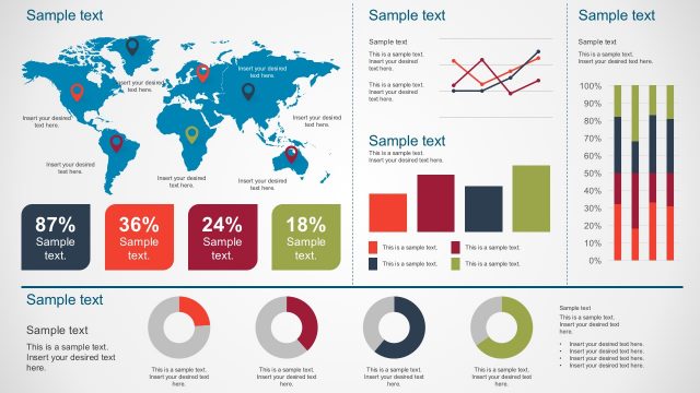
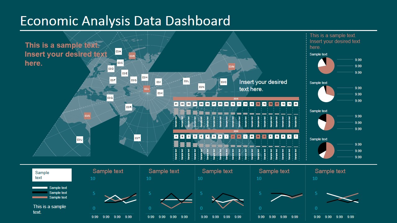
The information presented in the slide can be shown through balloon pins, text boxes, pie charts, and line graphs. The combined forces of these graphs and charts allow for a thorough and extensive data analysis. By correlating these different types of information, the presenter can highlight the relationships of certain aspects, such as sales, to another, such as customer demographic. The pie charts can reflect the market share of different company products for public consumption. The line graphs can be used in the presentation of sales in different regions, so that the team can determine the areas that should be put into the plan’s focus.
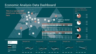
The slide is divided into segments by long white lines. The center segment contains an irregular presentation of a world map. It contains squares which mark specific areas of the world. Corresponding text boxes translate this information into tables. Beside the world map feature is a set of four pie charts, arranged vertically. These have a color scheme involving red, white, and black. Five line graphs in the bottom segment reflect this same color scheme.
Suitable for comprehensive analysis models, the Economic Analysis Data Dashboard for PowerPoint and its design are created in high definition graphics. Any modification will not have any effect on the image resolution. The presenter can download other data analysis PowerPoint templates from the SlideModel Gallery.
What’s inside this template
Example presentation scenarios
- A business analyst can use the world map and location labels to brief executives on regional market conditions and explain where performance varies by geography.
- A marketing manager can use the pie chart column and bottom line charts to compare audience segments, campaign response, or product share in a market review.
- A strategy consultant can use the dashboard layout to combine geographic context, trend signals, and short commentary in a client-facing economic analysis update.
- A finance presenter can use the line chart panels and date-grid table to report changes in economic indicators during a quarterly business review.
Features
- 100% editable presentation template
- Compatible with Microsoft PowerPoint and Google Slides
- 16:9 aspect ratio slides
- Scalable vector shapes, icons and illustrations
- Data-driven charts, editable in Microsoft Excel
- AI-Ready for Microsoft Copilot and Claude
- Instant access and download
Frequently asked questions
Q: How should a presenter explain this dashboard without overwhelming the audience?
A: Start with the headline message, then guide the audience by zones: map first for geographic context, pie charts next for composition, and line charts last for trend evidence. Avoid reading every label. Use the editable text callouts to state the interpretation so the audience understands what the dashboard proves.
Q: Who is this dashboard best suited for?
A: This template fits analysts, marketing managers, consultants, and finance teams who need to present an executive snapshot of market or regional performance. It works best when several related indicators must be viewed together, such as territory data, share breakdowns, and short time-series trends.
Q: Why does the design combine a map, pie charts, and line charts on one slide?
A: The map provides spatial orientation, the pie charts show proportional breakdowns, and the line charts show movement over time. Placing them on one dashboard helps the audience connect location, mix, and trend patterns instead of treating each metric as a separate story.
Economic Analysis Data Dashboard for PowerPoint
1-slide presentation template with economic dashboard, world map, pie charts, and line charts
Economic Analysis Data Dashboard for PowerPoint is a 1-slide data dashboard template for reporting regional economic indicators. It combines a world map with location labels, stacked pie charts, small multiple line charts, and a compact tabular date grid for analysts, managers, and marketers using PowerPoint or Google Slides.
- Category
- Data & Charts
- Rating


 Loading...
- Aspect ratio
- 16:9
- Item ID
- 7066-01
- Colors
 Microsoft PowerPoint
  Microsoft Copilot
  Claude for PowerPoint
 Other formats supported
Subscribe today and get immediate
access to download our PowerPoint templates.