Dos and Don’ts PowerPoint Template
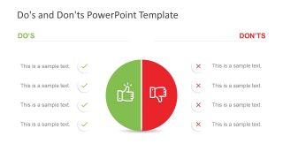
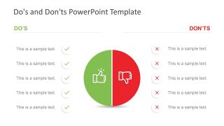
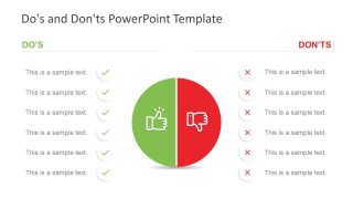
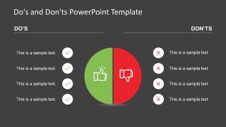
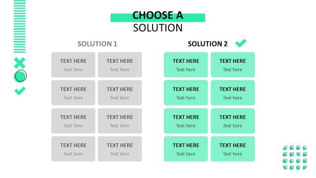
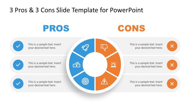
The Do’s and Don’ts PowerPoint Template is a presentation tool for comparison topics. It is a data table design with thumbs up and down icons. There are four slides of dos and don’ts displaying a different number of rows in each. The last slide, however, contains a black background, which can help users select a template according to their presentation theme. These do’s and don’ts slides show two content layouts with circular clipart icons in the middle. This icon shows two halves of a circle with thumbs-up and thumbs-down icons. Further, thumbs up is a green half-circle shape, while thumbs down is red. These two colors are commonly used for right/wrong, true/false, yes/no, etc.
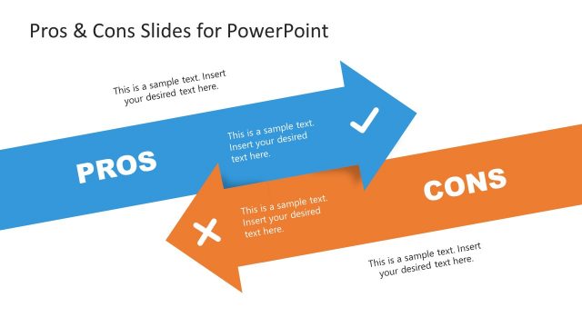
The Do’s and Don’ts PowerPoint Template provides four, five, and six rows layouts. These slides, at a professional level, assist in comparing products, services, or solutions. The two-segment process can also demonstrate the current and future state of an entity. It could be a company, its services, or its process approach. Or, explain the pros and cons of a process as a brainstorming activity among peers. But more importantly, these slides enable the audience to understand which action should or shouldn’t be taken during the project. The correction symbol “green tick” represents dos as bullet points, while “red cross” is for don’ts.
The do’s and don’ts template is fully editable and customizable in Microsoft PowerPoint and Google Slides. Therefore, users can change the colors of background, shapes, icons, and text by using formatting options. They can also edit text placeholders by adding important presentation content. They can replace circular bullet points and half-circle shapes created in PowerPoint with any other figure available. These feature of changing flat shapes or colors enables users to adjust new slide into their existing presentation’s theme.
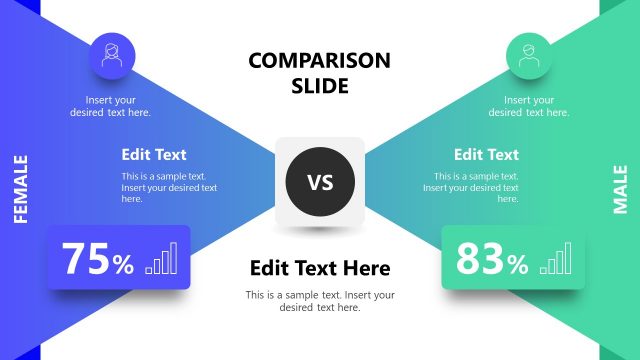
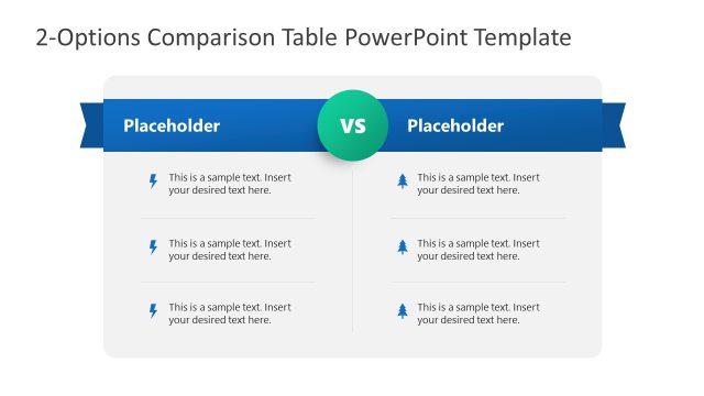
Alternatively, you can download other comparison slides with 100% editable placeholders, flexible tables and creative infographics to use in professional PowerPoint presentations.


