Slide 3 of 4 from Bell Curve for PowerPoint
6072-05-concept-curves-bell-3
Bell Curve Comparison Slide for Presentations
- Diagram
- Comparison Split
- Evaluation Slide
- 16:9
- 100% Editable
About This Slide
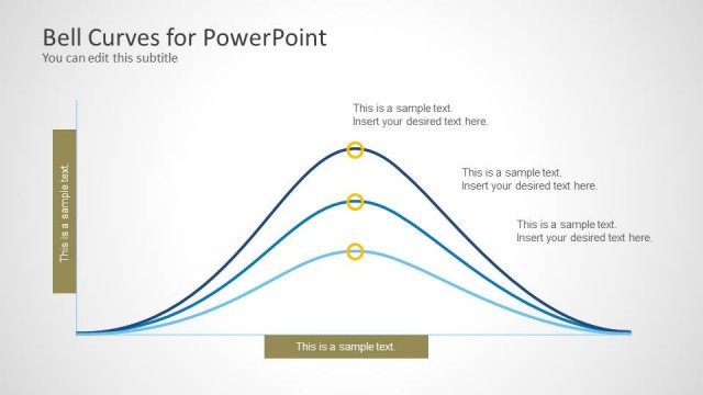
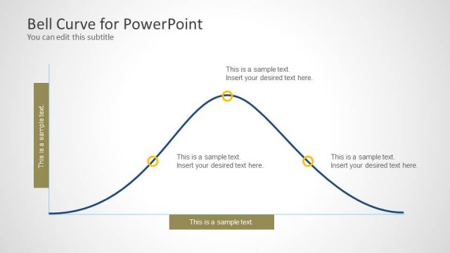
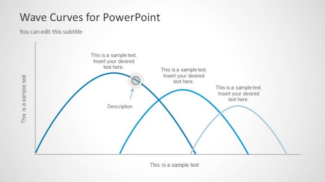
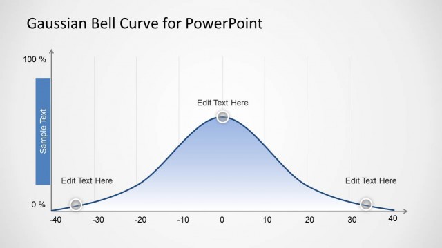
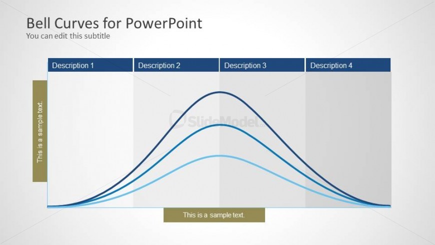
Bell Curve template for PowerPoint with four phases in the slide design. You can edit this slide design and enter your own descriptions.
What’s on This Slide
The slide features a horizontal layout with four distinct sections. Each section contains a title placeholder at the top, labeled 'Description 1' through 'Description 4.' Below each title, there are two bell curve shapes, varying in thickness and color, representing different data distributions. The curves are aligned horizontally, flowing from left to right. Each section has a text placeholder at the bottom, aligned centrally, for additional descriptions. The background is light, with a subtle gradient, enhancing the visual clarity of the curves.
How to Use It
This layout serves as a comparative analysis tool for presenting multiple bell curves side by side. It is suitable for illustrating statistical distributions in business or academic contexts. This slide fits well in a presentation sequence following an introduction to normal distribution concepts, allowing for detailed exploration of variations in data. It can be used to discuss performance metrics, survey results, or any scenario where data distribution is relevant.
Text Placeholders & Capacity
Keep your copy within these limits so it fits without resizing. Node body slots can accommodate roughly 10-15 words each.
| Placeholder | Count | Max characters (approx.) |
|---|---|---|
| Slide title | 1 | 30 |
| Subtitle | 1 | 30 |
| Item heading | 4 | 15 |
| Item body | 4 | 50 |
Slide Keywords
Download unlimited PowerPoint templates, charts and graphics for your presentations with our annual plan.
DOWNLOADReturn to Bell Curve for PowerPoint.