As we mentioned in our previous article about drop shadows in PowerPoint, adding shadow effects can make elements pop up from a presentation. But what about text? Do the same premises work when we apply text shadow in PowerPoint? Stay tuned for a detailed guide on this subject.

Considerations for using shadow effects with text
“Less is more” would be a great motto to follow when considering shadow effects in text. Why is that? Simple: shadow effects, when used wrong, affect text legibility.
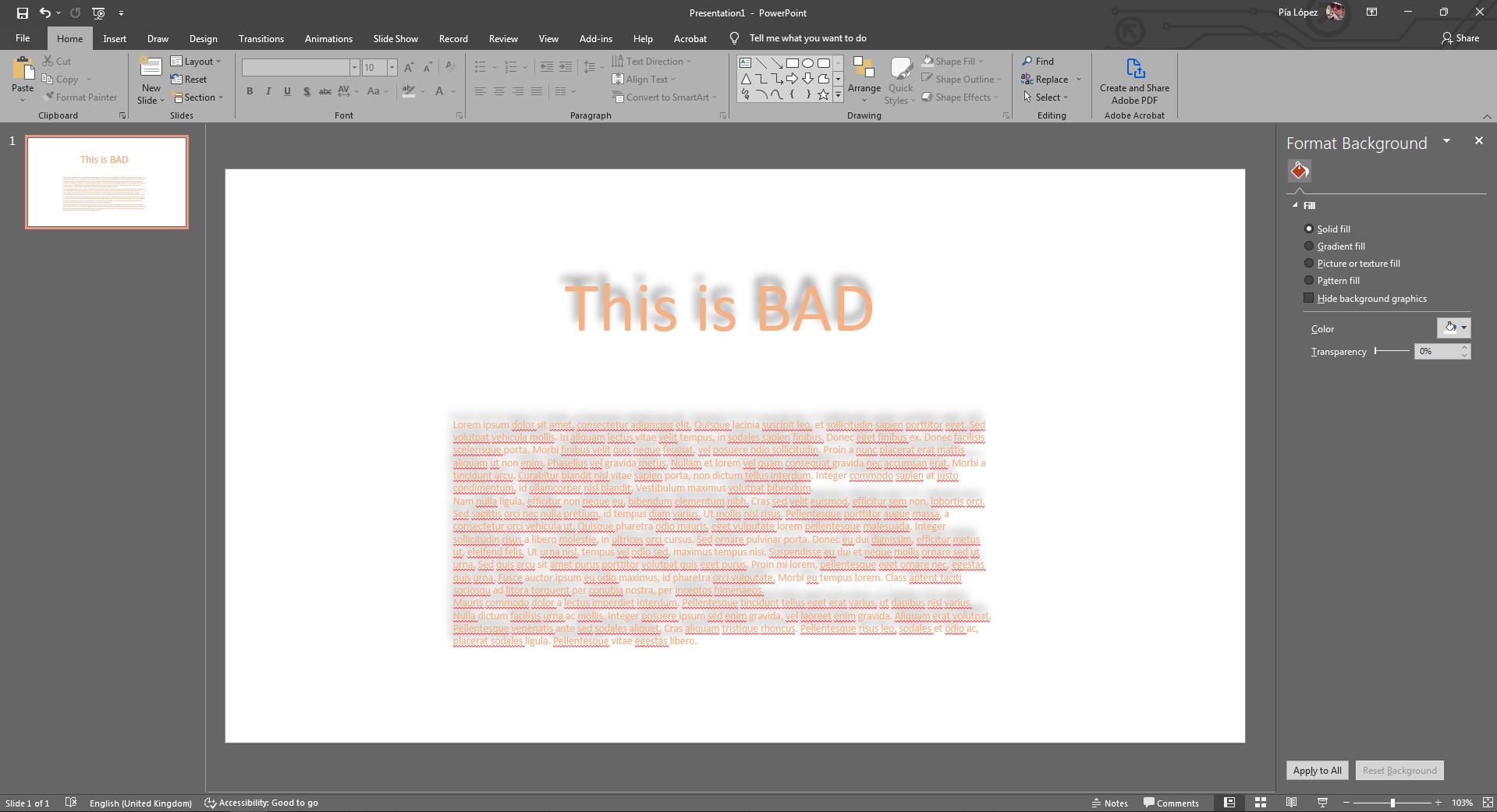
Ignore the lorem ipsum generator for a second and try to read what’s written with the text shadow applied. The two reasons why you experience discomfort reading this are:
- Little contrast between the text color and the shadow. On some occasions, it can make the text look as if blended with the shadows.
- The shadow effect is set to be far from the text and with increased blurriness.
- Applying text shadow to all characters in the text instead of using it to make some elements stand out.
Graphic design rules apply to presentation design. Hence, please don’t overdo shadow effects if your aim is to elevate the quality of your presentations.
Method #1 – Apply a text shadow in PowerPoint via the Ribbon
This first method is the most common approach when using text shadows. For this tutorial purpose, we will create simple text in a blank PowerPoint presentation.
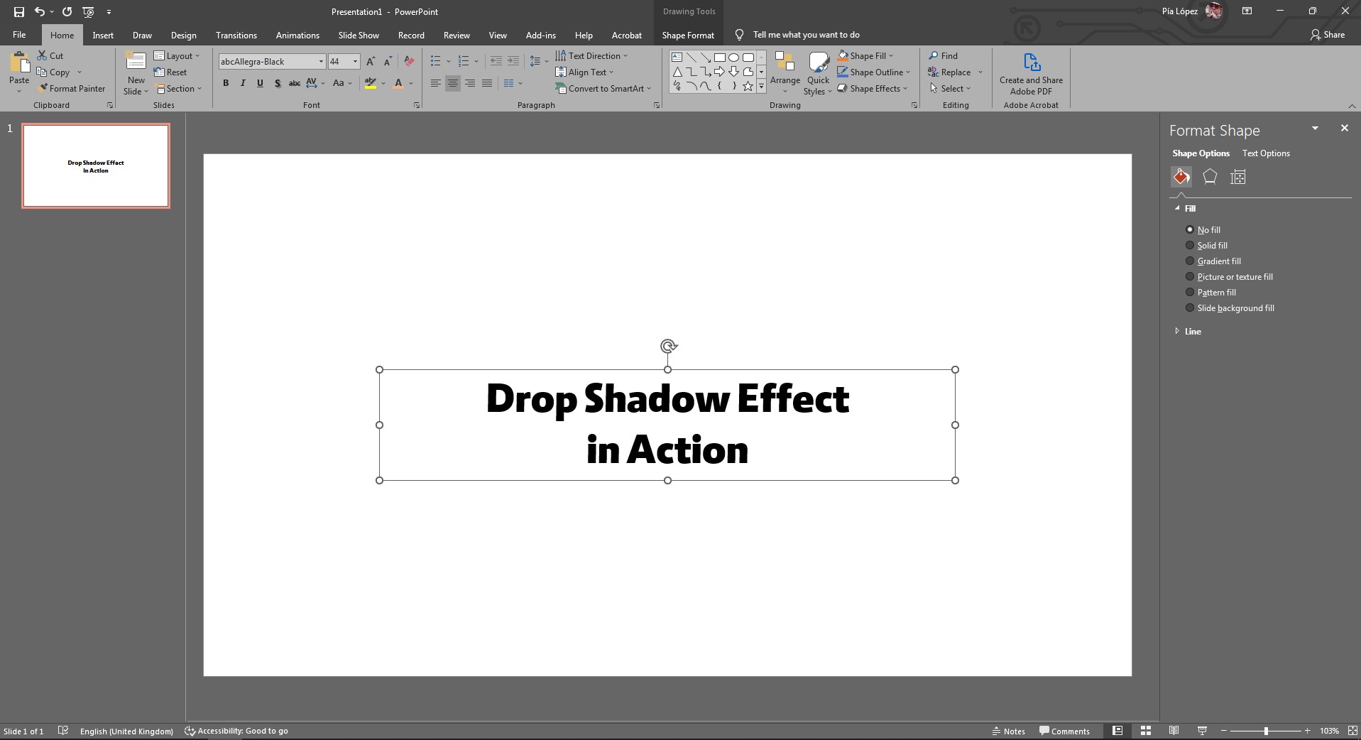
The font used is Allegra Black, which will create an interesting contrast between text and shadow. Yes, color contrast and font-weight matter when applying text shadows in presentation design.
Select the text box (not the text itself), and go to the Ribbon.
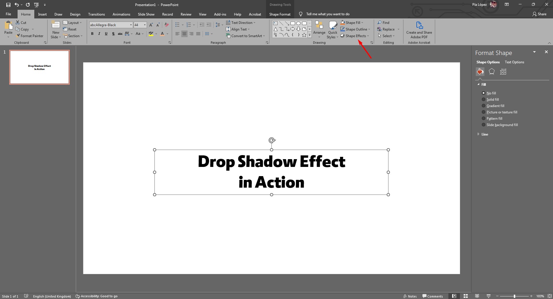
Click on Shape Effects and browse to Shadows.
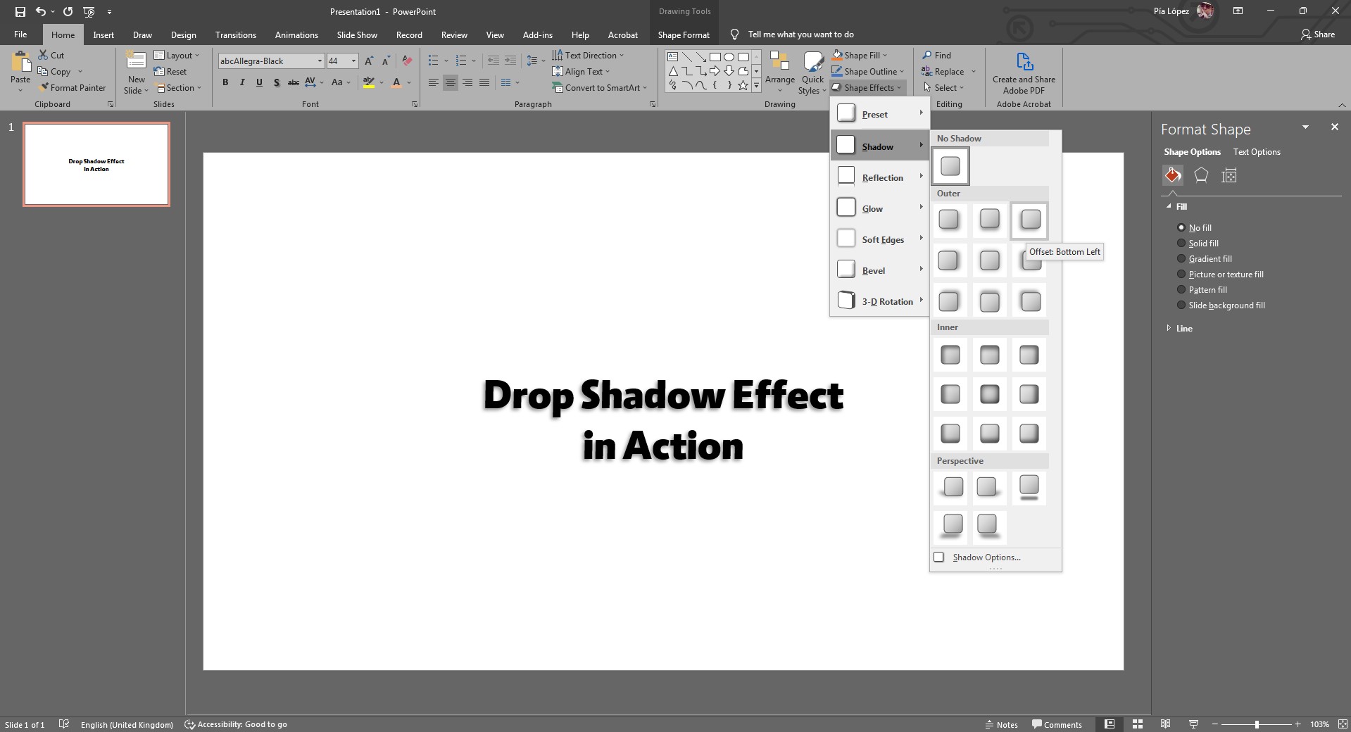
In this case, we will stick with Offset Bottom Left. And this is how the effect should look.
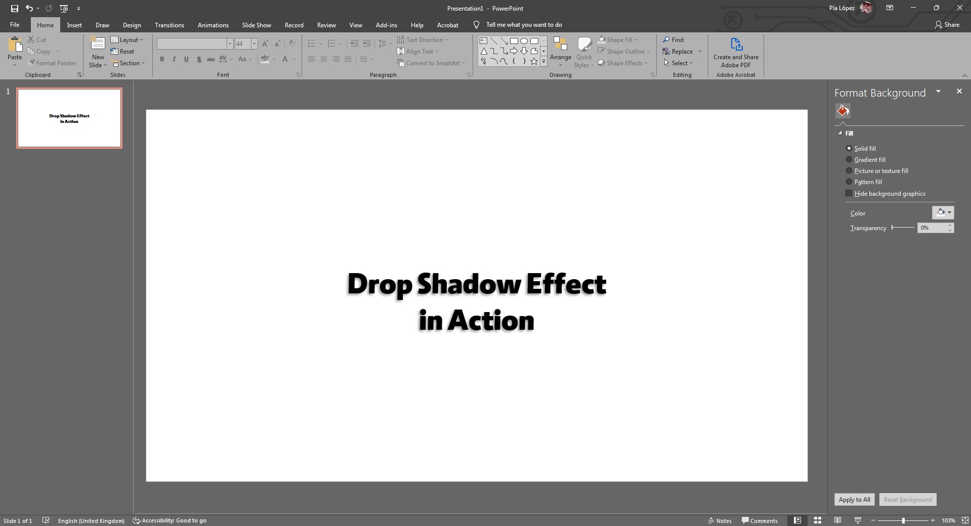
To tweak this shadow effect, access the Shadow Options in the same menu we were in before.
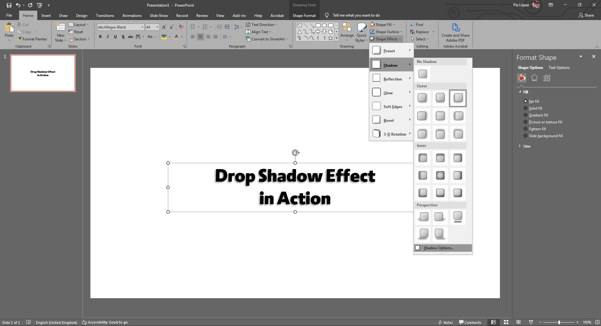
Now, the parameters for the shadow effect in PowerPoint are:
- Preset: Selects the behavior of the shadow effect, meaning from which direction it comes.
- Color: By default is black. Change the color to see some interesting results.
- Transparency: The optimal values for this slider are between 55-65% Anything lower than 55% would look too dark, and anything higher than 65% will be so transparent that the text shadow effect won’t be seen.
- Size: Should always be 100%. Otherwise, it nulls the shadow effect.
- Blur: Try to keep it between 2-4pts.
- Angle: Defines the position for the shadow effect.
- Distance: As the name says, how far the shadow is from the object/text.
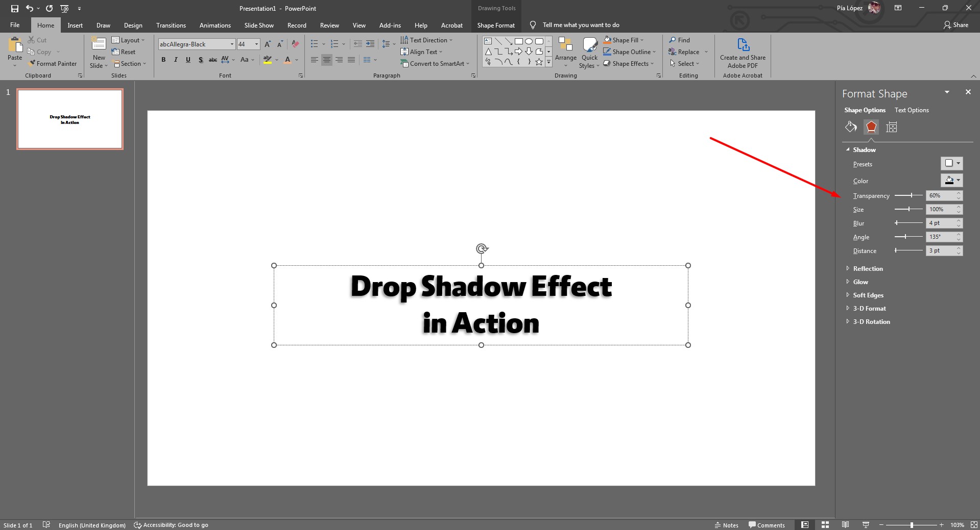
As you can see below, by altering these parameters, just one of them, the shadow effect can drastically change.
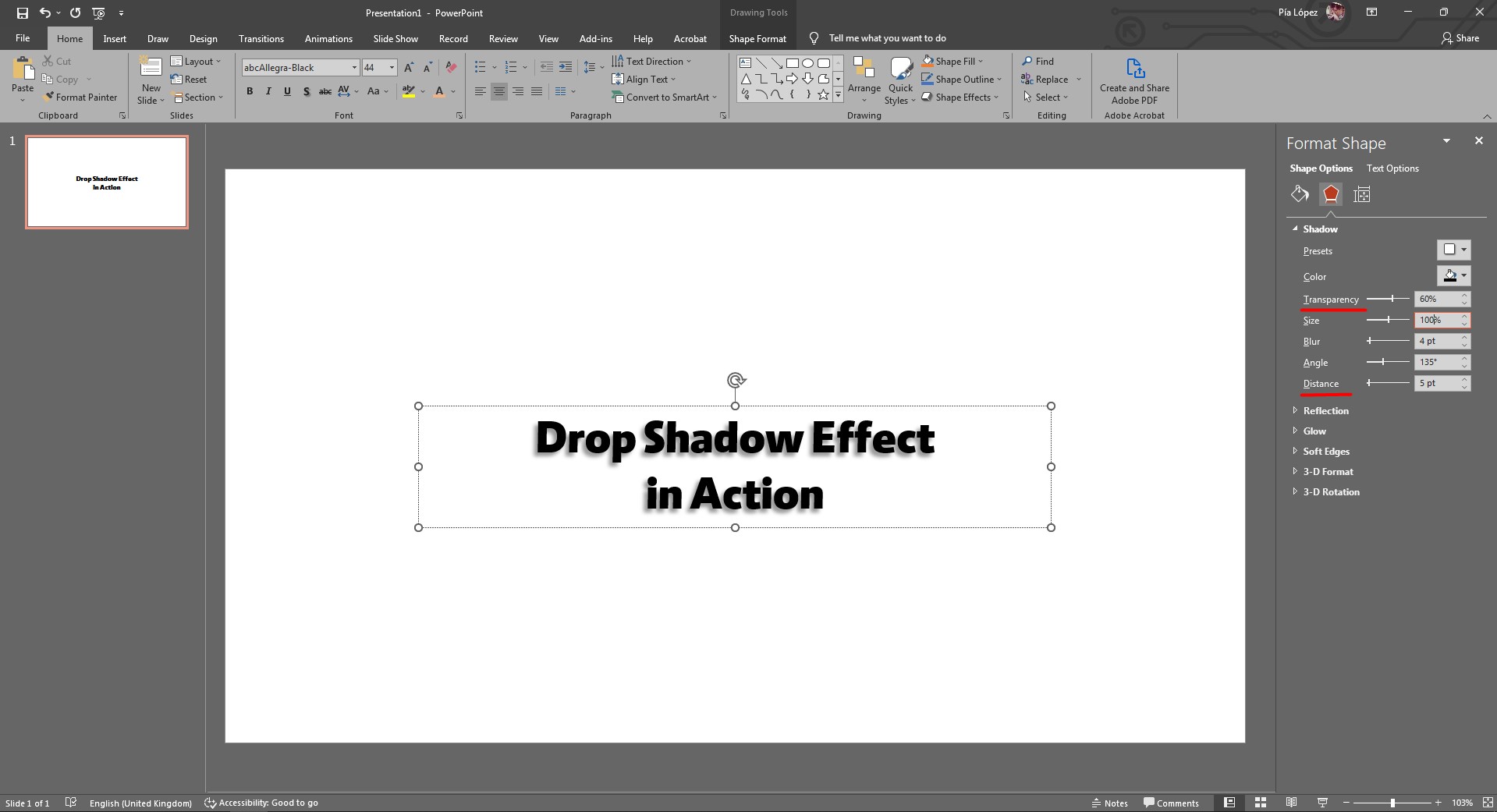
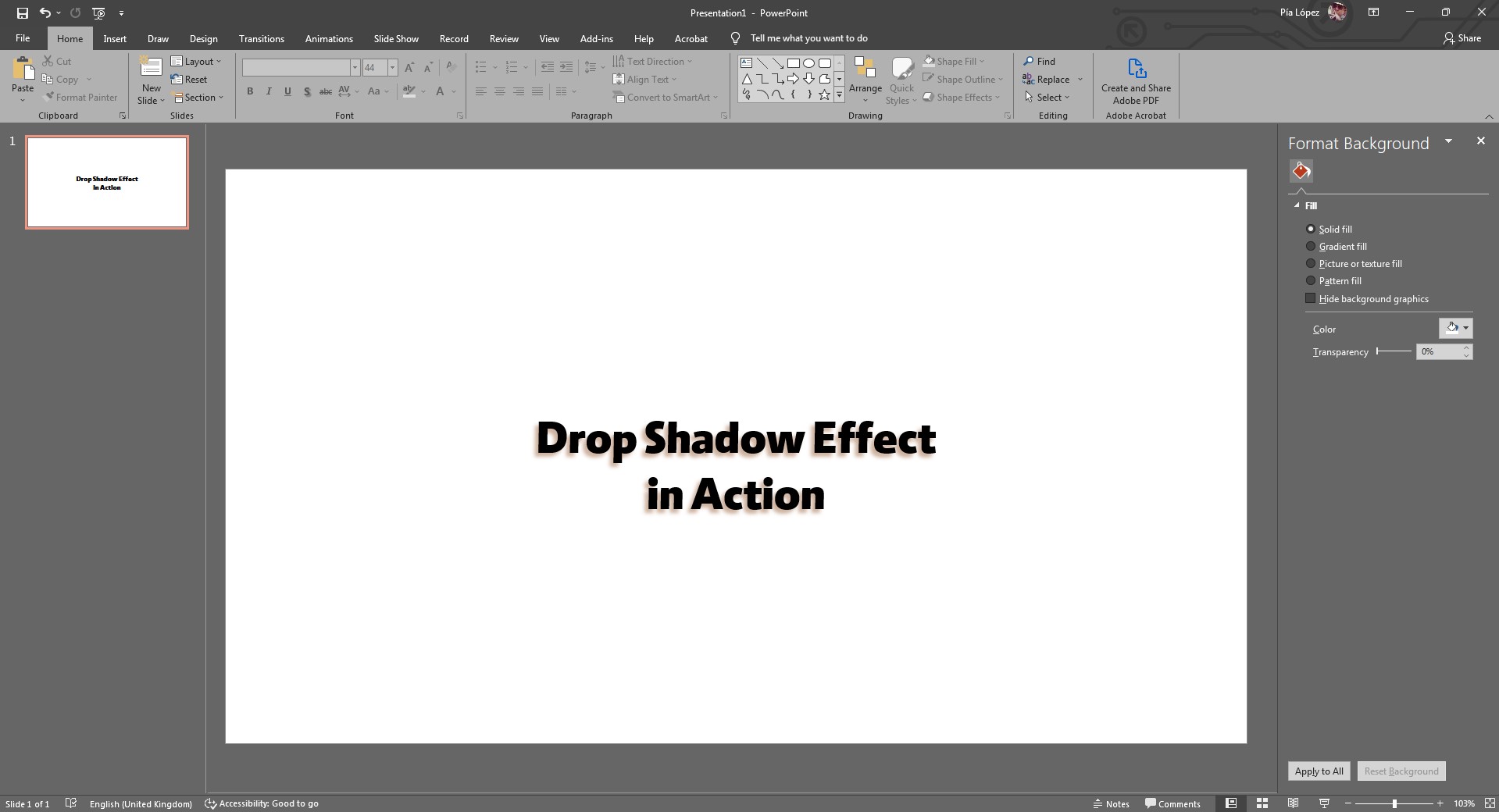
And as a final step, here is what the shadow would look like if altering the color value.
Method #2 – Apply text shadow in PowerPoint via right-click
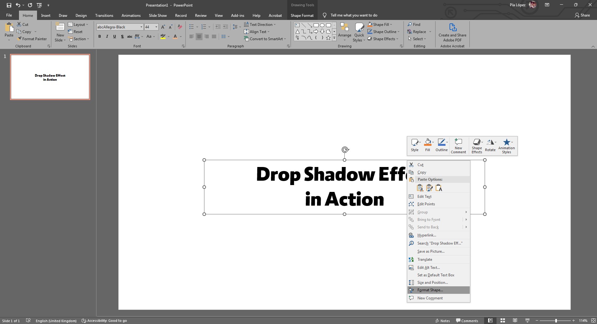
This is an alternative method. Once you have your textbox in place, select it and then right-click.
Go for the option Format Shape. That will open the panel we’ve seen above. Also, keep in mind that clicking on Shape Effects can have the same result.
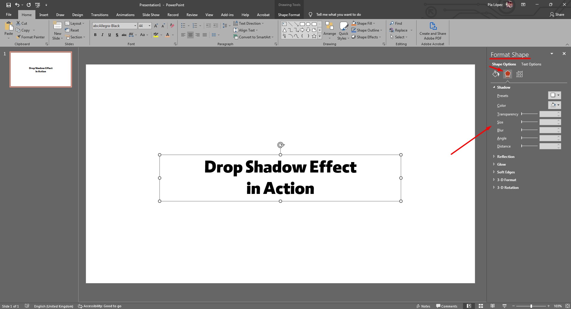
Once the Format Shape panel opens on the right side, click on the pentagon icon. That opens the Shadow Options.
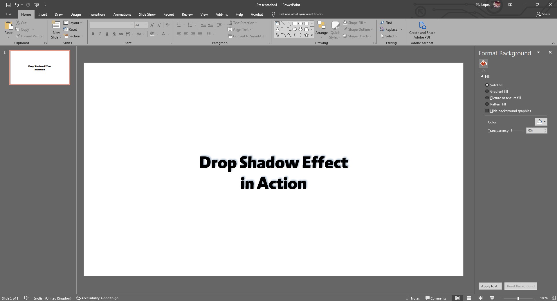
And to conclude, this is the end result with a different color applied to the shadow and a different angle.
FAQs
How can I apply a text shadow in PowerPoint?
To apply a text shadow, select the text box, go to the Shape Format tab, choose Shape Effects from the ribbon, and click Shadow. You can choose from preset shadow options or customize the shadow further by adjusting settings such as color, transparency, size, blur, angle, and distance.
What is the ideal transparency level for text shadows in PowerPoint?
The ideal transparency level for text shadows in PowerPoint is between 55% and 65%. This provides enough visibility without making the shadow too dark or too light.
Can I change the color of the text shadow?
Yes, you can change the color of the text shadow by selecting Text Outline in the Shape Format tab, navigating to Shadow Options, and choosing a custom color for the shadow.
Why does my text become hard to read after applying a shadow effect?
The text may become hard to read if there’s little contrast between the text and the shadow, or if the shadow is set too far from the text with excessive blurriness. To avoid this, maintain contrast between the text color and the shadow, and avoid overly large or blurry shadows.
How do I remove a shadow effect from my text?
To remove a text shadow, select the text box, go to Shape Format > Shape Effects > Shadow, and select No Shadow to remove the effect.
What font and color choices work best for applying text shadows?
Fonts with heavier weight, like bold fonts, and colors with good contrast to the shadow work best. Lighter colors with darker shadows, or vice versa, can create a visually appealing effect while maintaining readability.


