Slide 6 of 8 from Free Smart Chart PowerPoint Templates
Horizontal Smart Bar Chart PowerPoint
Horizontal Bar Chart for Data Comparison
- Chart
- Bar Horizontal
- Evaluation Slide
- 16:9
- 100% Editable
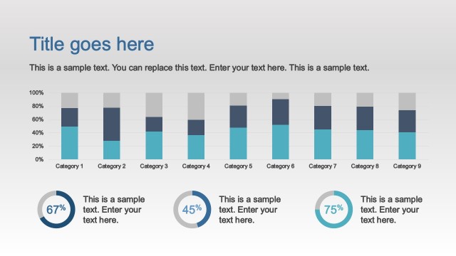
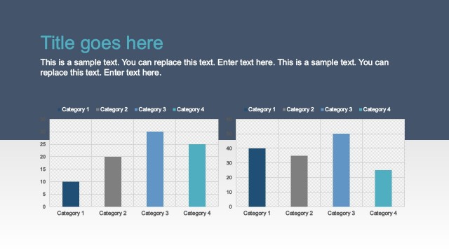
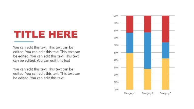
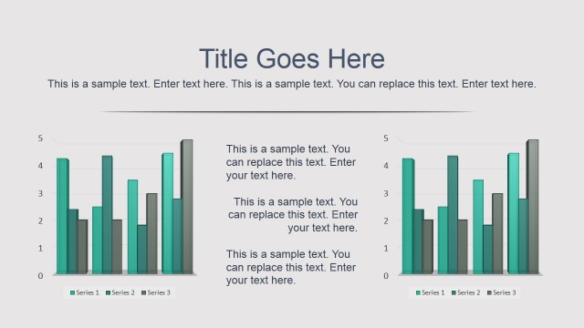
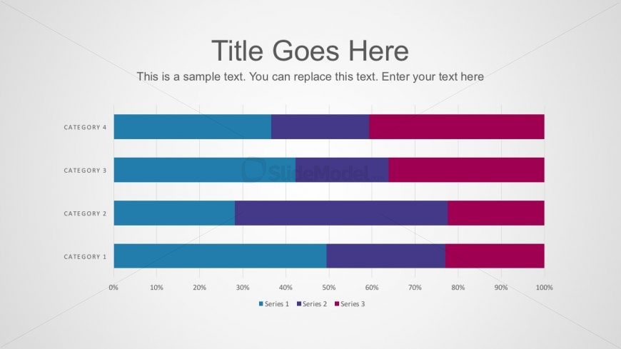
The Horizontal Bar Chart slide from the Free Smart Chart PowerPoint Templates offers a clear way to visualize performance metrics and financial comparisons. This editable slide template includes distinct colored bars for multiple data series, making it suitable for business presentations and pitch decks that require detailed survey results or market analysis. Its design supports effective communication of comparative data across categories using vector icons and clean layout elements.
What’s on This Slide
The layout features a horizontal bar chart with four categories labeled vertically on the left. Each category has three colored bars representing different series, arranged horizontally. The bars are evenly spaced and extend across the slide, with the x-axis showing percentage values from 0% to 100%. There are text placeholders at the top for the title and a subtitle below it, both centered. The overall color scheme includes shades of blue, purple, and pink for the bars, with a light background that enhances visibility.
How to Use It
This layout serves as a data comparison tool, effectively displaying multiple series across categories. It fits well in presentations that require visualizing performance metrics, survey results, or financial data comparisons. It can be used in business meetings to present sales figures, project progress, or market analysis. This slide is best positioned after introductory content to provide detailed insights into specific data points or trends.
Text Placeholders & Capacity
Keep your copy within these limits so it fits without resizing. Node labels can accommodate about 4-5 words each.
| Placeholder | Count | Max characters (approx.) |
|---|---|---|
| Slide title | 1 | 30 |
| Subtitle | 1 | 50 |
| Item heading | 4 | 20 |
| Item body | 3 | 15 |
| Axis label | 1 | 20 |
Slide Keywords
Download unlimited PowerPoint templates, charts and graphics for your presentations with our annual plan.
DOWNLOADReturn to Free Smart Chart PowerPoint Templates.