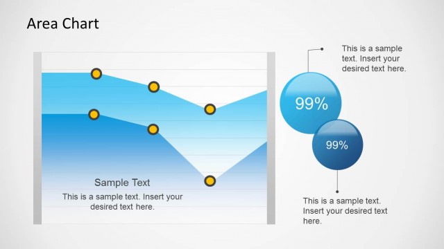
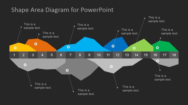
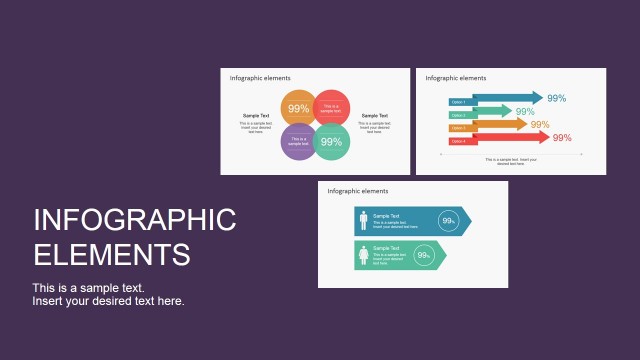
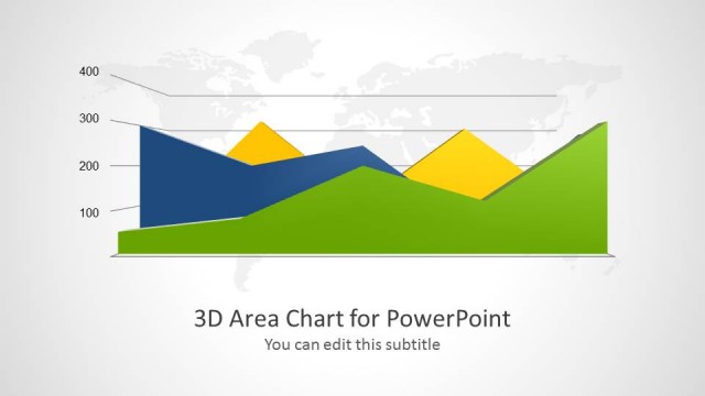
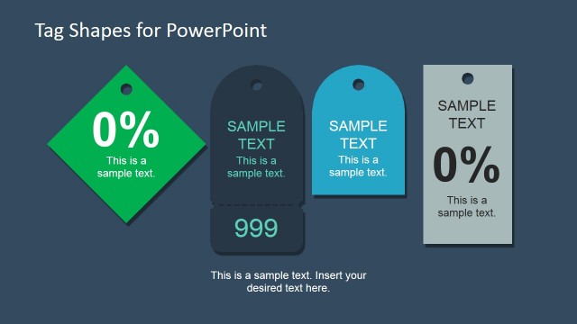
Infographics Area Chart Template for PowerPoint is a presentation chart design that you can copy and paste into your own PowerPoint presentations to make infographics using Microsoft PowerPoint.
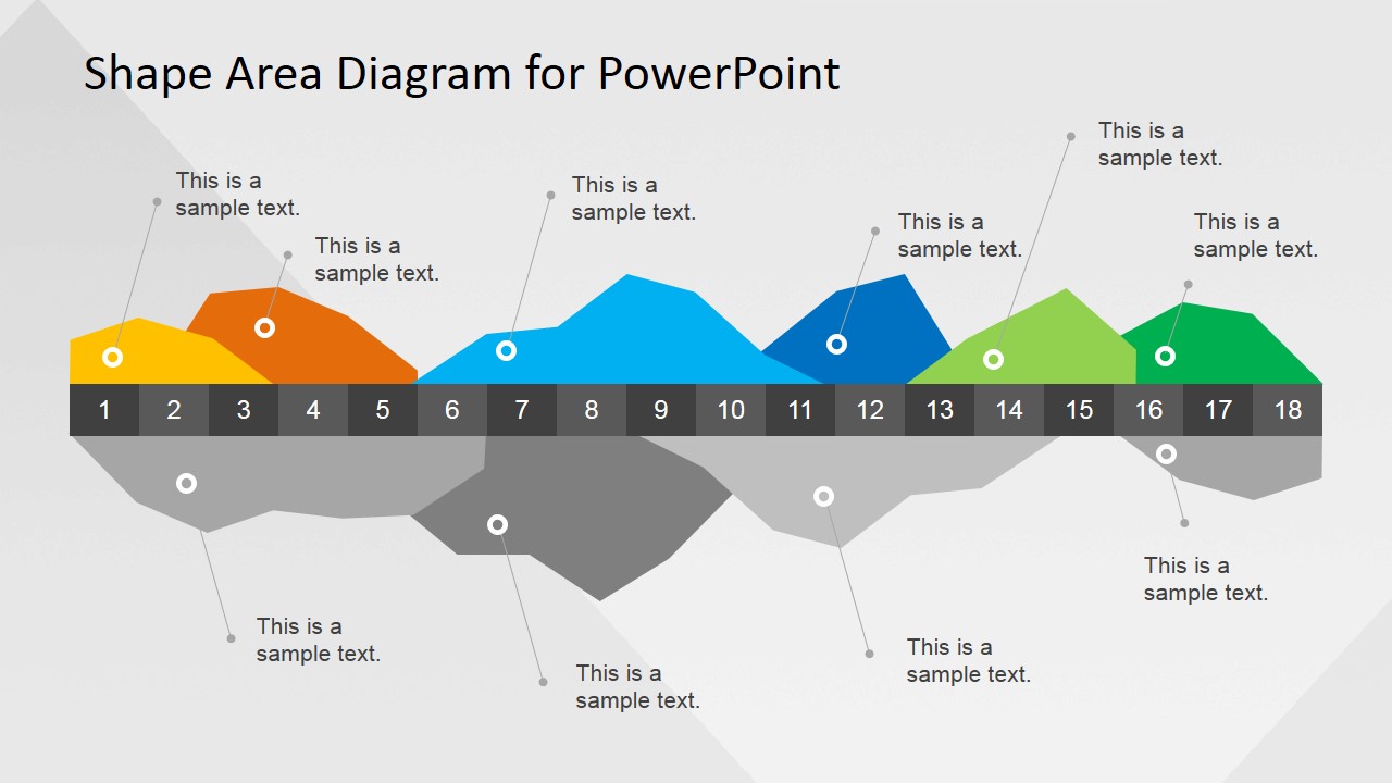
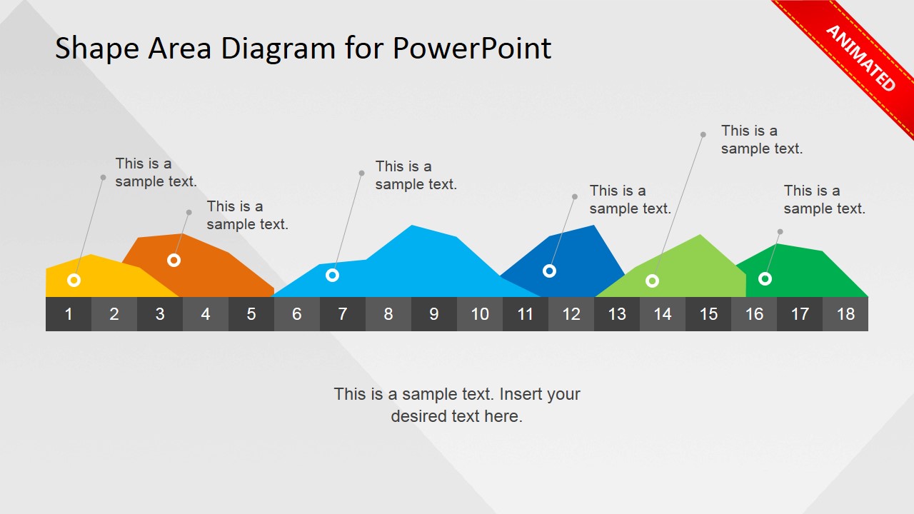
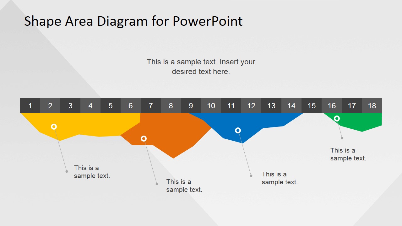
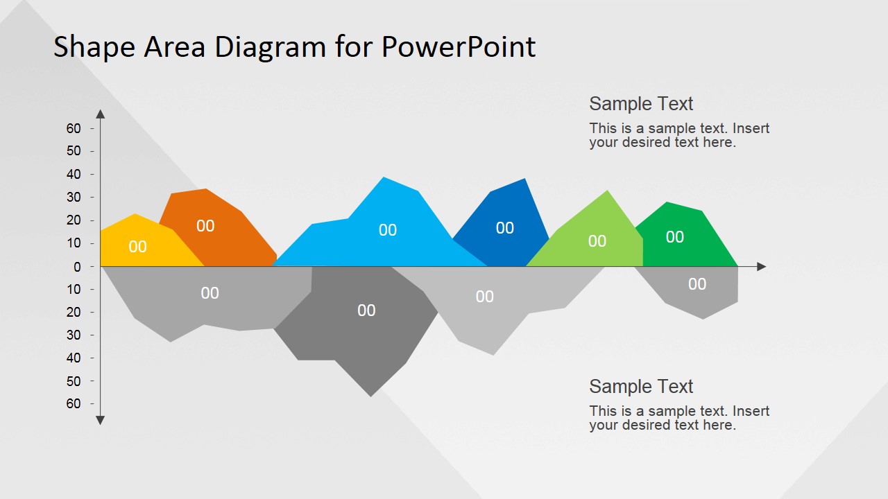
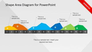
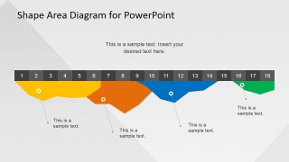
Inside this data chart template you can find a colorful Area Chart created with shapes and a few additional slides with (a) animated area chart slide design, (b) inverted area chart for PowerPoint.
This area chart was created with PowerPoint objects (shapes) so you can easily manipulate the chart editing the points. This is not a data-driven chart which means that you cannot edit the data using Excel, instead you can easily change the data points by editing the PowerPoint shape. If you are looking for a data-driven area chart for PowerPoint please browse our data-driven PowerPoint templates gallery.
What’s inside this template
Example presentation scenarios
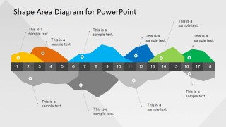
- A business analyst can use the numbered area chart to explain how performance changes across 18 periods while placing callouts on the most important peaks and dips.
- A marketing manager can use the positive-only area chart to show campaign momentum and attach short notes to selected growth points.
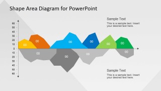
- A finance presenter can use the axis-based positive-negative chart to compare gains and losses around a baseline during a monthly review.
- A consultant can use the inverted area chart to discuss risk exposure, backlog, or underperformance across sequential stages without building a spreadsheet-heavy slide.
Features
- 100% editable presentation template
- Compatible with Microsoft PowerPoint and Google Slides
- Scalable vector shapes, icons and illustrations
- AI-Ready for Microsoft Copilot and Claude
- Instant access and download
Frequently asked questions
Q: How should a presenter explain the area chart without overwhelming the audience?
A: Treat the chart as a visual trend story, not as a table. Start with the numbered band, identify the period range, then use only the strongest callouts to explain peaks, dips, or transitions. On slide 4, separate positive and negative movement around the baseline so the audience sees direction before details.
Q: Who is this template best suited for?
A: This template fits analysts, consultants, managers, and marketing presenters who need to show movement over time or across numbered steps. It works well when the message is pattern recognition, such as growth, decline, recovery, or risk concentration, rather than exact data extraction from a spreadsheet.
Q: Why use a shape area diagram instead of a standard line chart?
A: The filled area shapes create a stronger visual metaphor for volume, pressure, or accumulation than a thin line. The numbered band acts like a timeline, while leader-line callouts let the presenter explain causes or events at specific points. This design makes the slide more suitable for narrative explanation than raw measurement.
Infographics Area Chart Template for PowerPoint
4-slide presentation template with editable shape area charts and infographic callouts for PowerPoint and Google Slides
Infographics Area Chart Template for PowerPoint is a 4-slide chart infographic set for showing trends with editable PowerPoint shapes. It includes a numbered horizontal area chart, a positive-only version, an inverted area chart, and an axis-based positive-negative chart. It is intended for analysts and business presenters using Microsoft PowerPoint or Google Slides.

 Loading...
 Microsoft PowerPoint
  Microsoft Copilot
  Claude for PowerPoint
 Other formats supported
Subscribe today and get immediate
access to download our PowerPoint templates.