Data Driven Infographic PowerPoint Charts
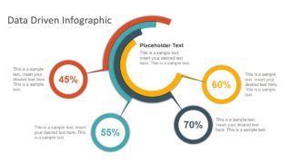
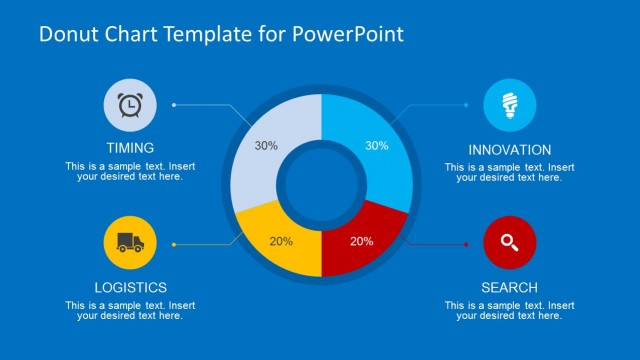
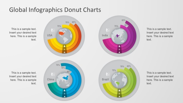
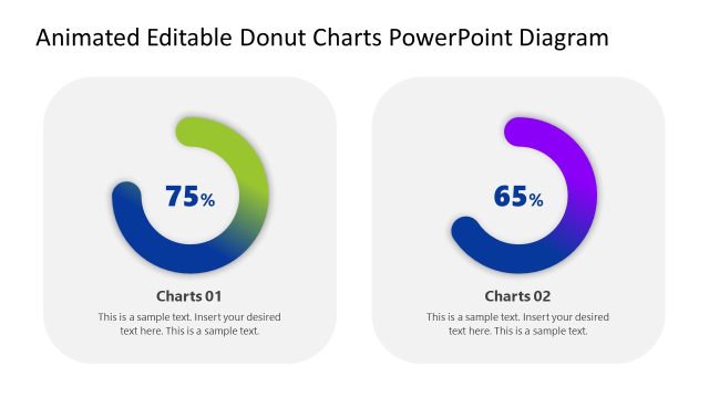
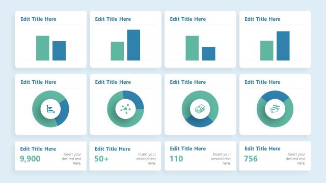
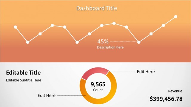
The Data Driven Infographic PowerPoint Chart is an eye-catching visualization template. The template is a 1-slide diagram design to display statistical data in 4 segments. This infographic layout design is suitable for data reporting presentations such as sales targets and performance reviews. Therefore, it is an ideal dashboard presentation tool in PowerPoint. This data-driven infographic chart is basically a custom doughnut chart. It contains a stack of doughnut charts to demonstrate qualitative information about multiple elements. Further, this custom chart adds a modern minimal outlook to data-driven infographic diagram. Because the colors and placement of doughnut charts give an idea of advance technology graphics.
The Data Driven Information PowerPoint Chart shows 4 segments in different colors. These segments use doughnut charts as status bar charts to visualize work progress. The users can customize shape, size, colors, and data values of these graphics by simply editing custom features. Furthermore, the circular shapes of PowerPoint display performance percentage that are editable text placeholders. The users can also add more information in available text placeholders.
The template of Data-Driven PowerPoint is a flat infographic visualization slides for periodic performance reports. Because this slide can simplify presentation of complex data and convey concepts effectively. For more information, we have created an article about data presentations.

