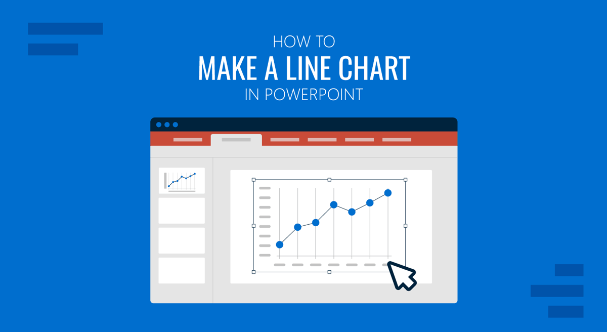
Line charts are among the most widely used in business presentations. They are clear, intuitive, and ideal for illustrating how values evolve. Many business presentations that showcase sales growth, performance trends, operational metrics, and forecasting data use line charts in PowerPoint. Although many presenters prefer to build charts in Excel or Power BI, PowerPoint offers built-in charting tools that make it easy to create visuals tailored to presentations.
In this guide, we will show you how to make a line chart in PowerPoint, customize it for business presentations, and discuss what formatting options to consider for improving clarity and impact.
Why Use a Line Chart in PowerPoint
If you are new to line charts, take some time to understand their utility and importance.
1. Use for Time-Based Data: Line charts excel at showing changes over time, monthly revenue, quarterly performance, annual sales trends, or week-over-week metrics.
2. Ideal for Showing Patterns and Trends: A line chart makes it easier to spot upward or downward trends, volatility, plateaus, and cyclical patterns. These insights are much harder to extract from raw tables.
3. Great for Comparing Multiple Data Series: PowerPoint allows multiple lines on one chart, so analysts can compare regional performance, product categories, historical vs. forecast data, and before-and-after results.
4. Clean and Minimalist: Unlike bar or column charts, line charts focus attention on movement and trajectory, which makes them easier to read.
5. Presentation-Friendly: PowerPoint includes formatting tools, colors, labels, markers, and animations that make charts visually appealing and easy for audiences to follow.
How to Create a Line Chart in PowerPoint
Below are a few simple steps for creating a line chart PPT.
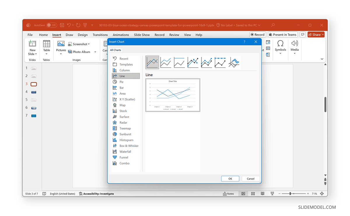
Step 1: Open PowerPoint, go to the slide where you want the chart, and select Insert -> Chart.
Step 2: From the Chart dialog box, choose Line from the left-hand menu and select your preferred line chart type. The available options include the following chart types:
- Line
- Stacked Line
- 100% Stacked Line
- Line with Markers
- Stacked Line with Markers
- 100% Stacked Line with Markers
- 3-D Line
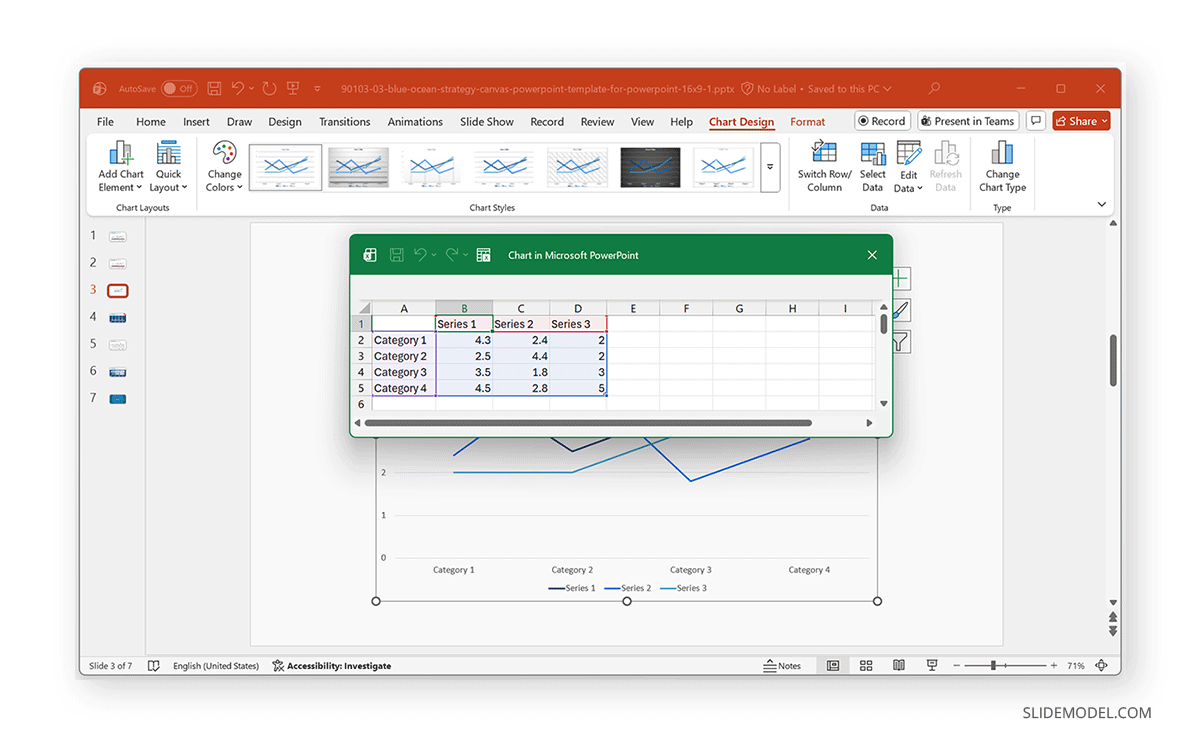
Step 3: Once you click OK, PowerPoint will insert a default line chart along with an Excel data window. Once the chart appears, an embedded Excel sheet opens. To modify the data:
- Replace the sample categories (e.g., Category 1, Category 2) with your actual time-based labels, months, quarters, years, etc.
- Replace the sample numbers with your real values.
- Add or delete series as needed by expanding rows and columns in the Excel sheet.
Step 4: Format the Chart for Clarity
The default PowerPoint line chart includes many elements that you might not need. Use the tips below to improve line chart readability. In case you find it challenging to use this method, you can use our Line Chart PowerPoint Templates to create designs that suit your needs quickly.
- Adjust the Line Thickness: You can adjust the line chart thickness by going to a line and selecting Format Data Series -> Width to change the line width. Thicker lines are easier to see on large screens, so you might want to ensure that your chart lines are thick enough to be legible.
- Choose Colors: You can choose corporate colors or consistent palettes. Avoid low-contrast combinations such as light gray and pastel tones.
- Add or Remove Markers: Markers can enhance visibility, but too many can clutter the chart.
- Refine the Axes: Remove unnecessary gridlines, adjust axis labels for better spacing, and format numbers (e.g., 10K instead of 10,000).
- Edit the Chart Title: Replace the placeholder title with a meaningful headline, such as:
“Quarterly Revenue Growth” or “Year-Over-Year Performance Trend”. - Remove the Legend if Unnecessary: If your chart has a single line, you don’t need a legend. For multiple lines, keep the legend concise and place it strategically (top or right is usually best).
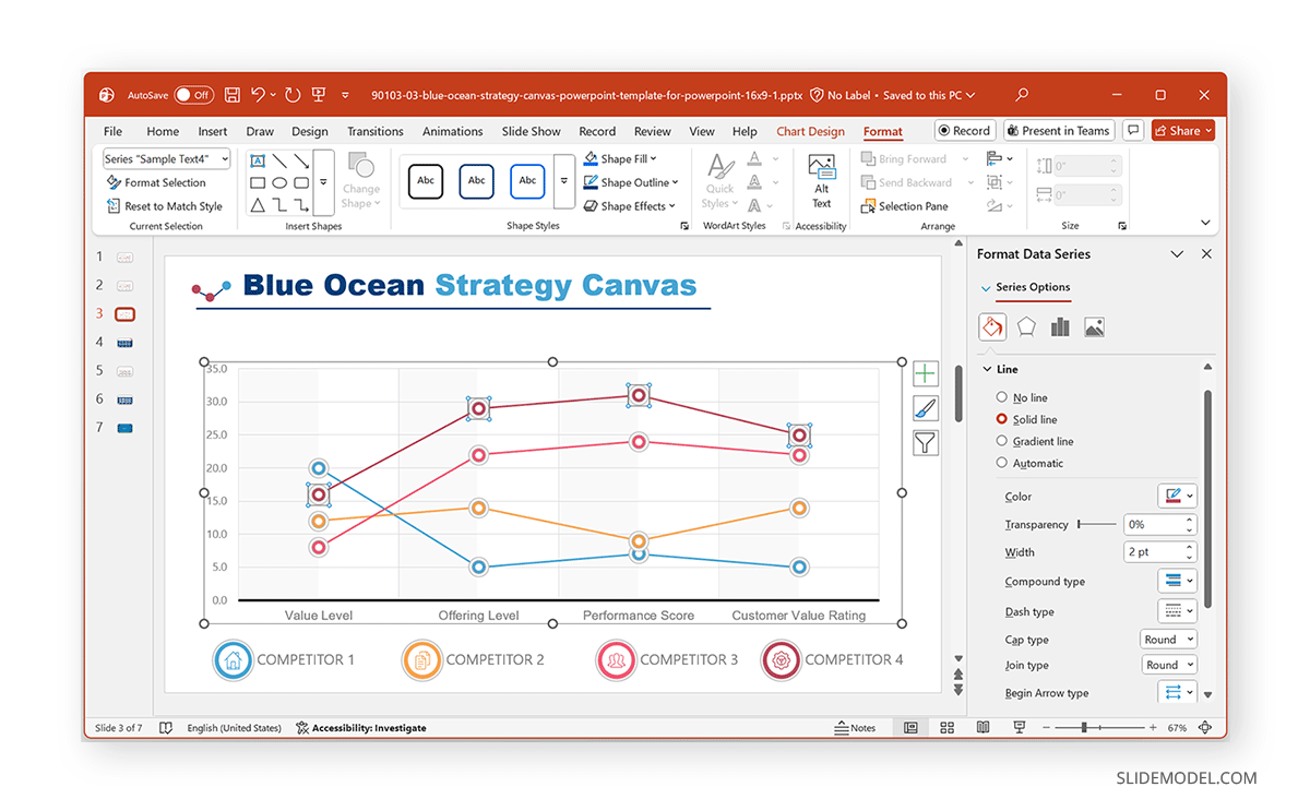
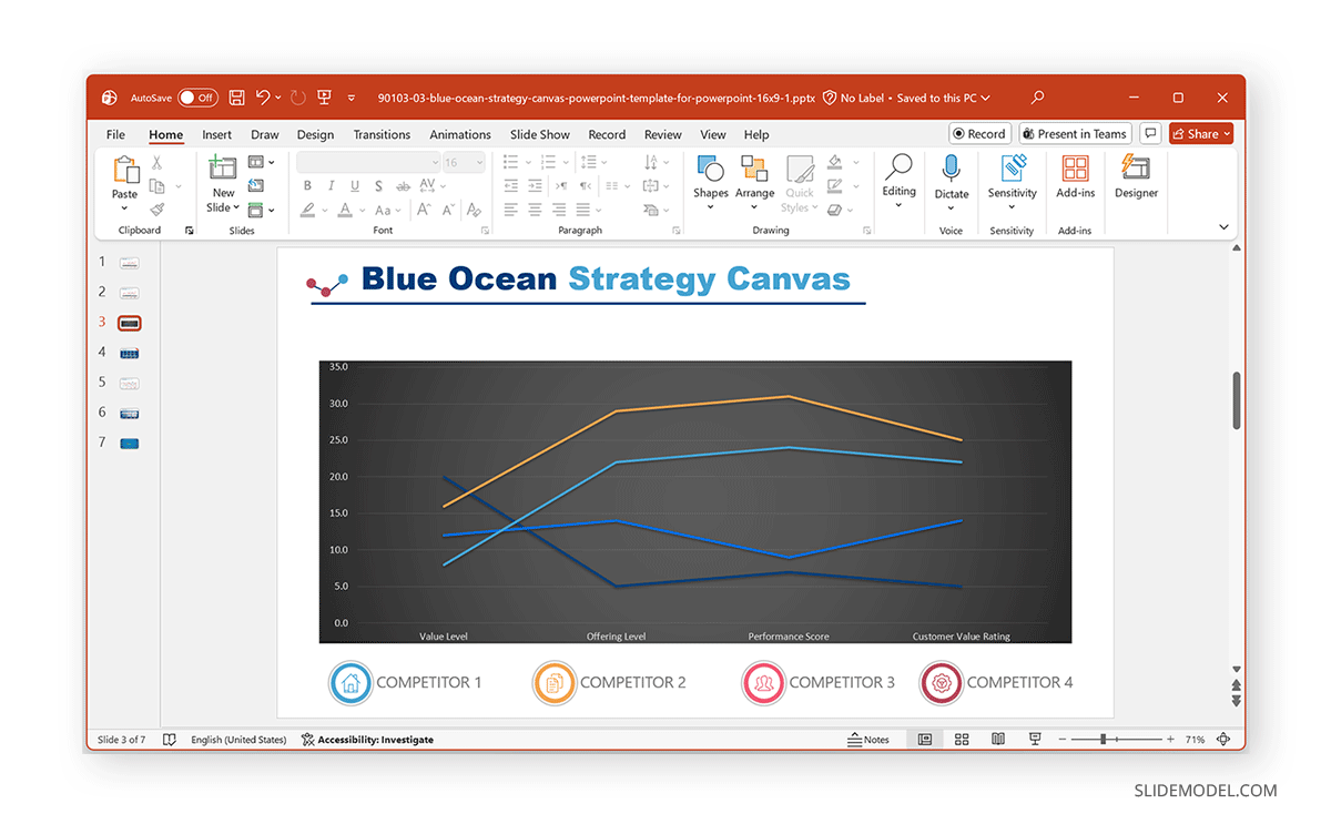
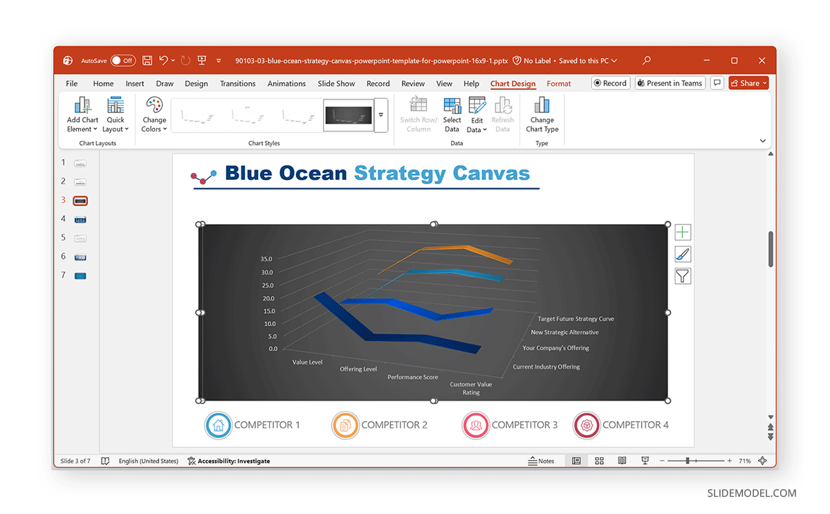
In the example below, we used the Blue Ocean Strategy Canvas PowerPoint Template to design a line chart. As you can see from this example, you can easily incorporate pre-designed templates to create charts that are easy to make and present.
Tips on Which Line Chart to Use in PowerPoint
1. Standard Line Chart
A standard Line Chart is the simplest and most commonly used option. It displays trends over time with continuous lines connecting data points. This chart works best for visualizing a single data series or for comparing a few series on similar scales. Because it’s clean looking, it is ideal for showing overall direction, growth, or decline without unnecessary complexity. This chart type is suitable for:
- Sales or revenue trends
- Market growth over the years
- Performance over time
- Any continuous data
2. Stacked Line Chart
A Stacked Line Chart shows the contribution of each data series to the total over time. Instead of overlapping lines, the values are stacked, making it easy to visualize cumulative trends and understand how individual components contribute to the overall result. You might want to use a Stacked Line Chart when:
- Showing total performance alongside component contributions
- Visualizing cumulative growth
- Understanding how segments add up to a whole
3. 100% Stacked Line Chart
A 100% Stacked Line Chart displays each data series as a percentage of the total at every point in time. All values always add up to 100%, so your audience focuses on proportional contribution rather than absolute numbers. It is commonly used when:
- Showing market share percentages
- Visualizing budget allocation ratios
- Comparing the relative contributions of groups over time
4. Line Chart with Markers
A Line Chart with Markers adds a circular (or custom-shaped) marker at each data point. This makes it easier for the audience to see exact values, peaks, dips, or inflection points. It’s especially useful in executive presentations where clarity and precision are essential, such as when:
- Highlighting individual data points
- Emphasizing specific months, quarters, or milestones
- Presenting charts where each value matters
5. Stacked Line with Markers
A Stacked Line with Markers combines cumulative stacking with visible data-point markers. It highlights how each data series contributes to the total while allowing viewers to see the exact values at each time point. Such as when:
- Showing both cumulative totals and individual component milestones
- Multi-team or multi-department contributions
- Financial breakdowns where exact points matter
6. 100% Stacked Line with Markers
A 100% Stacked Line with Markers illustrates proportional contributions to a 100% total over time, with markers emphasizing key data points. This format is useful when stakeholders need to see both relative percentages and specific change points. A few examples include:
- Market share comparison
- Product mix or portfolio distribution
- Proportion-based KPIs
7. 3-D Line Chart
A 3-D Line Chart adds depth and a three-dimensional perspective to the standard line chart. While it may look visually appealing at first glance, it’s generally less practical for precise data interpretation because the 3D perspective can distort the perceived values and angles. However, such a chart might be used for:
- Decorative or highly stylized presentations
- Visuals where storytelling matters more than precision
- Design-driven slides for marketing or creative projects
Common Mistakes to Avoid When Creating a Line Chart in PowerPoint
Even experienced presenters sometimes make errors that reduce chart clarity or can mislead the audience. To ensure your line chart communicates the right message and avoids pitfalls. Now that you know how to create a line chart in PowerPoint, let’s discuss a few common mistakes when making your charts.
1. Overloading the Chart
Adding too many lines to a single chart overwhelms viewers and makes it challenging to distinguish meaningful trends. When every category competes for attention, no single insight stands out. Limit your chart to the most essential series, usually two to four lines, and move secondary data to supporting slides if necessary.
2. Mixing Inconsistent Data Intervals
Line charts rely on consistent spacing to convey accurate trends. Therefore, mixing monthly, quarterly, or annual values on the same axis creates visual distortion and can misrepresent the underlying pattern. It is recommended to always use the same time interval across the chart. If you need to show multiple time granularities, create separate charts or use annotations to avoid misleading the audience.
3. Using Low-Contrast Colors
When lines are too similar in color or overly muted, the audience struggles to distinguish between data series, especially in large rooms or when presenting on projectors. Low-contrast color palettes weaken the message and reduce readability. Choose bold, high-contrast colors that align with your brand while ensuring each series stands out clearly against the background.
4. Overuse of Markers
Markers help highlight individual data points, but applying them to long datasets or multiple lines can create clutter. Too many markers make the chart feel noisy, distracting from overall trends. Use markers sparingly, preferably only when you want to draw attention to specific milestones, turning points, or small datasets where every value is significant.
5. Misleading Axes
Manipulating the axis scale, intentionally or accidentally, can distort the trend and mislead the audience. For example, truncating the y-axis can exaggerate minor fluctuations and make normal variations appear dramatic. Always double-check your axes to ensure they start at appropriate baselines, use consistent intervals, and accurately reflect the data. A trustworthy visualization builds credibility and supports transparent decision-making.
Final Words
Knowing how to create a line chart in PowerPoint is an essential skill for professionals who regularly present data. With PowerPoint’s built-in chart tools, you can visualize trends, compare categories, and create clean, corporate-ready slides that communicate insights clearly. This might mean tracking performance, presenting KPIs, or explaining long-term trends. Either way, a well-designed line chart in PowerPoint can help transform raw numbers into a visual narrative. If you need inspiration beyond the basics, you can explore these high-quality line chart examples for PowerPoint for professionally designed chart templates.