A histogram is a tool for visually presenting data. Instead of creating a histogram from scratch in PowerPoint, you can generate it in Excel and then import it to a slide. Histograms are often created in Excel, and the data must be transferred from detailed data sheets to a PowerPoint presentation. This guide will walk you through creating a histogram in Excel and customizing it for professional presentations in PowerPoint.
How to Create and Import a Histogram from Excel to PowerPoint
While you can also directly create histograms in PowerPoint via Insert -> Chart -> Histogram, you might often find important data in Excel spreadsheets. Therefore, you might want to familiarize yourself with the method for making a histogram in PowerPoint by importing it from Excel.
Step 1: Create a Histogram in Excel
Insert a Histogram in Excel
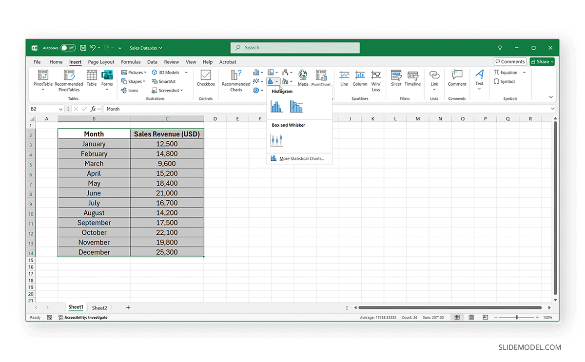
To create a histogram in Excel, go to the Insert tab, click on Insert Statistic Chart, and select Histogram from the dropdown menu. Ensure your data is organized in a single column, with numeric values representing frequencies or occurrences, and label the data column appropriately to provide context for your histogram.
Adjust Bin Sizes, Axis Labels, and Formatting
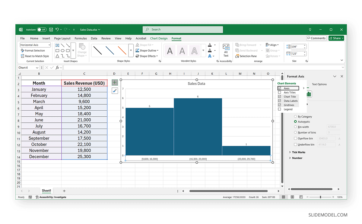
Once you have created a histogram in Excel, make adjustments to format the Bin size, Axis, and Labels.
- Click on the histogram chart and select Format Axis to adjust the bin width and interval sizes for better readability.
- Modify the axis labels to ensure clarity and precision.
- Use the Chart Design tab to customize colors and styles for a more professional look.
Finalize the Histogram for Export to PowerPoint
Once you are satisfied with the histogram’s appearance, review it for accuracy and consistency. Then, save the Excel file to ensure you can reference or update the histogram later.
Step 2: Exporting the Histogram to PowerPoint
There are multiple ways to add your histogram to PowerPoint. Choose the method that best suits your needs.
Method 1: Copy-Paste the Histogram as an Image
Using this method, you can paste your histogram as an image in PowerPoint. To paste your histogram as an image, use the following method:
- Click on the histogram chart to highlight it, copy it via the right-click context menu, and paste as an image.
- Once the chart is pasted into PowerPoint, it might need some adjustment. Drag the corners of the chart image to adjust its size. Position the histogram in an appropriate location within your slide layout. Use the Picture Format tools to resize, crop, add Artistic Effects, recolor, and make other adjustments to the chart image.
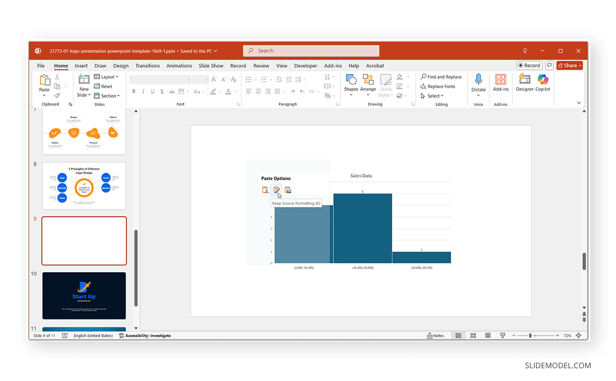
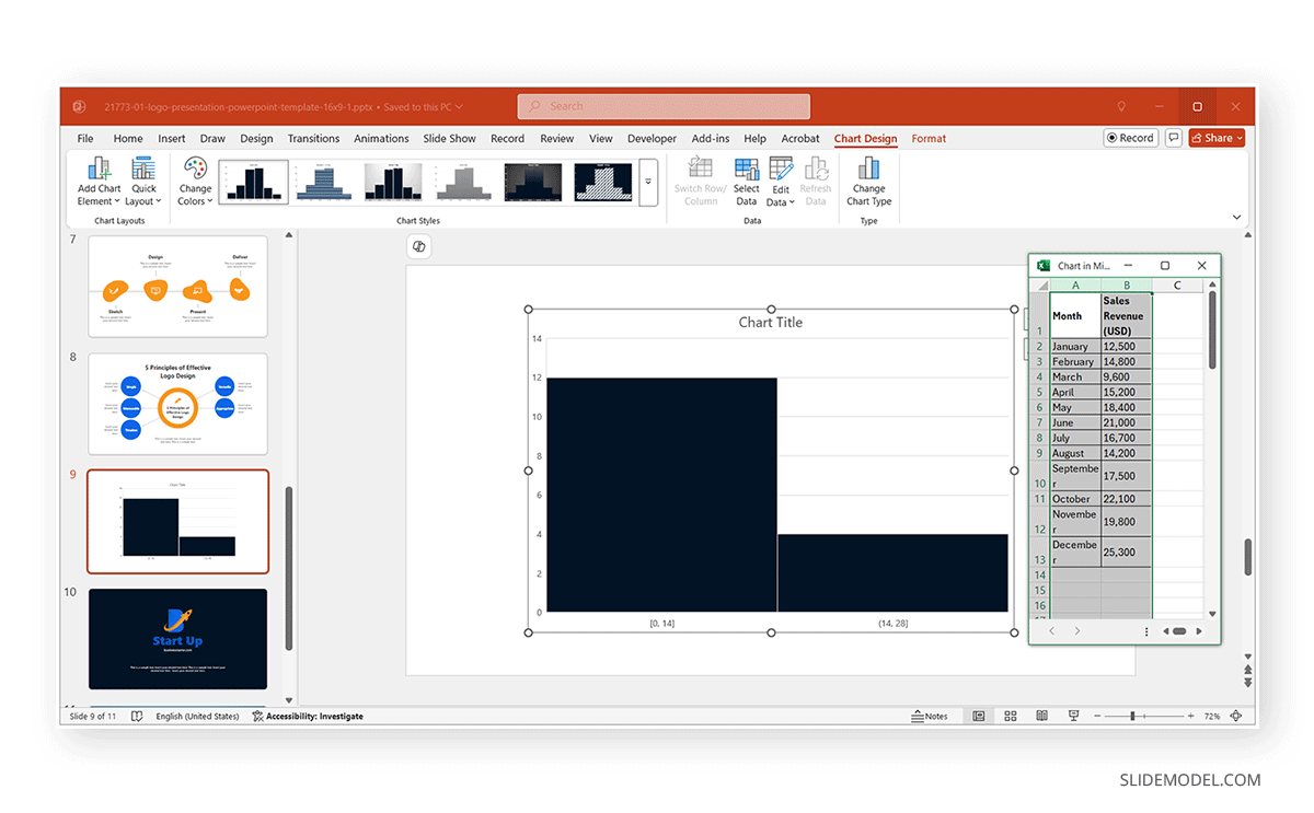
Method 2: Copy-Paste as an Editable Chart
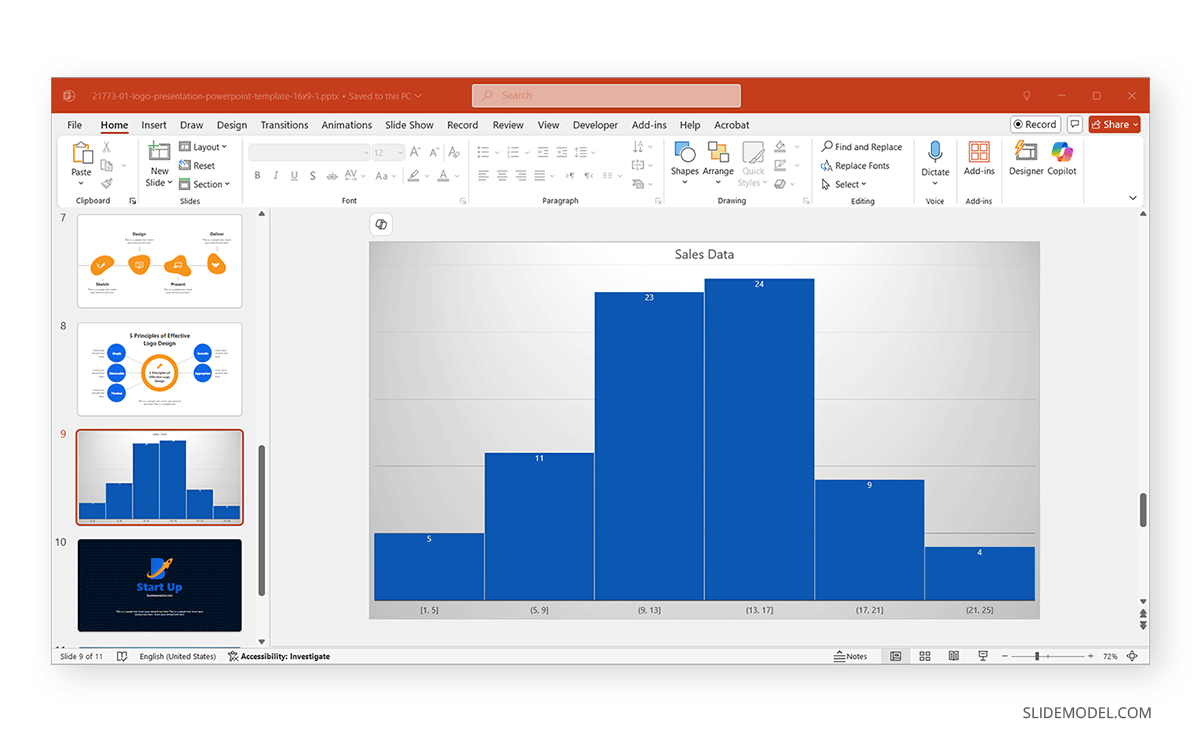
To make your chart editable, paste the histogram from Excel to PowerPoint using the following method. For the purpose of this post, we will add a histogram from Excel to PowerPoint in the Logo Presentation PowerPoint Template, which is a logo design and start-up-themed PowerPoint template.
- Copy the Histogram in Excel by selecting the chart via the right-click menu from Excel, and paste it with the Destination Theme (A icon) or by retaining the source formatting (Paint Brush and Clipboard icon).
- You can adjust the colors, fonts, and labels within PowerPoint to match your corporate theme. Double-click the chart to make any additional edits.
Method 3: Use PowerPoint’s Built-in Excel Integration
You can also link a chart using the built-in Excel integration. Linking a Live chart allows for seamless updates when data changes and ensures consistency between PowerPoint and Excel reports.
- Go to the Insert tab, click on Chart, select Histogram, and click OK.
- Click Edit Data and choose Select Data Source to import data from your existing Excel file.
- Maintain a live link, so updates in Excel are automatically reflected in PowerPoint.
Step 3: Customizing the Histogram in PowerPoint
Once the histogram is in PowerPoint, you can enhance it for better readability and impact.
1. Adjust Colors and Fonts for Presentation Consistency
Use PowerPoint’s Chart Tools to change colors and fonts to match your brand identity. Select a theme-friendly color palette to ensure consistency across all slides. If you have a corporate template, it can be used to maintain consistency. In such a case, you can copy slides from other readymade templates according to need and adjust them to your corporate template.
2. Add Annotations, Labels, and Callouts
Insert text boxes to highlight key data points. Use arrows and shapes to draw attention to significant trends. It’s always good to apply data labels for better clarity.
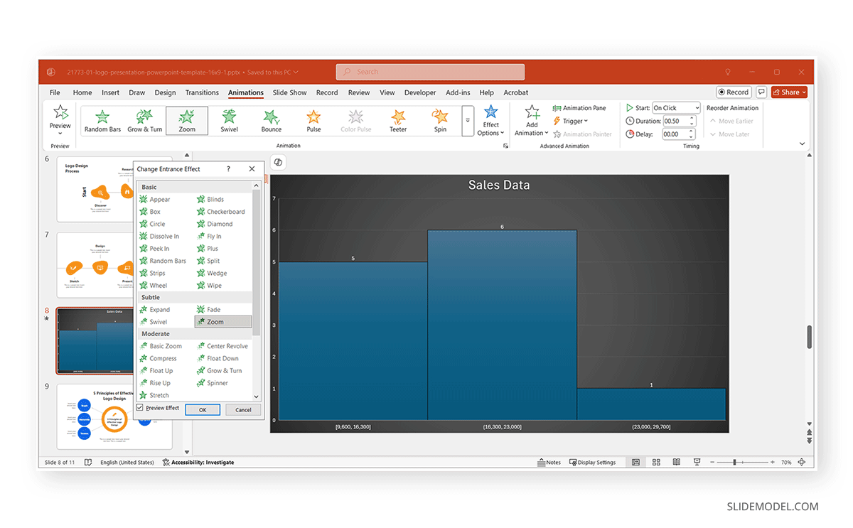
3. Animate the Histogram for a More Dynamic Presentation
Apply entrance animations to reveal the histogram gradually, and if necessary, use motion paths to emphasize changes in data. Avoid excessive animations to maintain a professional look for your histogram. Be careful when using animations that slide or have an exaggerated entrance or exit, as they can appear distracting and non-serious.
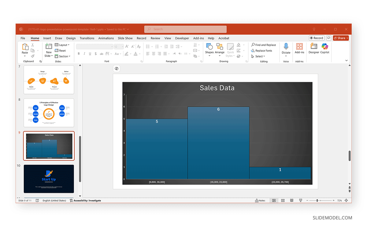
The below example shows a histogram created from data imported from Excel. Once your histogram is added in Excel through data integration or pasting the chart itself, making subtle adjustments to its overall design can make your histogram more visually pleasing.
How to Create a Histogram Directly in PowerPoint
If you prefer to create a histogram directly in PowerPoint without creating the chart in Excel first, follow these steps:
Step 1: Insert a Chart in PowerPoint by going to the slide where you want the histogram and clicking Insert -> Chart.
Step 2: In the Insert Chart dialog box, choose Histogram and click OK.
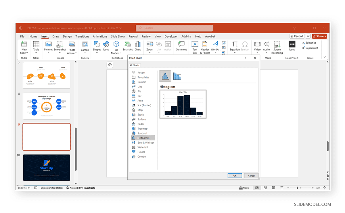
Step 3: Enter data in the PowerPoint data table by typing or pasting it from a data source. After inserting the histogram, a small Excel-like data table will appear in PowerPoint. Replace the default data values using your source of data. Modify the bin ranges and frequencies as needed.
Step 4: Use the Chart Tools tab to customize the colors, fonts, and styles to match your corporate theme. Adjust the axis labels, gridlines, and legend for better readability.
Best Practices for Making a Histogram in PowerPoint
To ensure your histogram is effective and professional, consider the below-mentioned best practices.
1. Keep Histogram Simple and Focused
Avoid excessive design elements that can distract from the data. Use clean, professional fonts and colors that align with your corporate branding. A simple histogram is easier to explain and present. Excessive design elements can make it difficult for the audience to follow the data, and presenting the information will come with challenges.
2. Choose Appropriate Bin Sizes
Adjust the bin sizes to ensure the data distribution is visible. Avoid too wide or too narrow bins, as they can misrepresent the data trends.
3. Maintain Consistency Across Slides
Use the same style for all charts and graphs to create a cohesive presentation. Ensure all text, colors, and labels match the overall theme. You can customize the colors and overall histogram style based on your corporate colors and brand guidelines. This can also help automatically maintain consistency and cohesion with your corporate theme.
4. Highlight Key Insights
Use callouts, annotations, or contrasting colors to draw attention to significant data points. Avoid cluttering the chart with unnecessary details. By focusing on key insights, you can avoid making the data too complicated.
5. Use Meaningful Data
Ensure your histogram represents real trends. Avoid misleading data or information that might be confusing for the audience.
6. Keep the Chart Scaled Properly
Avoid stretching or distorting the histogram. Maintain aspect ratio for clarity.
7. Use Gridlines Wisely
Enable light gridlines for better data comparison. Avoid heavy gridlines that overpower the visualization.
8. Test the Visibility on Different Screens
Ensure the histogram remains readable on large projectors and small laptop screens. Adjust the font sizes and contrast levels if necessary. While many devices account for responsiveness across different projectors and screens, too much text or small font size can make data hard to read.
9. Use Dynamic Animations Sparingly
A subtle fade-in effect can make the data appear engaging without being overwhelming. Avoid excessive motion that can make the presentation look unprofessional.
10. Provide a Summary
Include a brief explanation of the data insights. You can do this by highlighting key takeaways in a short text box or creating a slide with highlights to summarize the findings. Alternatively, you can mix both ideas, create a summary slide, and paste a small version of the histogram into the slide.
Final Words
By following the methods mentioned in this tutorial, you can efficiently create, import, and customize a histogram in PowerPoint to make your presentations more data-driven and engaging. Whether using copy-paste methods, editable charts, or live links, choosing the right approach will help ensure accuracy and visual consistency.
Histograms are essential tools for conveying statistical data clearly and effectively. Integrating them into PowerPoint presentations makes complex numerical data more manageable for your audience. Customization options such as adjusting colors, adding labels, and animating elements allow you to tailor the histogram to fit your specific presentation style. Additionally, maintaining a connection to an Excel dataset ensures that your histogram remains up-to-date with any changes in the underlying data.