Slide 1 of 5 from Free Coronavirus Dashboard Template for PowerPoint
Flatten The Curve PowerPoint
COVID-19 Flattening the Curve Visualization
- Chart
- Line Chart
- Context Slide
- 16:9
- 100% Editable
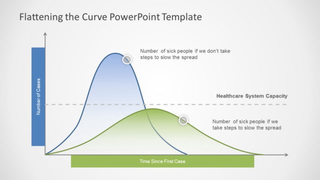
The COVID-19 Flattening the Curve slide from the Free Coronavirus Dashboard Template for PowerPoint offers a clear line chart to illustrate the effects of intervention strategies on case numbers. This slide template is ideal for public health presentations, epidemiology discussions, and crisis management briefings, providing editable shapes and vector icons to enhance understanding of healthcare capacity and infection trends in a business presentation or slide deck.
What’s on This Slide
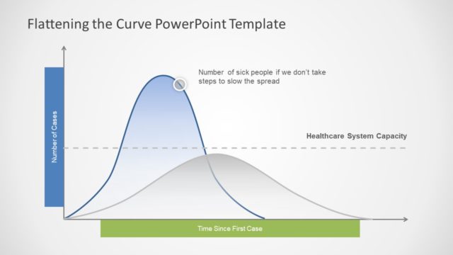
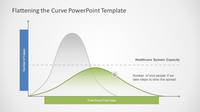
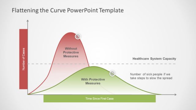
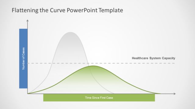
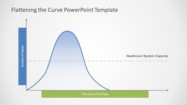
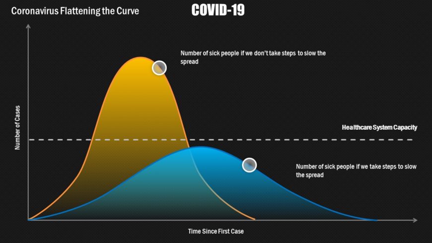
The slide features a line graph depicting two curves representing the number of COVID-19 cases over time. The vertical axis shows the number of cases, while the horizontal axis indicates time since the first case. The upper curve, in yellow, represents the number of sick people if no measures are taken, while the lower curve, in blue, illustrates the number of cases if steps are taken to slow the spread. A dashed line indicates healthcare system capacity. Text placeholders exist for the title and curve labels, positioned prominently at the top and along the curves.
How to Use It
This layout serves as a visual representation of the impact of intervention strategies on COVID-19 case numbers. It is suitable for presentations discussing public health strategies, epidemiology, or crisis management. This slide fits at the beginning of a presentation to introduce the topic and provide context. It can be used in discussions with healthcare professionals, policymakers, or in educational settings to illustrate the importance of flattening the curve during a pandemic.
Text Placeholders & Capacity
Keep your copy within these limits so it fits without resizing. Title and labels have moderate space, allowing for concise text.
| Placeholder | Count | Max characters (approx.) |
|---|---|---|
| Slide title | 1 | 30 |
| Item heading | 2 | 50 |
Slide Keywords
Download unlimited PowerPoint templates, charts and graphics for your presentations with our annual plan.
DOWNLOADReturn to Free Coronavirus Dashboard Template for PowerPoint.