Slide 5 of 9 from Free Conference Presentation Template
Charts & Graphics Slide – Conference PowerPoint Template
Charts and Graphics for Conference Presentation
- Chart
- Bar Vertical
- Evaluation Slide
- 16:9
- 100% Editable
What’s on This Slide
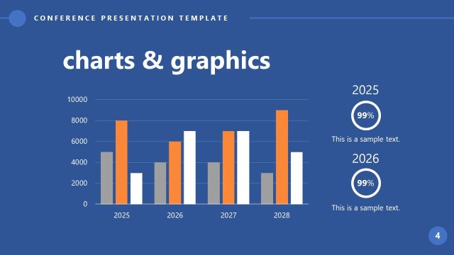
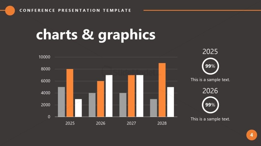
The layout features a bar chart occupying the left side, displaying data for the years 2025 to 2028. The bars are colored in orange, gray, and white, with the orange bars indicating higher values. To the right, two circular indicators show percentages for 2025 and 2026, accompanied by text placeholders for descriptions. The title 'charts & graphics' is prominently displayed at the top center in large white font. Text placeholders are present below the circular indicators, aligned to the right, allowing for additional context. The overall background is dark gray, enhancing the visibility of the chart and text.
How to Use It
This layout serves as a data visualization tool, ideal for presenting statistical information in a clear format. It fits well in a presentation sequence after problem identification and before conclusions, effectively summarizing key metrics. This structure is useful in business scenarios such as quarterly reports, project updates, or performance reviews, where visual data representation is essential for audience understanding. It allows for quick comparisons across multiple years, making it suitable for trend analysis and forecasting discussions.
Text Placeholders & Capacity
Keep your copy within these limits so it fits without resizing. Node labels can hold about 4 characters each, while body text slots can accommodate around 25 characters.
| Placeholder | Count | Max characters (approx.) |
|---|---|---|
| Slide title | 1 | 30 |
| Item heading | 4 | 4 |
| Item body | 2 | 25 |
Slide Keywords
Download unlimited PowerPoint templates, charts and graphics for your presentations with our annual plan.
DOWNLOADReturn to Free Conference Presentation Template.