We have all seen it happen! The lights dim, the projector hums, and within minutes, the audience starts checking their phones or gazing blankly into space. The presenter is still speaking, but no one’s listening. The culprit? Death by PowerPoint, the slow, painful erosion of attention caused by cluttered slides, huge paragraphs of text, and the presenter’s monotone.
Death by PowerPoint doesn’t mean PowerPoint itself is the problem; instead, it’s how presenters misuse it. Slides overloaded with text, data, and bullet points can overwhelm audiences instead of engaging them. It goes without saying that people no longer have a broad attention span, and engaging an audience by a presenter is more complex than ever. However, there are ways to avoid presenting to blank minds and faces. In this article, we will explore what “Death by PowerPoint” is, the mistakes that cause it, and how to design slides that captivate and not exhaust the audience.
What is Death by PowerPoint?
The phrase “Death by PowerPoint” originated in the late 1990s and early 2000s, when presentation software became increasingly common. As PowerPoint spread through business, academic, and government institutions, as well as among military officials, so did its misuse. Presenters began cramming too much information onto slides with lengthy paragraphs, endless bullet lists, and unreadable charts.
The term gained traction after American military analysts and consultants began using it critically. In 2010, The New York Times famously quoted U.S. Army General James N. Mattis of the Marine Corps, saying, “PowerPoint makes us stupid,” referring to a slide so complex that it attempted to explain an entire war strategy in a single frame. That slide became an internet meme and a textbook example of how not to communicate ideas using PowerPoint.
In essence, the term “Death by PowerPoint” or “Death by PowerPoint Presentation” refers to a presentation so overloaded, monotonous, or confusing that it kills any chance of audience engagement, comprehension, and memory retention.
The Psychology Behind Presentation Fatigue
Why do poorly designed slides exhaust people? The answer lies in cognitive load theory, the idea that our brains have a limited capacity for processing information.
Information Overload
When slides overwhelm us with text or data, we experience information overload, and attention declines sharply. A cluttered presentation competes with the speaker’s verbal explanation, forcing the audience to process two streams of complex information simultaneously. The result is disengagement, frustration, and memory loss.
Memory Retention Issues
Studies have shown that audiences remember significantly less from text-heavy presentations than from those that use visuals and concise messaging. This phenomenon, often referred to as presentation fatigue, is common in corporate presentations where employees attend multiple back-to-back slide decks every day. The human brain simply shuts down when overwhelmed by endless bullet lists and identical templates. For example, the Harvard Business Review argues that audiences cannot meaningfully listen while reading detailed slides and recommends that “people should be able to comprehend each one (slide) in about three seconds”. Similarly, the University of Minnesota lists using 15 or fewer words to sum up your message among the best presentation practices.
Distractions Cause People to Switch Off
If your microphone is affected by audio-related problems, or your presentations keep freezing up, or you sound too monotonous, the audience will lose interest. This might also happen due to a combination of several other factors, including mismatched imagery, confusing tables and charts, the use of jargon in slides that the audience can’t comprehend, and poorly formatted slides.
Worst Presentation Mistakes: What Causes Death by PowerPoint?
To understand how bad slides wreck ideas, let’s examine the habits that make slides unbearable and how to avoid such mistakes.
1. Text Overload
When slides become substitutes for documents, audiences stop listening and start reading. Soon, they stop reading and switch to using their phones or looking for a way out of the confusing mess. Long paragraphs, tiny fonts, and excessive bullet points compete with the speaker’s voice, forcing the audience to divide attention and absorb neither. This often occurs when the presenter is underprepared or lacks knowledge. This doesn’t necessarily mean that the presenter is not knowledgeable, but perhaps the presenter opted to copy large blocks of text without much consideration for the audience.

2. Cluttered Design
Too many elements, such as logos, icons, photos, or charts, can create what is commonly known as ‘visual clutter’. Slides lose focus, and the audience doesn’t know where to look. Poor contrast, mismatched fonts, or inconsistent color schemes amplify confusion.

3. Monotonous Presentation Delivery
Even beautifully designed slides can fall flat if the presenter reads from slides, and that too in a monotone voice. The presenter needs to adjust their tone to excite and engage the audience. A common concept that many presenters overlook is how to enhance their presentation flow.
4. Overcomplicated Charts and Data
Charts with too many variables or unlabeled axes overwhelm audiences. Remember, a slide should highlight key insights and not replicate a spreadsheet.
5. Ignoring the Audience
Perhaps the most common mistake many people make is treating every audience the same. Slides that work for an internal progress report may alienate clients, investors, or non-technical stakeholders. You need to plan ways to engage the audience according to their specific needs.
The Cost of a Presentation Gone Wrong
A bad presentation doesn’t just bore the audience; it wastes time, credibility, and opportunity.
Lost Attention: Once your audience tunes out, it’s almost impossible to win them back. Regaining lost attention is more challenging than gaining it when you start the presentation.
Damaged Credibility: Cluttered slides can make even an expert seem unprepared or careless. You might be knowledgeable, but if you can’t convey your ideas to the audience, it might damage your credibility.
Poor Decision-Making: If your audience can’t process key data, they may make misguided conclusions. This can result in misconceptions that can complicate your presentation. For example, a journalist misinterpreting your slides can result in a public relations nightmare.
Reduced Retention: Research in cognitive psychology consistently shows that people process and recall visual information more effectively than text alone, a phenomenon known as the picture superiority effect. For example, a classic study by Allan Paivio (University of Western Ontario) demonstrated that people are more likely to remember information presented as images than as words, due to dual-coding in both visual and verbal memory systems.
Practical Tips and Best Practices: How to Avoid Death by PowerPoint
Now that we have explored what causes Death by PowerPoint and its adverse effects, let’s discuss how to prevent it. The good news? Preventing presentation fatigue is entirely achievable. By focusing on clarity, storytelling, and simplicity, you can turn PowerPoint from a liability into a storytelling ally.
1. Think Story, Not Slides
Before opening PowerPoint, outline your narrative. Ask what the main message is, who my audience is, and what I want them to do next. Once you know the story arc, problem, tension, and resolution, design slides that reinforce, not repeat, your spoken words. Great presenters, from Steve Jobs to TED Talk speakers, use stories, not slides, to connect emotionally. Structure your talk like a story with context, challenge, insight, and impact. Use visuals to amplify emotional moments, not dilute them. You can also consider using visual aids such as PowerPoint templates like the Story Mountain Infographic Template for PowerPoint for storytelling.
2. One Idea Per Slide, Less Text, More Visuals
Each slide should communicate a single concept. If you need to explain multiple points, create numerous slides. This keeps the audience focused and prevents visual clutter. Replace bullet points with visuals, icons, infographics, charts, or photos that illustrate your point.
3. Use Contrast and Hierarchy
Good design guides the eye. Use bold typography for key takeaways, whitespace to separate sections, and consistent color contrast for readability. Avoid decorative fonts that distract. Remember that your audience is human. Avoid jargon, use clear labels, and respect time limits. If the content feels overwhelming, consider breaking it into segments or hosting interactive discussions.
4. Practice Delivery, Not Just Design
Even the best slides fail without confident delivery. Rehearse transitions, tone, and timing, and avoid reading directly from slides. Subtle animations or transitions can guide attention, but overuse quickly becomes distracting. Fade in bullet points gradually, or highlight one element at a time to control pacing.
5. Plan for Your Audience
A presentation might click with a particular type of audience but not with another! Depending on the level of knowledge, professional background, culture, and other factors, you might need to tailor your PowerPoint presentation to an audience. This might involve using culturally appropriate examples, avoiding jargon where necessary, and occasionally using subtitles in another language if the audience does not understand English or the language the presenter speaks.
Examples: Bad vs. Effective Slides
Even the strongest message can lose its impact if it’s presented poorly. Below are some common slide design mistakes and how to fix them using concise visuals and clear hierarchy.
1. Sales Strategy Slide
Bad Slide: A slide packed with 10 bullet points explaining the sales plan in detail, which overwhelms the audience with too much text and no visual focus.
Effective Slide: A single headline, e.g., ‘Sales Up 24% in Q2’, paired with one key graphic (e.g., a growth chart) and a short takeaway summarizing the main point. Such a layout will instantly communicate success and invite discussion.

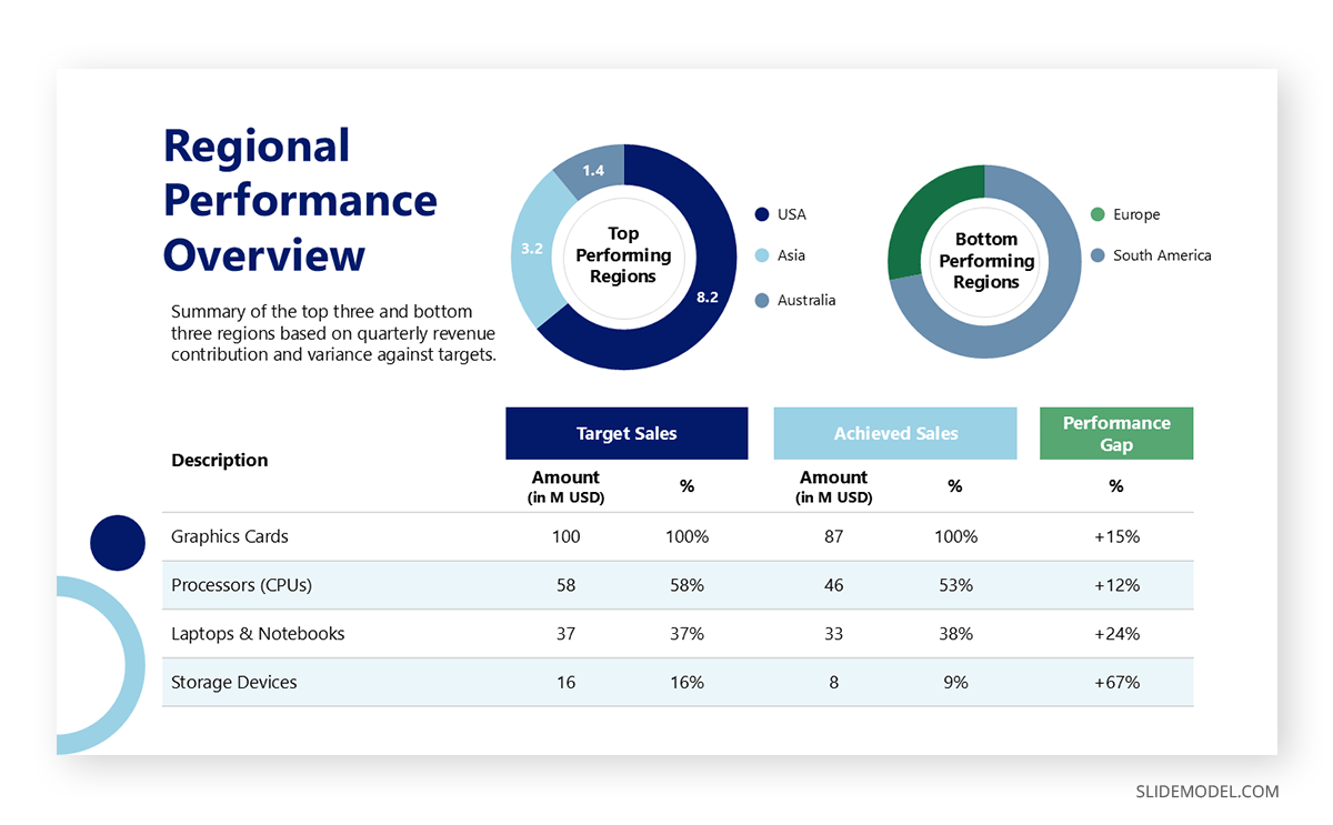
2. Performance Data Table
Bad Slide: A cluttered table containing 40 numbers across multiple columns and rows. Such a side forces the audience to decipher raw data instead of understanding insights.
Effective Slide: A clean bar graph or data visualization showing only the top three and bottom three performing regions. This makes performance differences visible at a glance, supporting faster decision-making.
3. Process Diagram
Bad Slide: A complex diagram with 15 arrows and small labels trying to explain every step of a workflow. This creates confusion, and the audience is unsure where to begin.
Effective Slide: A simplified five-step SmartArt process using color-coded stages to show flow clearly, e.g., Plan -> Design -> Build -> Test -> Launch. This provides clarity and structure, guiding the audience through the process in a systematic way.

4. Product Features Overview
Bad Slide: A slide filled with paragraphs describing features and technical specifications.
Such a slide disengages the audience.
Effective Slide: Use three large icons representing each key benefit, paired with concise captions (e.g., Faster Setup, Lower Costs, or Cloud-Ready). This converts dense text into visual cues that are easier to remember and explain.
5. Presentation Length and Slide Density (Kawasaki Method Example)
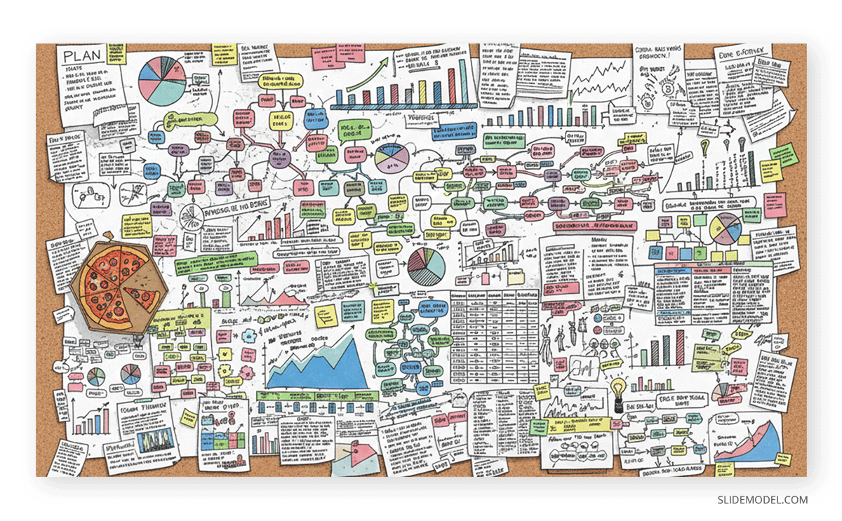
Bad Slides: A 50-slide presentation crammed with dense paragraphs, unreadable charts, and tiny text, intended to last an hour or more. This overwhelms the audience, dilutes key messages, and causes attention fatigue long before the main point is reached.
Effective Slides: Using the Kawasaki method, you can create a crisp presentation with only basic points to ensure the audience grasps your message and key takeaways. This method was made famous by Apple’s Guy Kawasaki, who came up with a renowned principle that recommends the following:
- 10 slides maximum
- 20 minutes of delivery time
- 30-point font minimum
You can learn more about this method from our tutorial about Understanding the 10/20/30 Rule of PowerPoint Presentations.
Final Words
Death by PowerPoint isn’t about the use of PowerPoint, but about using presentation design that ignores human attention and emotion. Slides should amplify your story, not suffocate it. The most memorable presentations aren’t data dumps but something memorable for the audience. They combine visual design, narrative flow, and audience empathy into something that informs, excites, and inspires the audience. At the very least, a presentation should give the audience something to think about.
By creating uncluttered slides tailored to your audience and a presentation tone that doesn’t sound like a monologue, you can avoid ‘Death by PowerPoint’ and make your slides work in your favor, not against you.