Decline PowerPoint Templates
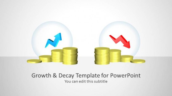
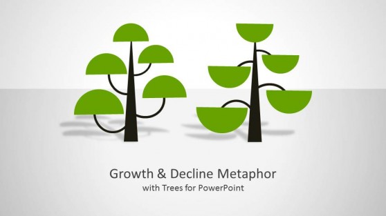
Decline PowerPoint Templates are business-themed presentations that may be customized to demonstrate growth and decline trends. These templates include editable diagrams with essential clipart images such as arrows, coins, trees, and curves.
Our Decline PowerPoint Templates are ideal for corporations, marketers, and educators wishing to present falling trends statistics. They work on Mac and Windows computers and can be used in all PowerPoint versions (including Office 365 subscription plans), Google Slides, and Keynote. Customize these templates to meet your needs and rearrange slide items to fit your presentation.
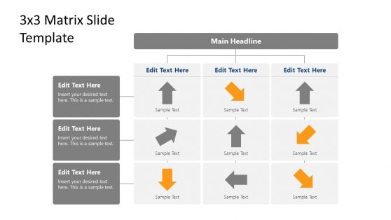
3×3 Matrix Performance PowerPoint Template

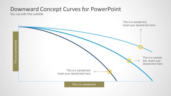
Downward Curves for PowerPoint
Declining Graphs SlideModel templates include editable placeholders, letting you quickly and easily enter your data and change the look to meet your brand or presentation style.
You can save time and effort while still producing high-quality graphs with our Declining Graph Templates. Our templates are designed to assist you in visualizing trends and communicating data, providing you with the tools you need to make informed decisions and push your organization ahead. These Declining Graphs PPT files can help you succeed whether you are an entrepreneur, marketer, or analyst.
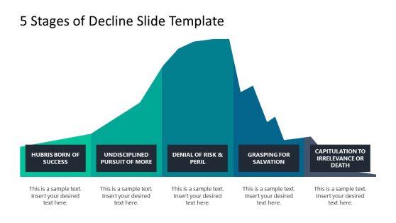
Examples of the application of Declining Graphs can be labeled as expressing diminishing sales, earnings, internet traffic, customer satisfaction scores, or any other data demonstrating a downward trend. The simple templates provide an excellent approach to graphically and professionally showcasing information.
What Is A Declining Graph?
A declining graph is a chart that shows a diminishing trend in data or another variable over time. It is a graphical representation of how a specific metric or variable has dropped over time. The graph can be displayed using a variety of charts, including line charts, bar charts, and scatter charts.
How Do You Create A Declining Graph In PowerPoint?
To make a declining graph in PowerPoint, follow these steps:
- Create a new slide in PowerPoint.
- Select “Insert” from the top menu.
- Select “Chart” and the appropriate chart type for your data (such as a line or column chart).
- In the Excel file, replace the sample data with your own.
- Change your chart’s colors, font styles, and other components to make it look better.
- Add axis labels and a title to your chart, explaining the variable and the period.
- Make necessary annotations or footnotes to clarify the data or emphasize crucial areas.
- Check your chart to ensure it appropriately shows facts and communicates your point.
- Save your slide and incorporate it into your presentation.
Creating a Declining Graph from scratch can be challenging, but don’t worry. With a variety of designs to choose from, you can quickly create professional-looking graphs by choosing from our collection of amazing templates.
What Is The Purpose Of A Declining Graph?
Declining graphs show negative patterns in data sets. A declining graph’s major goal is to give audiences a straightforward approach to assessing data trends showing a decreasing tendency over time. They often track diminishing sales, stock prices, or market share in numerous sectors, including business, finance, and economics.
Can I Customize The Appearance of My Declining Graph in PowerPoint?
Yes, you may change your graph’s colors, fonts, and other graphic aspects in PowerPoint. You can add annotations, headings, and labels can also be added to make your graph more illustrative.
What Types of Data Are Best Displayed Using a Declining Graph?
Declining graphs are useful for visualizing data sets with a declining trend. You can use any of these templates to demonstrate a variety of long-term patterns, such as diminishing sales, performance, website traffic, or customer satisfaction scores.